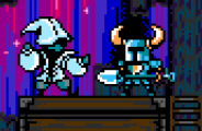
You may have heard – Shovel knight has finally made his way across the ocean to Japan! We’re very excited about the leap. We’ve invested a lot of time making sure our localization is fun and smartly done. Wait, what is localization? It’s the process of translating text and adapting a game for a local market, of course! We partnered with the super cool experts at 8-4 to make our localization the highest quality possible. Today, we wanted to talk about some of the neater changes we’ve made to the game to really go the extra mile for Japanese gamers.
History
But before we jump in…it’s time for a history lesson! Way back in the day, game localization was the wild west. There was no standard or ruleset for what was appropriate in localizing a game. Sometimes developers would make translation changes that were absurd and riddled with typos, and other times, developers would put so much effort in that they’d completely change the name and create a whole new series.
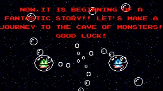
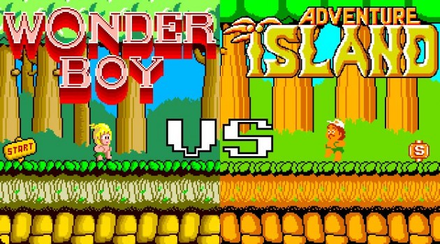
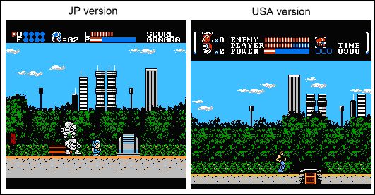
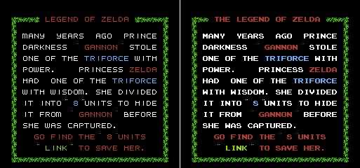
(On the left is Bubble Bobble’s poorly worded text. On the right is Wonder Boy, a Japanese game that was changed to Adventure Island when ported to the NES/Famicom. The game actually split off into two distinct series.)
(Update 8/1/16: It’s come to our attention that Adventure Island was converted from Wonder Boy during its port from arcades. We were confused because often porting and localization are intermixed due to Famicom->NES transition. We apologize for the error!)
This inconsistency created a lot of interesting localization changes in games as developers learned with each title what were the appropriate changes to make. Also, due to the restrictions of the NES, lots of changes were required when bringing them from Japan. Some issues including complexity in fonts, technical limitations, or game design observations and learning that happened post-release. We’re going to discuss just a small sampling of the changes they made to games back in the day, so you can see where the reasoning came from for the changes we’ve made to Shovel Knight for Japan.
Before you read any history from us, it’s best to learn from the expert himself, Clyde Mandelyn: http://legendsoflocalization.com/. He’s put together really awesome pieces (and books!) on some famous game localizations and the changes they made post Japan release.
Common Japan to North America Localization changes
Obviously, lots of small or large text changes happen when localizing a game as a result of the complexities of translation. But we’re going to instead show some of the visual, sounds, and gameplay changes that you might have seen during the NES/Famicom era.
Graphic Changes
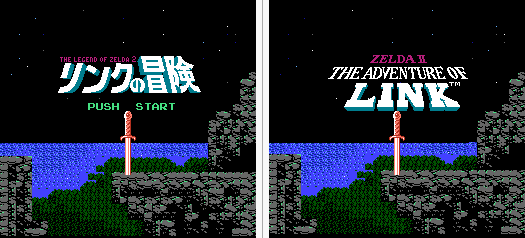
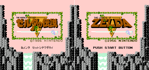
Of course, usually one of the big changes to a game was the title screen. Sometimes this could be a complete replacement, or sometimes it was just the removal of some Japanese text.
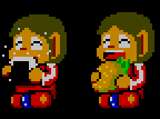
Sprite changes were very common in the NES days. Often, the logic was that players might not understand Japanese specific sprites like food:
Or alternatively, North American localization teams might think the Japanese characters or sprites wouldn’t be appealing. Below Power Blade, known as Power Blazer in Japan, changed its main character to look cooler instead of cute.
Sometimes these changes were made to make the gameplay more clear and understandable:
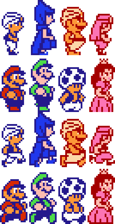
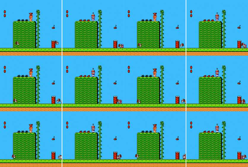
Super Mario Bros. 2 (known as Doki Doki Panic) in Japan is a case where Nintendo of America went to great lengths localizing the game. It’s a great example of what was typically changed at the time…they turned a game that wasn’t Mario into Mario!
In some cases, they decided to change sprites so they were now animated! Below is an example of one change where it made the gameplay objects really stand out:
Sprites could also be changed to be less or more complex. Or maybe they’d be changed to improve over the Japanese version. Here’s an animation change of that kind from Mario 2:
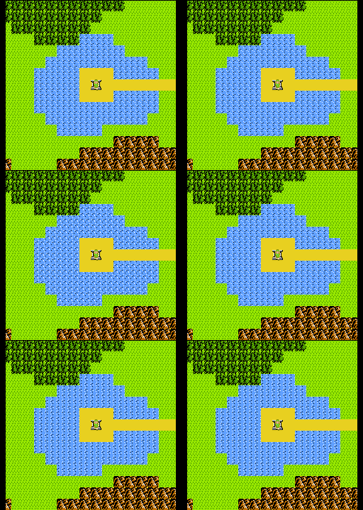
Sometimes these animation changes were due to restrictions in hardware between the Famicom, NES, or Famicom disk system. Here’s an animated sprite (actually a background tile that appears animated) in Zelda 2 that was removed in the NES version as the NES wasn’t able to manipulate VRAM in quite the same way as the FDS:
Font changes
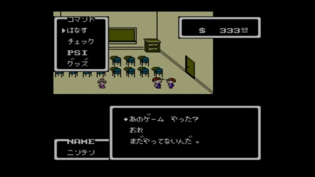
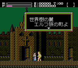
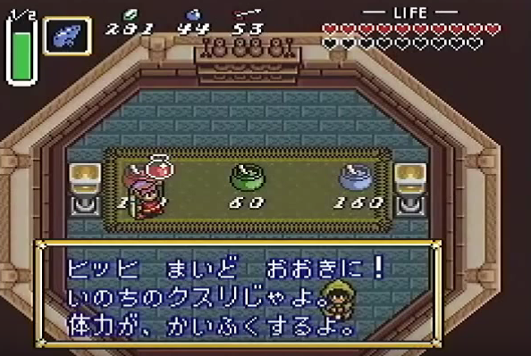
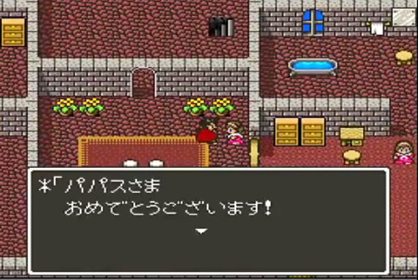
Fonts were often a big area where changes were made. Creating a game in Japanese was difficult due to the common character set, Kanji, being nearly impossible to contain on the small amount of memory that the NES could afford. Kanji can contain thousands of characters (a common newspaper might include 2500+)! To get around this issue, sometimes games chose to use the smaller Kana character set (up to around 100 characters), or they decided to use the much smaller English character set! English is somewhat common in Japan, so it didn’t make the games completely unplayable as you might expect (especially given the typically small amount of text in NES games). Here are some examples of Kana text on the NES/Famicom:
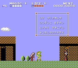
Here’s an example of Zelda using English in the Famicom version:
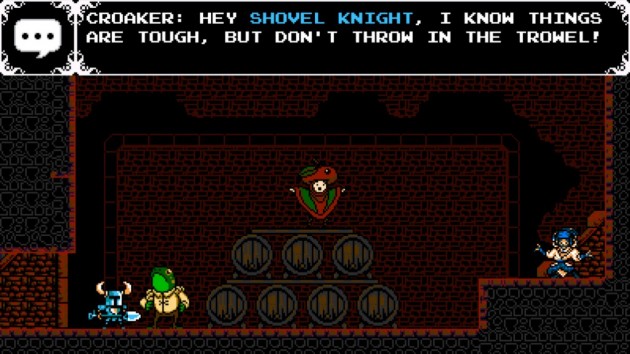
Notice the difference in font here. The NES had a standard 8×8 thick font, so the North American text was re-appropriated to use what players were accustomed to seeing. You might also be realizing that all the letters are in uppercase! This is to cut the number of characters needed in half. Shovel Knight already does the same thing!
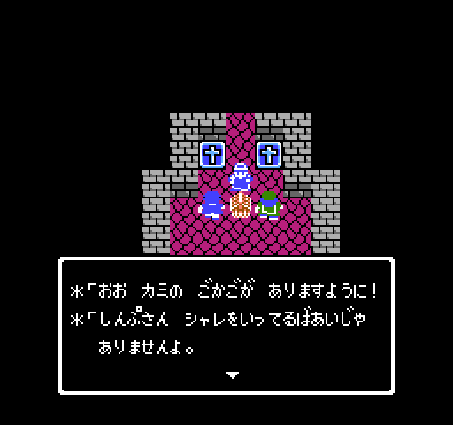
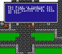
In cases where text readability was very important, the developers dedicated more resources to represent more complicated text. Below, you can see how Final Fantasy on the NES broke the lower case barrier:
You may notice the odd looking ‘g’ in the letter king. This is due to NES/Famicom games only having space for 8×8 characters. A lowercase g, to be properly spaced would break this boundary, so they’ve instead positioned the character higher. This is another reason why Kanji was so hard to represent on the NES/Famicom. Each character’s complexity is nearly impossible to represent clearly with only 8×8 pixels. But there were limited cases where developers were still able to pull off Kanji on the NES/Famicom. Take a look at Faxandu:
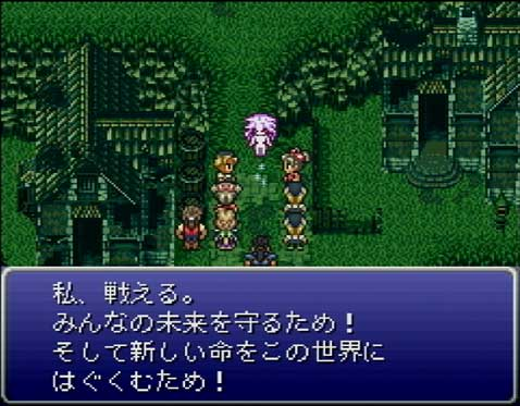
As you can see the font is much larger than the typical 8×8 size. This is due to how Kanji’s complexity is almost impossible to clearly represent with an 8×8 pixel block. Faxanadu doubles the size using 16×16 blocks (where the characters fit in 14×14). On the Super Famicom/SNES, developers had a little more freedom, so Kanji fonts often were 12×12:
Audio
It wasn’t just visuals that were changed, sometimes game localization teams changed the sounds associated with a gameplay object.
And they even went as far to change music compositions. This was sometimes due to differences between the hardware for a Famicom, NES, and Famicom disk system. Or as we’ve stated previously, this could be due to the difference of the actual cart technology. Check how different Castlevania 3’s soundtrack is between versions:
Gameplay
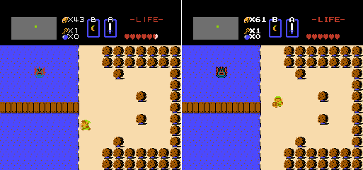
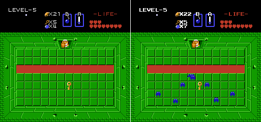
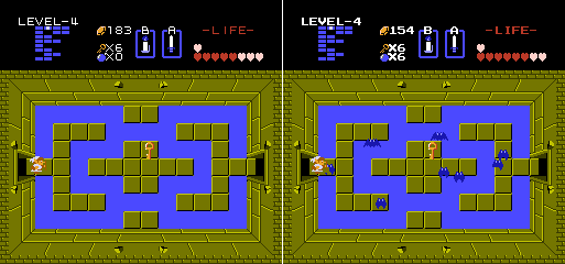
Finally, sometimes the NES transition from Famicom would go as far to changing gameplay. This could be anywhere from making the game easier or harder, removing glitches, accounting for hardware differences, or simply trying to make the game more fun. Here are a couple of rooms from Zelda where they decided to add bats!
And infamously in Zelda, Pols were weak to sound in the Famicom version, but the NES controller didn’t have a microphone, so they were instead weak to arrows:
Shovel Knight Localization Differences
So when we went about localizing Shovel Knight, we wanted to recreate some of the fun differences you might find between regions. We even went through the process of trying to “reverse” localize it. That meant to us, asking what features Shovel Knight would have had if it started out as a Japanese game. We had a few rules in all our changes though: 1) We wanted the gameplay to remain consistent 2) We didn’t want any significant change that made you feel like you missed out by not playing the original version 3) We didn’t want to do something that was traditionally considered bad localization. To us that meant, no typos or bad English, and nothing that would diminish the quality of the game. We also didn’t want to change too much! In the end, we wanted create a great localization by today’s standards. But we had to add a little fun! So we made a few subtle changes here and there that we think really made a big difference!
Graphic Changes
The title Screen is an obvious one. We wanted to match what you’d expect out of a Japanese game in the era, which meant having Japanese text alongside the English logo:
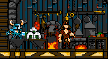
After that, we made some more changes to the static sprites. Below you can see that when upgrading your health, Gastronomer sometimes will randomly serve up a Rice Ball dish.
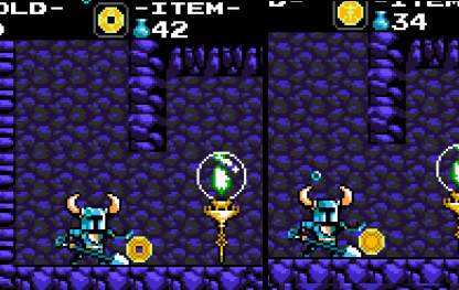
Additionally, the Midas Coin now has a hole more representative of some Japanese coins:
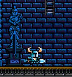
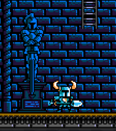
Also, the Hall of Champions statues have an alternate design.
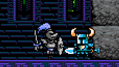
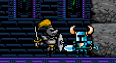
We also made some slight color changes. Certain Wizzem and Iron Knight palette types have changed as you can see below:
The final static sprite change we made was reworking the character portraits for Reize, Baz, Polar Knight, and The Enchantress. We tried to make them have a slightly more anime-esque art style.
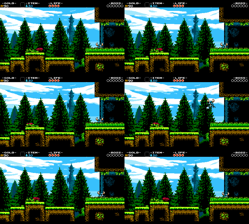
After that, we decided it was time to make some static art be more animated – really show off the power of the Famicom! First up, in Plains, we decided to animate the grass:
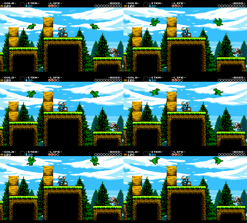
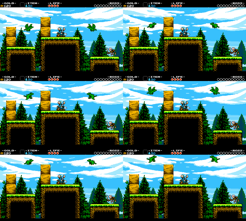
For Dragon Whelps (green and blue), we originally created sprites with a lot of frames in their flying animation, but decided to cut it back as it didn’t look like something that could appear on the NES. But we left it in for the Japanese version!
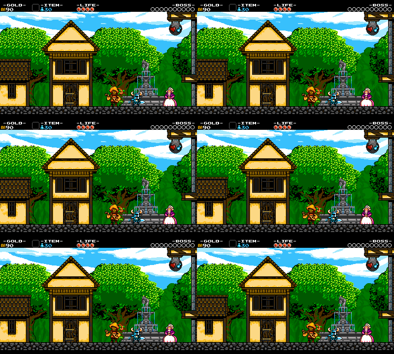
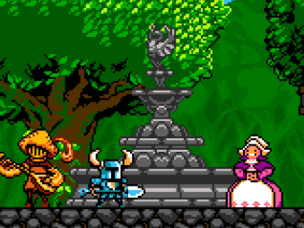
For the Village Fountain, we created a different design and animated it to flow with water!
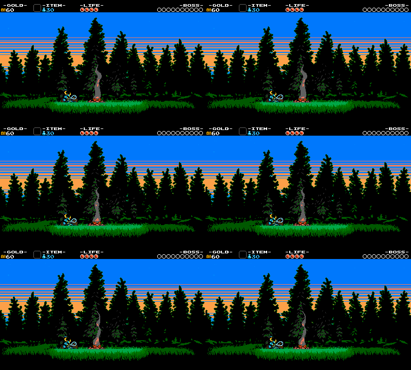
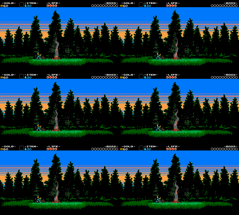
And the last graphic change we made: sleeping Shovel Knight at the Campfire now has a snooze bubble!
Font Changes!
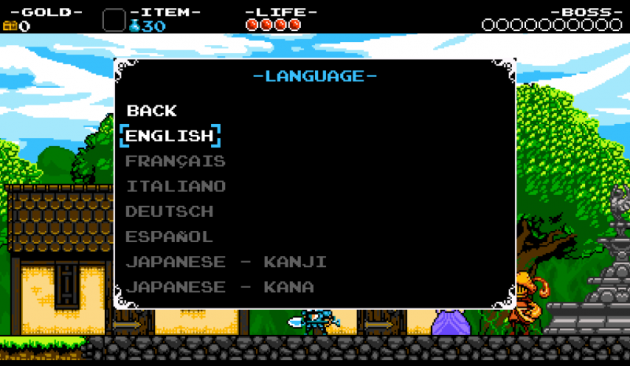
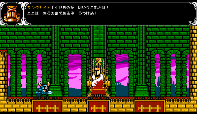
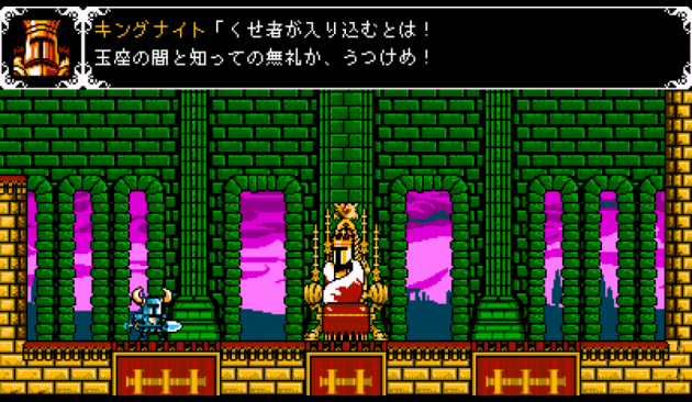
Font was a really tricky decision for us. We wanted to use Kana characters because that was most representative of the NES era and its limitations. That said, most Japanese players would rather play the game in Kanji. Kanji can be considered nostalgic and retro as well as it was widely used on the Super Famicom. Additionally, Kanji would require us to redo every text box in the game, as we created our menus, dialogue boxes, etc to fit 8×8 font characters. So obviously the easy way out would be to do Kana…so after much deliberation, we caved and decided to do both!
The game has officially been translated into both alphabets, and supports the player switching between both on the fly:
You might see that we opted for 12×12 pixel sizes on the Kanji font. This allowed us to get a look most closely aligned with the Super Famicom.
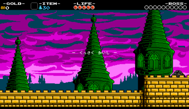
Notice also, that we haven’t changed the HUD text from English. We felt it was very common at the time to use English words for the HUD, and we decided to stick with what we had:
Sounds Changes
Not much to go on about here. We already took the Famicom route with the music and included a VR6 chip. So we instead decided to change a few sounds:
- Gryphon death SFX and Bubble Dragon death have been swapped
- Wizard Fire (and Shovel Knight’s fire rod) uses the burner SFX instead of magic SFX
- Fairy enemy plays different SFX when attacking with a bite.
Extra Cheats!
We couldn’t just stop there! We decided to add a few more extra bits. Remember the X&BUTT cheat code? Well, butt is sadly not exactly the funniest word in Japan, so we’ve come up with a different replacement scheme. Along with text replacement, the cheat also enables two new graphic replacements that we thought were a little too far for the graphic changes in the main game.
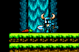
Carrots are replaced with Daikon Radishes:
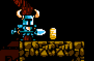
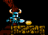
And Gold coins are vertical, more closely resembling koban style coin.
We’ve also made it so this Japanese specific cheat turns on localization changes in all languages. Pretty cool, huh! But if you don’t want to use a cheat, you can switch to Japanese at any time to see all the changes!
Thank you
Hope you enjoyed a little look at the extra efforts we put into the Japanese localization. Translating a game is a ton of work, and we hope more people will now see how much love goes into each and every release of a game. You should give it a shot once our update with the Japanese changes are out in the wild!

