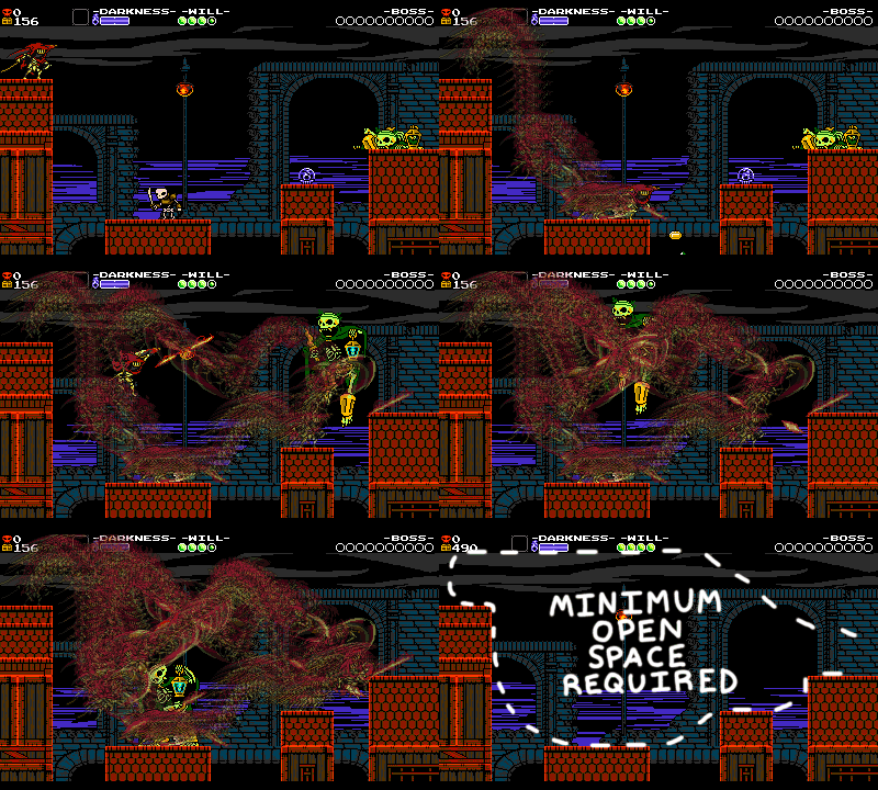
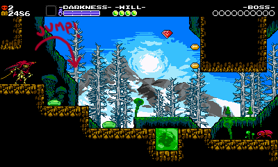
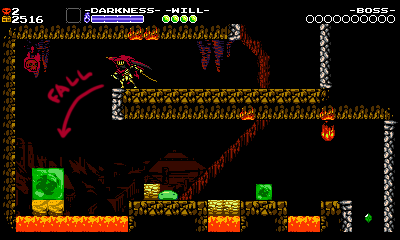
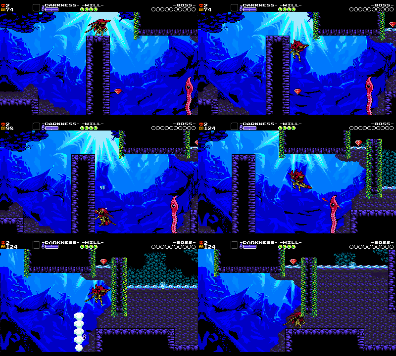
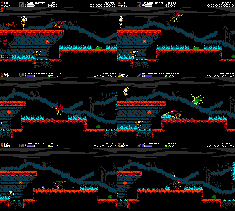
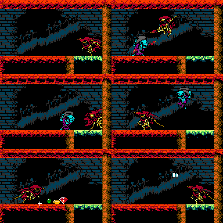
In our last chapter, we developed a strategy and scope for creating levels in Specter of Torment. We also assigned objects and mechanics to each level. So, now that we’ve got a foundation of rules and ideas to build on and a rough plan for all the levels, it’s time to actually design the specific rooms that make up the gameplay of each level! Let’s talk about some of the things we consider when designing a small stretch of gameplay.
Chapter 2: Plotting Rooms & Encounters
Grouping Gameplay Concepts
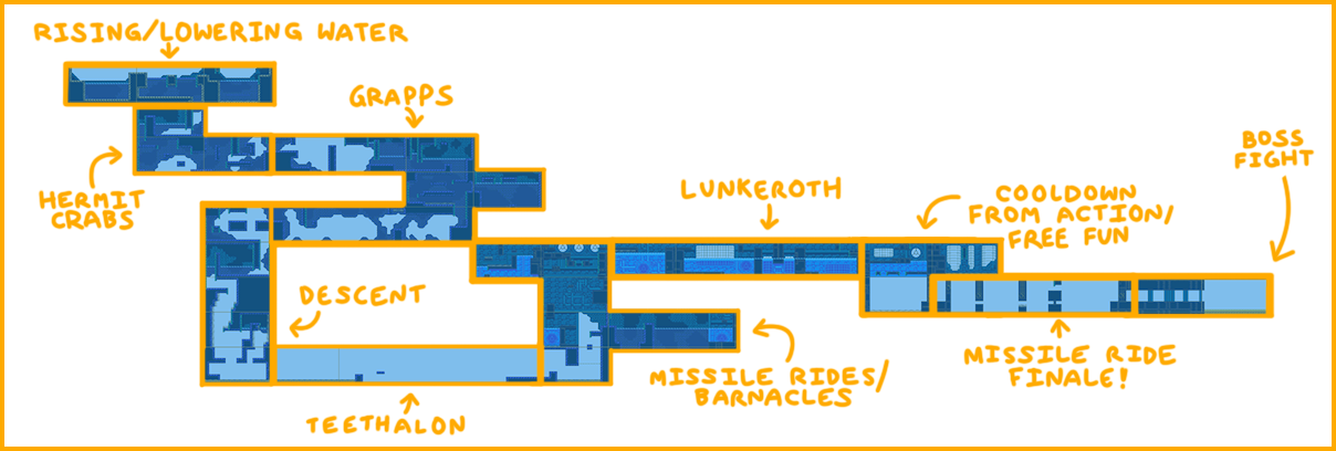
In the previous article, we took a brief look at the Lich Yard’s overarching plan and how we arrived at it. This time, we’ll look at the Iron Whale. Here’s a similar view of the level grouped by concept. These areas have already been grouped for thematic and gameplay reasons using the methods described in the previous article. We’ll give a quick rundown of what’s going on:
- You start on the beach. Rising & lowering pools of water are in the beginning on the surface, before you submerge. Thematically it’s your approach to the Iron Whale, and it also gets you experimenting with water physics.
- You face small undersea critters (Grapps, Hermit Crabs) in your descent. Rising pressure as you descend and become comfortable with underwater action.
- Culminates in a scary (and more treacherous) Teethalon Encounter at the very bottom of the ocean!
- After that, some relief as you enter the Iron Whale up through the bottom! Thematically it’s like infiltration, and the missiles are the underwater defense. Rising action as you climb!
- Once inside the ship, you encounter Lunkeroth, a big invulnerable fish that pursues you for the rest of the level. This is the hardest part of the level and combines everything else, but you should be ready for it at that point.
- Finally, you ride a missile through Treasure Knight’s Treasure room into his vault. Thrilling, thematically interesting and not too difficult!
Within each section of the level, we strive to use our basic ingredients in as many interesting ways as we can imagine. We’ll generally start simply to teach the player, but quickly introduce scenarios that are focused on combat, puzzles, or timing. While it should be fun to navigate the environment and battle in and of itself, every encounter should do something new or different to keep the player’s interest. You can’t show the same magic trick twice!
Occasionally, our plan doesn’t work out, and an object or enemy is confusing or too one-use. In those cases, we may need to redesign the enemy or object. Sometimes it can be difficult to know when an enemy needs work, or if it should be used differently in the level.
Introducing an Enemy

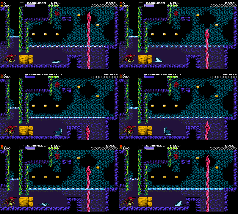
To illustrate how we develop a stage design around an element, let’s look at Specter of Torment’s introduction to a single enemy, Grapps! Found mostly underwater, Grapps is a long tentacle enemy that shoots in from offscreen. The part with the eyeball can be attacked, but the rest of the long tentacle is completely invulnerable. Unlike most enemies, you can’t walk through Grapps, which means it can be used to block the player, creating puzzles. Eventually, we want players to be Dash Slashing through these dangerous tentacles and other enemies and sailing across the seabed like a cool grim reaper! But we need to get the player familiar with the enemy first.
With all that in mind, here’s a few things we need to teach the player about Grapps before they can feel comfortable being the cool reaper we want them to be:
- Grapps moves in from offscreen and has a variety of behaviors, but it usually moves up and down.
- Touch it and you’ll get hit.
- Hitting the tentacle makes you bounce off, but hitting the eyeball defeats it and sends you through.
- Your Dash Slash can only target the eyeball.
Let’s look at our first room of Grapps in the game, and see how it teaches those lessons. By this time in the game, the player has already completed the first stage and defeated a boss, so we are reasonable assuming they’re pretty familiar with Specter Knight’s mobility set of wall climbing and Dash Slashing.
The first thing to keep in mind when designing any room is legibility for the player: making the intention of the level design clear. The hard part should be jumping over the pit, not knowing where the edge is! Critical information should be apparent so that the player can prepare for what’s next.
In that spirit, the first thing that happens as you enter the room is a screen transition. In Shovel Knight games (like in Mega Man games), the camera scrolls over to new rooms to separate the action. During this screen transition, the player autowalks for a few moments and cannot control the game. This brief downtime is a great opportunity to give the player a heads-up as to what’s next.
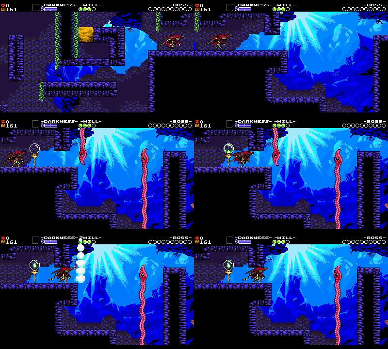
As soon as the screen scrolls over to the right, Grapps simultaneously shoot down from above and below. The loud pink hue and motion are important because they draw the player’s eye as soon as they enter the room. It also signals to players: “Like most things that stand out, you can interact with this!”
Now that the player knows that Grapps is a point of interest, they’ll likely walk over and interact with it, which is to say they will attack and defeat it. If they try to touch it, they will take damage – the player may not do this, but it’s not critical information for this encounter. Grapps blocks the way, though, so defeating it is required to proceed. Within moments of entering the room, the player is already put to work figuring out what to do with a limited array of options.
Clarity of Intention
Level design is about building trust with the player. So, what would it look like if this encounter were too ambiguous or not considered?
- If Grapps shot down at you slowly when you approached it, you might incorrectly think you could rush by and sneak under it. You’d be learning the wrong thing!
- If you couldn’t see Grapps until it was about to hit you, it’d be a cheap hit. No fair!
- If Grapps didn’t move (and you thought it was in the background), you’d be confused as to why your path was blocked. That’s also why it’s a bright pink color, to contrast better with our deep blue background.
When you don’t have all the necessary information to overcome an obstacle, it can feel frustrating. But if we start simple and build that knowledge, we can have more fun later.
On that note, check out the ceiling that’s brought down from above the screen right before the Grapps. This little overhang prevents the player from attempting to jump over the Grapps, as such a maneuver would result in the player getting hit offscreen and lead to more confusion. This ceiling helps communicate to the player: “Hey, don’t worry about anything up here. Just deal with the tentacle.”
Spacing an Encounter
Okay, so we’ve placed the first enemy in context and the player has learned a little. Great! What next?
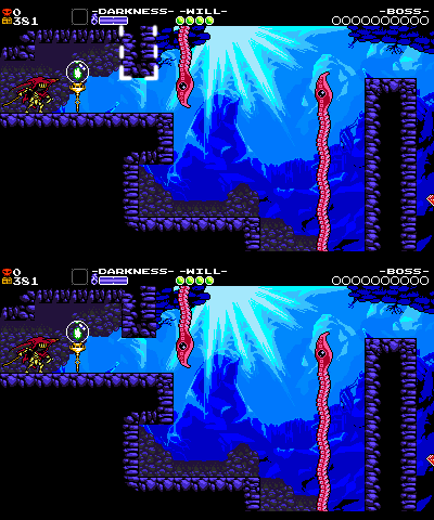
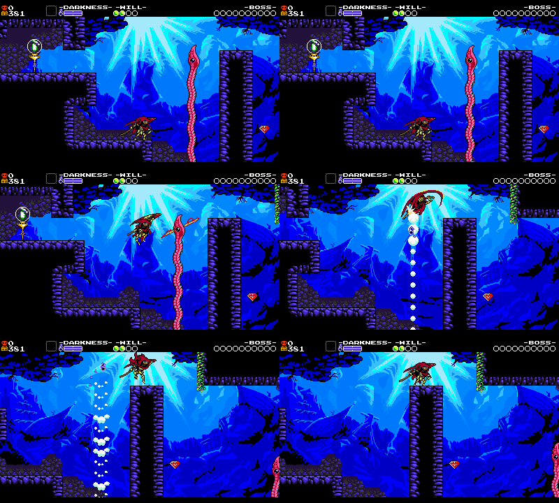
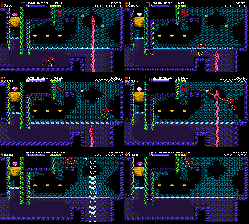
We want the player to jump up and Dash Slash Grapps’ eye, and the next encounter is set up to encourage that. For added fun and challenge, a pit can be mixed in now that the player is a little familiar with the enemy. An enemy will only be interesting on its own for so long! Note that the spacing for this encounter is highly specific too:
- The pit in front of you forces a jump in order to proceed. The enemy’s vulnerable eye is high up, only within reach of a dash slash if you jump. The cliff above and in front of you is also a flat and welcoming perch. A gem further catches your eye to the right.
- If Grapps were any higher up, you’d dash slash above the screen and lose track of your character. We always try to keep the action centered on-screen if possible!
- Any lower and you’d be able to trigger an unintended downwards dash slash on it, sending you down the pit.
- If the enemy were further to the left or right, or if the pit were too wide, Specter Knight might fall into the pit even if you dash slashed perfectly.
- All of this spacing is wider because we’re underwater- you can jump higher and float longer! Lots more time to rescue yourself if you make a miscalculation when experimenting with Dash Slashing the Grapps.
- There’s nothing else to look at or distract you. The wall of green moss doesn’t scroll on-screen until you are already committed to the jump.
Each room is a little Zen garden – we’ll push the positions of enemies and objects and tiles around the screen getting it all just right. But that’s the fun of working on a NES-style game with such a limited canvas – every single tile of space is scrutinized and justified!
More on Spacing
Proper spacing is a huge consideration throughout all of our level design! Think about the negative space around a level’s collision as a representation of all the possible player movements. It’s pivotal that nothing encroaches on that space without a good reason. It’s why you don’t bonk your head on unnecessary, incidental collision while trying to go for a crucial jump, or why enemies don’t smack into you while you stand somewhere you thought was safe. Alternately, battling in a tight corridor can make encounters more difficult and thrilling!
Which is why so much time is dedicated to spacing! Buffer space is needed at the entrance and exit of each screen so you feel safe entering new rooms. Space is critical around a checkpoint so you can cleanly grab its gems if you decide to break it. The spacing of elements in the room directly informs the player’s expectations.
Level layout is a space management project: about 10% of our design process involves thinking up fun scenarios, and about 90% involves wrangling with the spacing requirements of each element on-screen in order to implement that fun scenario as successfully as possible. Sometimes, an idea or action is too large or fast to display on the dimensions of the screen, so we’ll try and make it fit. There’s been some times when we had to scrap a cool idea altogether, but we created these restrictions for a reason – without them, we wouldn’t always be showing everything in a fun and parseable manner.
But Is It Fun?
If a level’s challenges are set up too mechanically, it can feel repetitive to play. That’s why it’s good to create different situations that allow the player to explore the mechanics. New elements can also be used together that allow familiar things to be seen in a different light. Ideally, players are learning concepts without necessarily knowing they are learning. In the next rooms, we spice it up a little bit while reinforcing Grapps’ basic concepts.
Rooms in Sequence
While each tile of each individual room must be considered, it’s also important that the room fits and escalates within the larger sequence.
After we get atop the perch from the last setup, we see the last Grapps of this screen. They’re far away and there’s a pit underneath – the player has to put themselves in danger and use their knowledge of Dash Slashing the eye. Other superfluous elements are stripped away to keep you focused on this one maneuver: If you do it wrong, you’ll go into the pit! This is the ‘test’ of the room. Thrilling!
After the player has gotten past that first room of Grapps, we have a little cooldown to relax where we can have a different kind of fun. In this room, Grapps’ main purpose is to be a platforming obstacle you jump over, but their secondary purpose is that they allow you to navigate to a secret! Getting dual gameplay out of an object placement is inherently satisfying to the player. We’ve seen these enemies up to now, but the secret requires you to have mastered the understanding of the enemy’s functionality in relation to Specter’s mobility. Enemies add some difficulty and interest, and gem placements highlight your intended path.
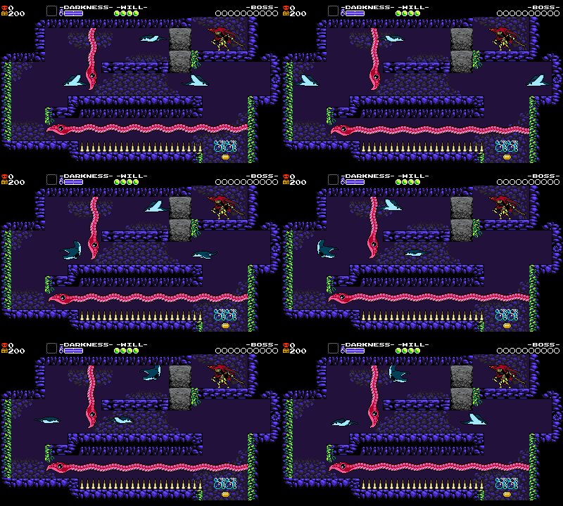
In the next room, the gameplay is mixed up so we can see more objects working in fun combinations. There are several Mantars to ‘uncork’, echoing the previous room’s setup, but now in a tighter corridor- the previous ones were out in the open. Grapps blocks your way in ways that you haven’t seen before, making you think harder about your path through the maze. And because this room changes the gameplay a little bit from action to puzzle, there’s a secret added to the right to reward your exploration impulses.
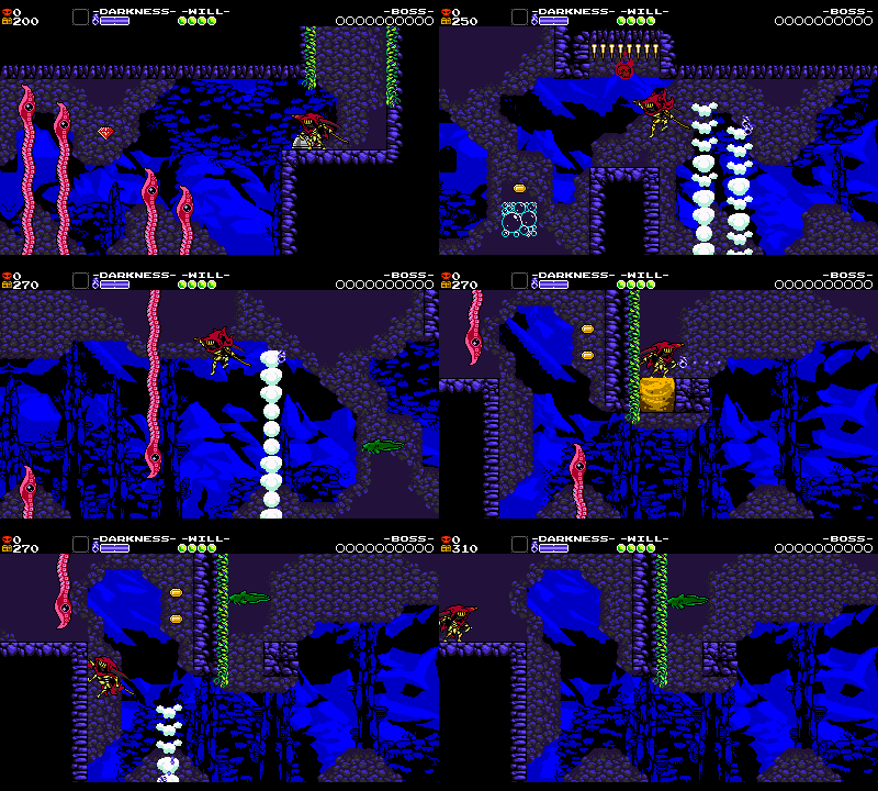
Finally, you’re tested on all of your Grapps-slashing ability in one extra-long final challenge where the stakes are highest! There is no floor beneath you, and once you pop the center bubble block, everything must be done in sequence without stopping to rest. The Grapps’ poke in like in the previous rooms, giving you just enough time to keep moving and slashing. You already know to line up the eyeballs with your slash so you’ll potentially do it intuitively now. Finally, Seprize (the eel) makes an unanticipated appearance to add to the pressure and thrills! When the player gets through this room slashing and wall jumping, it will hopefully look and feel as awesome as intended.
Specter Knight’s water physics make him much floatier, making difficult action sections like this possible because you have more leniency lining up Dash Slashes. If you manage to pull it all off, you’re rewarded with a checkpoint. Your Grapps fun is explored for now, and a new set of challenges begin with the next screen.
The grander point here is that an object on its own often isn’t engaging for very long. What makes a great use of an enemy or object is the serial interplay with other objects in a way that is surprising or tests/toys with your learning and mastery of skills!
Ramping
Did you notice that, in general, the last part of each room is harder than the first part? Also, each subsequent room is a bit more difficult than the last room? Not only that, but each set of rooms is more challenging than the last set! And not only THAT, but all the levels become gradually more difficult, from the easier Plains of Passage all the way up through the Tower of Fate!
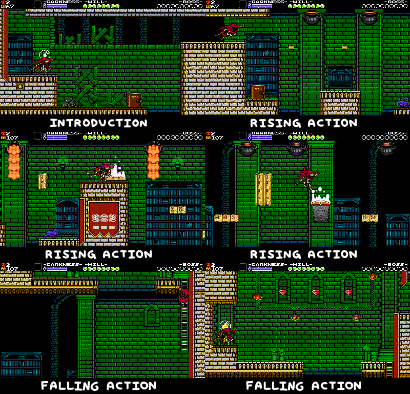
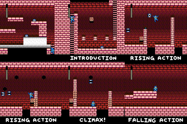
Every moment of gameplay, big or small, is ramping up then cooling down, cyclically.
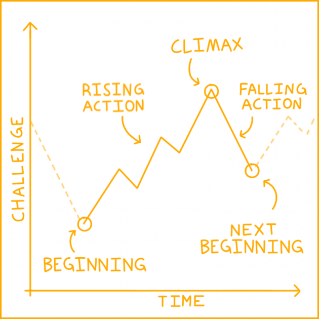
This graph was originally created to apply to story structure, but it works equally well in describing game difficulty ramping. Start simple, make it more complex and difficult, then pull back and do it again.
If the start of one room was as hard as the end of the previous room, it wouldn’t feel like you were rewarded for beating a challenge! If the difficulty were too even, it wouldn’t keep up with your increasing skills and you might get bored. If new gameplay objects were never removed and the game just kept building on itself forever, your brain might start to hurt from trying to remember how everything works.
Ramping Isn’t Just for Difficulty
Ramping isn’t just about challenge. Every element of the game should be introduced, extrapolated upon, shuffled away, and revisited in an interesting way. The story that the level is telling should also be ramped to feel more dramatic at the climax. Novelty should be ramped so that it doesn’t wear off. Tension should be ramped to keep the player engaged, then relieved. Ramping applies at the micro and macro level!
Different Ramping Structures
Shovel Knight levels share the same general structure for ramping ideas as classic Mega Man levels. Both typically introduce an idea, complicate it, layer it with other ideas, test the player with a really difficult version of the idea, and then cool down from the idea before starting the next idea. And at the end of the level, right before the boss, all the ideas combine for one really tough challenge! But there’s a lot of other ways you can apply a ramping structure to the level design process.
Most Mario games take a different approach, starting with the same introduction, but then often times easing up and giving the player a playground for them to just have fun experimenting with the idea with lower stakes. This is what makes Mario levels feel “playful”!
Meanwhile, Donkey Kong Country games like to build their levels around just a single idea, with the difficulty and complexity constantly ramping upward for the entire level. This is what makes Donkey Kong Country levels feel “tense”!
There’s no wrong way to structure a game’s level design. Different approaches create different feeling levels and help give each game its own unique gameplay personality. But no matter how it’s ramped, having any kind of structure for the level design always makes for a more cohesive gameplay experience.
Further Reading
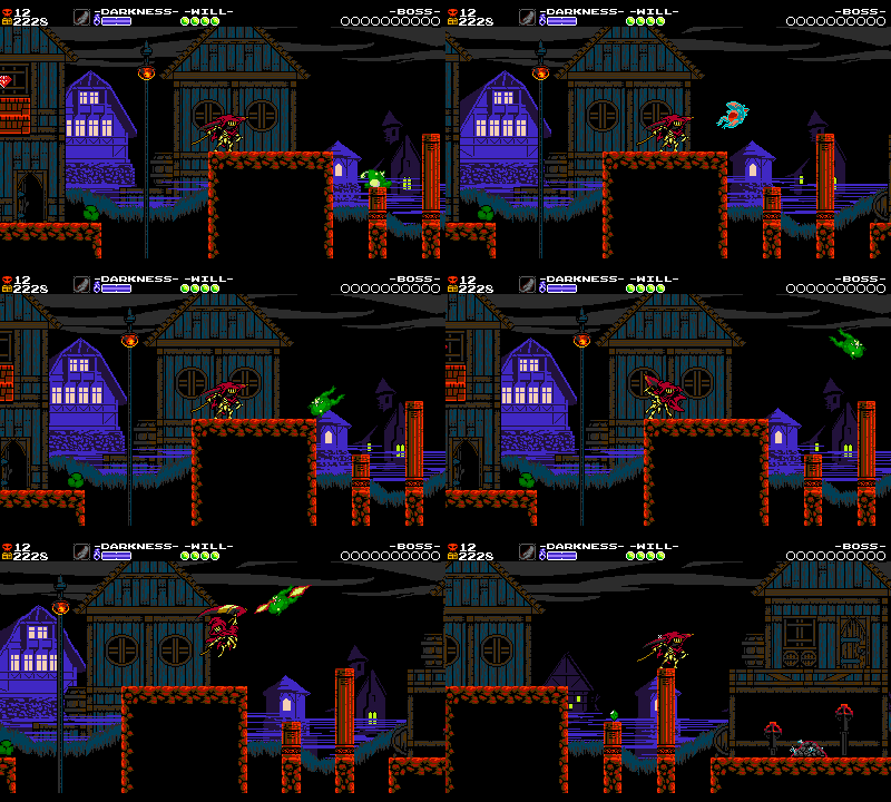
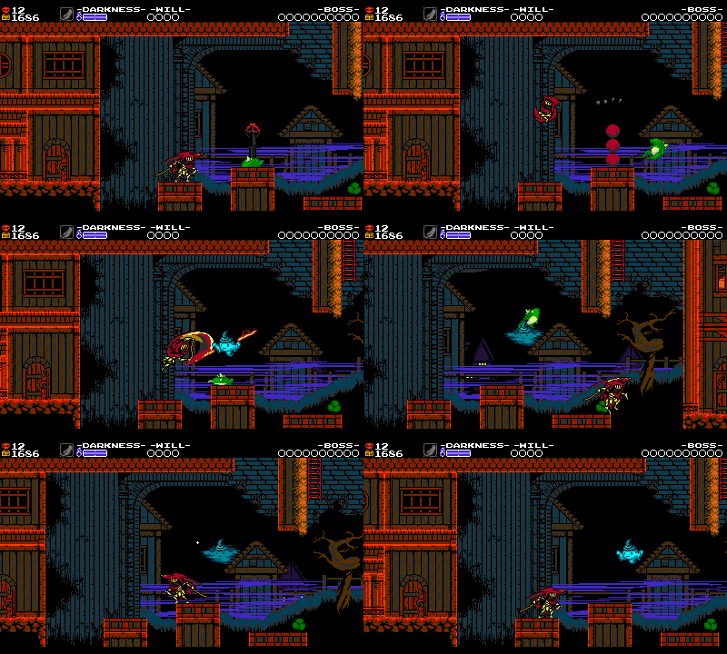
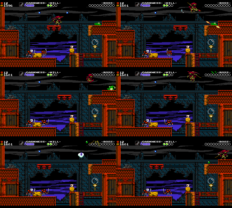
To drive all these points home – introducing an idea, expanding on it, spacing things out, ramping things up or down as the game progresses – let’s look at another example. This time, it’s the Tadvolt enemy in the Lich Yard.
This frog was envisioned as a little annoying fodder enemy – a nuisance that could jump around on precarious ledges and can knock you off! Like we did with Grapps, the first step is establishing Tadvolt’s properties and utility:
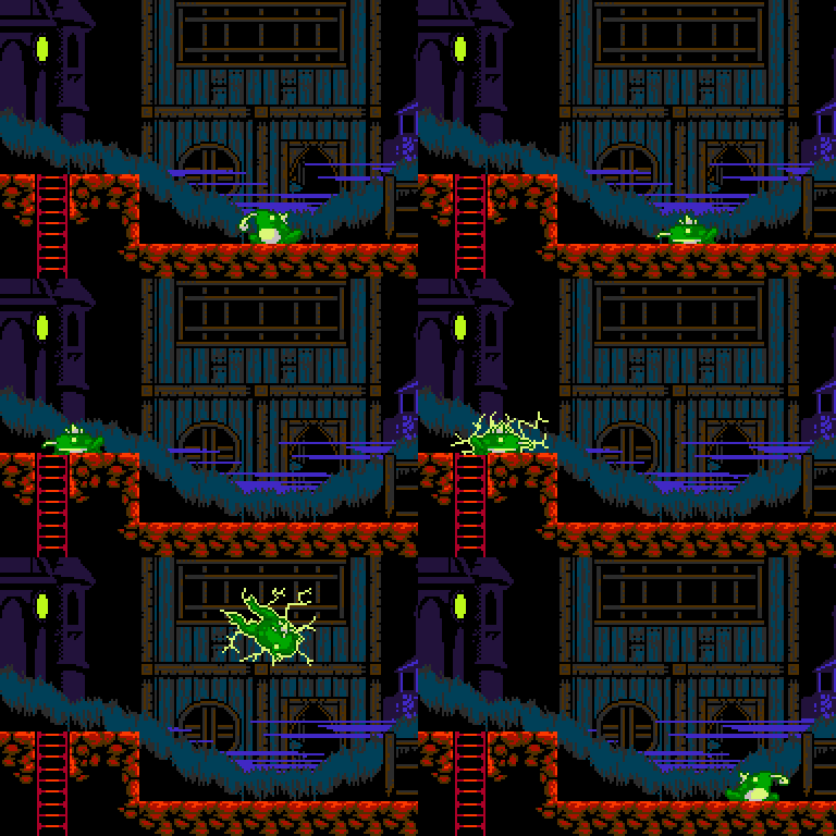
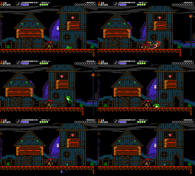
- It can appear asleep or awake. If it’s asleep, it stays asleep until disturbed.
- It jumps around with unpredictable timing and arcs!
- Touch it and you’ll get hit.
- You can safely Slash and Dash Slash Tadvolt.
- It takes 2 hits to defeat.
This first encounter is designed to show you the properties of the enemy in a safe context (just like the first Grapps). The Tadvolt is sleeping to begin with, so you can approach it at your own pace. Once you wake it up, there’s plenty of room to see how it hops around. The ground is totally flat, so it is always going to land in a spot where you can easily deal with it. All the nearby collision is raised pretty high, so the frog can’t chase you if you decide to run away. The spacing of the room is working together with the enemy to create our most ideal situation: the player having a safe space to try out battling Tadvolt.
The next encounter tries to gently create the precarious feel we’re going for. This Tadvolt doesn’t start asleep, so it’s already bouncing around once it appears and you have to engage. There’s a pit directly behind you, so there’s pressure to stand your ground. The enemy is also placed around some uneven collision, so you don’t always have a clean approach to attack it. Chances are you defeated the last Tadvolt in a safe and straightforward way, so you’ll be ready for this encounter.
Tadvolt number three starts asleep, but in a spot that forces you to Dash Slash into it, putting Specter Knight immediately into the action. There’s also a gravestone near the Tadvolt, likely making you contend with a ghost at the same time! However, because the gravestone’s platform is placed higher than the platforms around it, the ghost ends up in a spot where you can Dash Slash through them to move around the room and reapproach the frog. Unlike in previous setups, you can’t just run past the Tadvolt here. There’s a Bounce Bush puzzle that forces you to stop and handle the enemies first.
These mixed up elements make Tadvolt more interesting, and they’re all working toward their own goals too. The Bounce Bush isn’t just there to stall Specter Knight. It’s asking you to Dash Slash it to boost into a wall climb, an escalation on the previous three Bounce Bushes in the level sequence. The room’s elements are working on their own as interesting concepts, but they’re also working together to create one larger interesting setup. Carefully layering elements on top of each other like this makes for a deeper challenge than just four Tadvolts in increasingly difficult positions would.
Our fourth Tadvolt is placed at the end of a moving platform track, forcing you to approach with careful timing. This time, the enemy is placed on a cramped rooftop, asking you to maneuver Specter Knight without the luxury of open space found in previous setups. It’s a real test of the player’s knowledge of the frog’s jump arcs!
The stakes are actually a bit lower in this fourth setup. If you mess up here, the frog can hit you down into the pit below, but – instead of dying – you’ll only fall into the previous room. But that makes sense! The player just got a checkpoint, and reached the end of a sequence of rooms. They deserve a bit of a break in difficulty here.
Not every single frog encounter has to be precisely more difficult than the last. If you take the escalation of your setups too far… that can lead to some robotic-feeling or predictable level design. Some of these frogs are placed to “cool down” from a difficult section, just to make you feel overpowered! if you just did the most intense setup, then easily crushing an enemy in the next is a great reward and makes you feel like you have mastered them. They used to be hard, now they are a piece of cake!
The common thread is that each encounter always uses the frog in a different way to highlight interesting interactions that grow more layered as the level goes on.
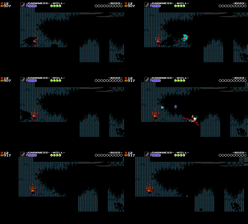
From here, the Tadvolts have completed their arc and now can taper off. But after a break for a few rooms, they casually resurface once again to escalate new gameplay – screens covered in pitch-black darkness and singed with ghostly blue flames. Now that the player knows all about Tadvolts, we can use them to make other mechanics feel even more interesting, and part of a cohesive whole.
Froggy Foreshadowing
All of these Tadvolts are also subtly being used to prepare the player for the more challenging Zamby enemies coming up ahead. Since the Zamby has a more dangerous, but functionally similar jumping attack, fighting Tadvolts sets the player up for success by letting them practice against a weaker, more lenient enemy with similar attacks.
This type of connection is part of why we try to choose each stage’s elements to work together – a good level isn’t just 30 good rooms in a row. It’s 30 good rooms with tightly-intertwined themes and mechanics! Good level design is also good mechanics design. Every videogame is a soup, and tasty soups have flavors that blend!
Wow, that sure was a whole lot of talk about putting 6 frogs in a video game!
As a fun exercise, next time you play Shovel Knight (or any stage-based game), focus your attention on how the game uses its ingredients to create a variety of setups, and in what order. Is each setup making the player interact with the ingredients in a unique way? Do those interactions grow more interesting and challenging as the game goes on? Are there threads tying those interactions together, or do you feel you are doing a bunch of random actions in sequence? Re-examining your favorite games with this sort of critical eye and honing your own personal sense of what makes a game fun is a great way to understand the venerable art of level design!
Next Time: Rooms For Improvement
We’ve now explored a little from overarching game concept, to level concept and structure, to room sequence, to individual considerations of elements in a room. Because we have a beacon to follow, maybe things are beginning to come together! But chances are, things may feel a little incohesive, rough and unfun in places. That’s where further examination and polish comes in.

