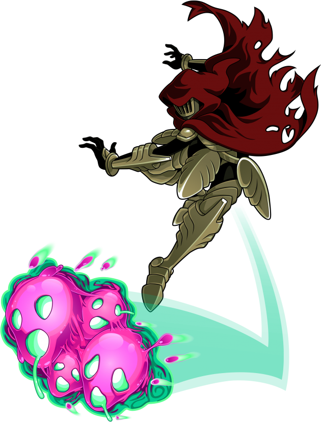
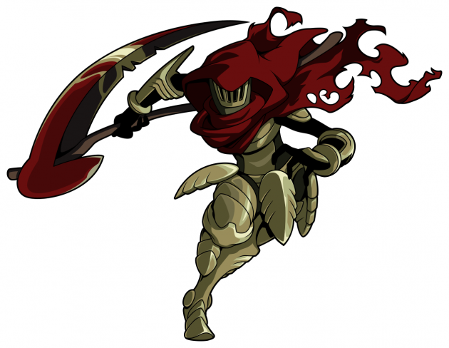
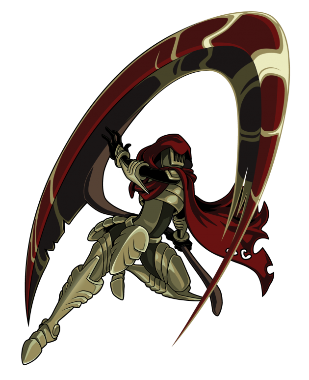
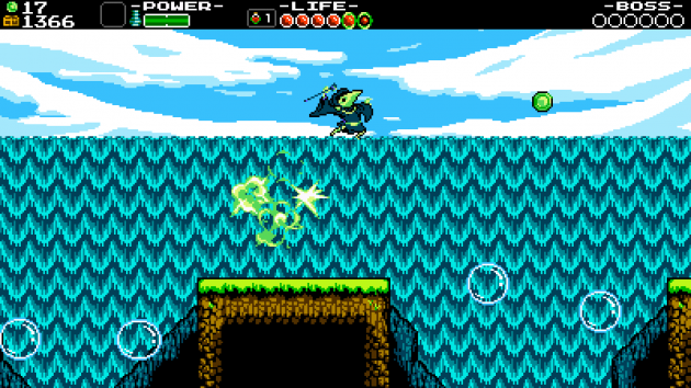
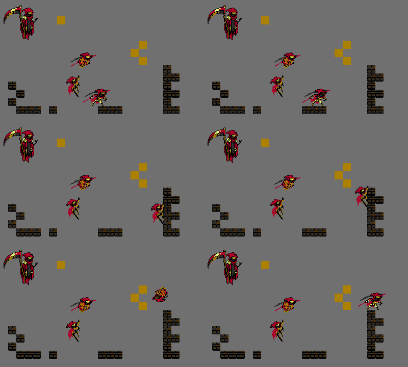
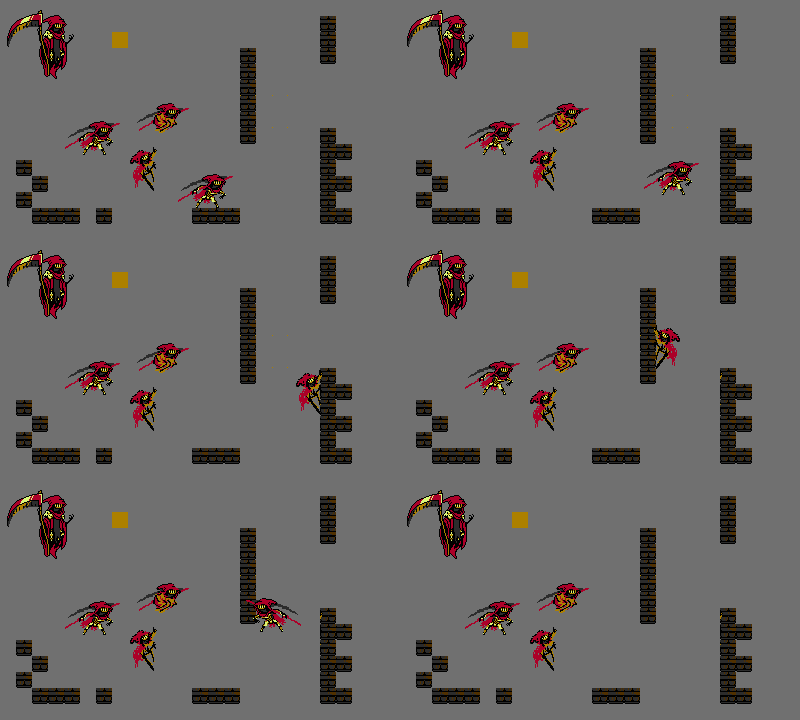
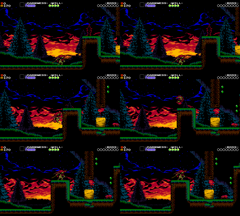
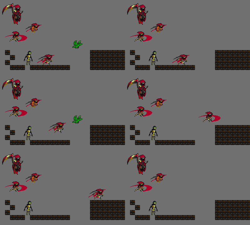
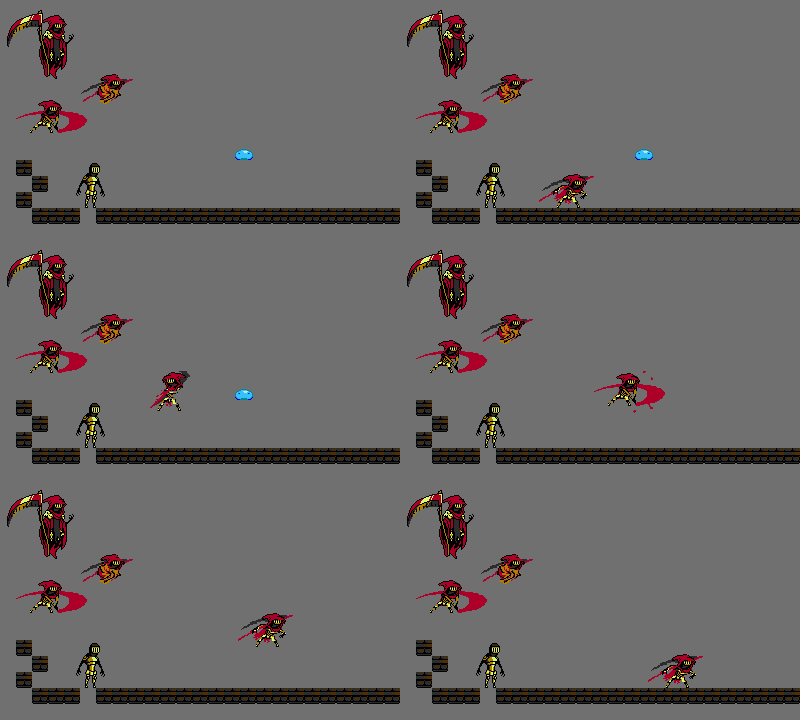
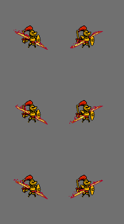
From the outset of development on Shovel Knight: Specter of Torment we had a couple of concrete goals and ideas. We wanted to go bigger and better than our previous effort, Shovel Knight: Plague of Shadows, and make Specter’s campaign even more unique and varied. We wanted to tell a more serious story with some creepier overtones. Most of all, we wanted to center the game around a truly cool character. Specter Knight was always supposed to be a “tragic but awesome” kind of guy, and we wanted to drive the point home every way we could. When crafting Specter Knight’s mobility, embodying these themes was most important.
Impressions from Plague of Shadows itself was also a huge influence on Specter of Torment! Reception to the alchemist’s maniacal moves… well, they certainly got a reaction! Some people hated how Plague Knight flew all over the place (usually into a pit!), while many warmed up to the explosive trickster after some practice. At Yacht Club, we love the subtlety and possibilities found in Plague Knight’s crazy mobility set, but we saw a lot of frustration too. For Specter Knight, we resolved to create more streamlined and intuitive controls with a lower execution barrier- a playstyle that was in between steadfast Shovel Knight and frantic Plague Knight.
We developed these guiding rules:
- Specter Knight is slick, edgy, and fierce!
- Specter’s gameplay makes it easy to be cool all the time. Being badass and flashy with Specter Knight should be natural!
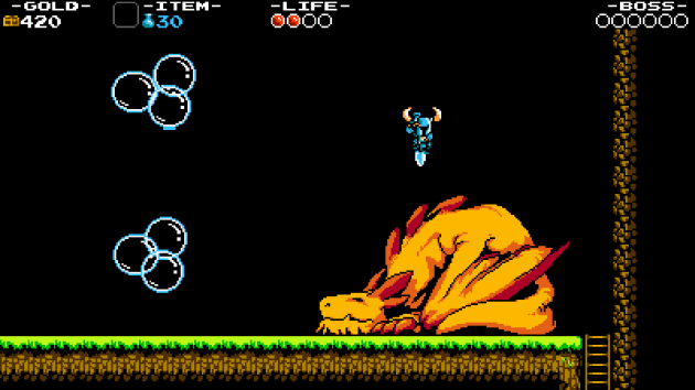
- Specter Knight should not be bound to the mobility of his boss battle in Shovel Knight. These abilities would come from his curios.
- Specter Knight should have an intuitive control scheme (avoiding making players hold a button to charge while feathering another button, for example).
- Specter Knight should be streamlined and complete-able, like the original Shovel Knight (Plague of Shadows hovers at 7.9% completion, while Shovel Knight is at 29.2% on Steam. You should all finish all the campaigns! Come on! ).
Inspirations
For Shovel Knight’s mobility, we aimed to craft something which felt at home on the NES. His controls were simple and his moves were few, which let players focus on how they could interact with the world. For Plague Knight, we strove to make a more complex scheme that allowed players to explore the controls and more ways to move through environments they are already familiar with. (You can read more about it in Plague Knight Mobility Design).
Even at the earliest of planning stages, we knew right away that Specter Knight couldn’t just have mobility like his boss battle from Shovel Knight. Floating around freely with a giant scythe doesn’t lend itself to platforming! Since we also decided that the game was set as a prequel, we rationalized that Specter would not yet be his full floating self. Instead, he would be more like a grim reaper ninja. We wanted Specter to feel sleek, confident, and powerful as he cut through levels. Where better to borrow power fantasies… than more modern 3D action games?! With tongue planted slightly in cheek, we went into the future, and imagined what it might have looked like in the past.
The Moves
Wall Climbing and Jumping
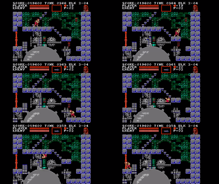
We started with a wall climb as it’s well suited to our ninja action. It also forces you to engage with the stage layouts in a way you never had to in Shovel Knight or Plague Knight. We can remember vividly the first time we used Grant in Castlevania III and our minds expanded with the possibilities for how to navigate the environment.
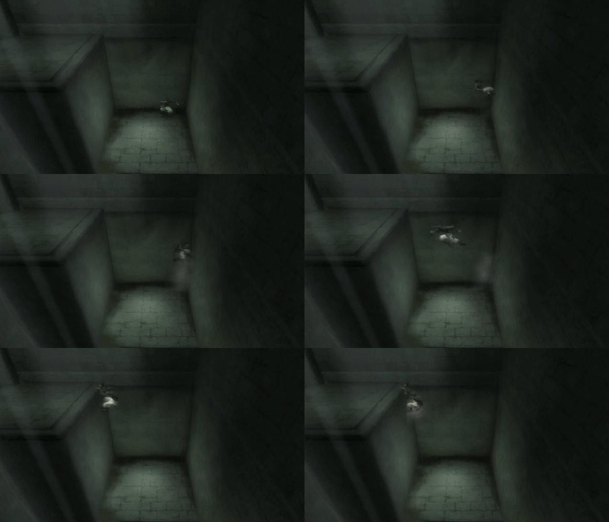
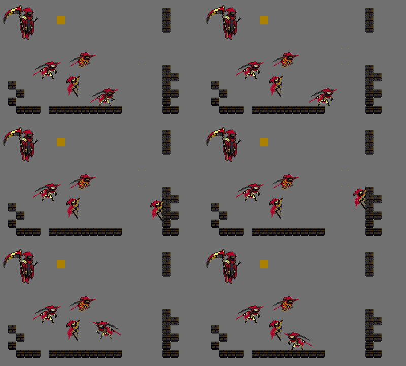
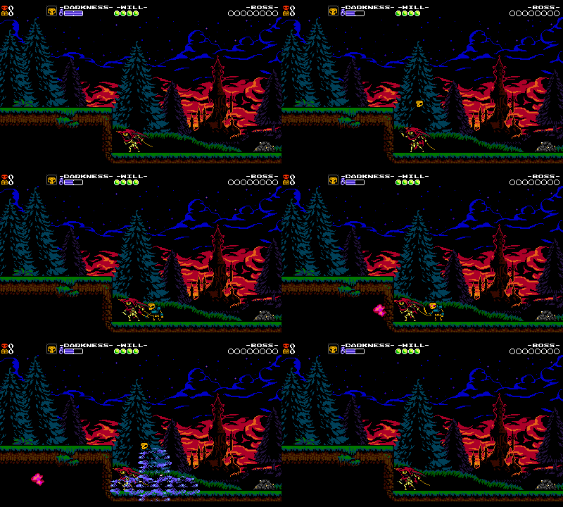
We love wall climbing, but we didn’t want to make Mega Man X where you can jump against every surface forever as we felt that style of movement is well-explored. We wanted to limit the wall climbing so we took inspirations from 3D action games like like Ninja Gaiden Black and Prince of Persia. In those games, your character can ascend the wall for a few steps, but then falls off. During the wall climb, you can jump away from the wall. OK, so how does that look in 2D?
Hmm… but what happens once you climb over the wall? It feels like you should automatically flip up over onto the platform, but Shovel Knight has lots of hazardous dangers just waiting on the edges of platforms!! Instead of an automatic maneuver, we pop you into a little spin that you have control over.
Dash Slash
Specter Knight’s signature move, the Dash Slash, was inspired by a desire to create a great context sensitive action. Even before The Legend of Zelda: Ocarina of Time’s notorious use of context sensitivity, context sensitive design had been a part of most adventure games. What is context sensitivity? For our purposes, it’s when the same button or action changes depending on the context of the game. When Link rolls, talks, side hops, grabs, puts away his sword and pushes all with the same A button, that’s context sensitivity in action.
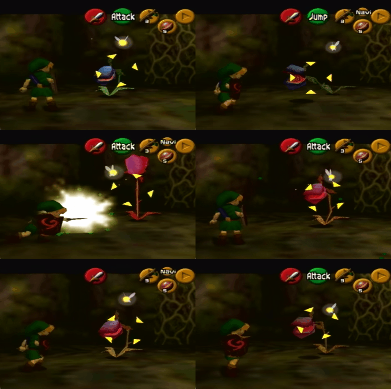
Look at that button flip!
The problem with context sensitivity is that it can be confusing to the player, as you might not always know how to be in control of your actions. You also don’t know what your capabilities are since they can change at any given moment! You can see a modern example of how it can sometimes go awry even in innoctuous innocuous ways within FFXV. We are not generally fans of context sensitivity. Shovel Knight doesn’t really have it- your button inputs and actions are almost always uniform, which helps make them feel dependable. Undeterred, we brainstormed context sensitive actions for Specter Knight in an attempt to conquer them once and for all.
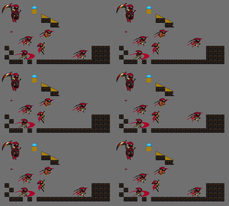
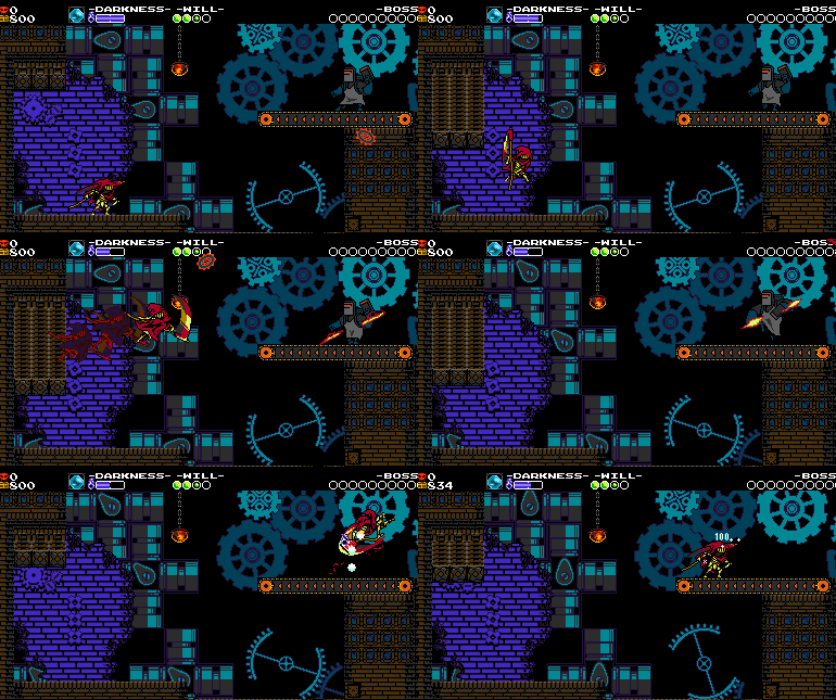
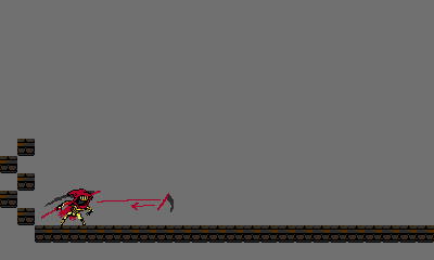
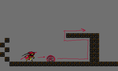
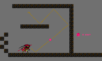
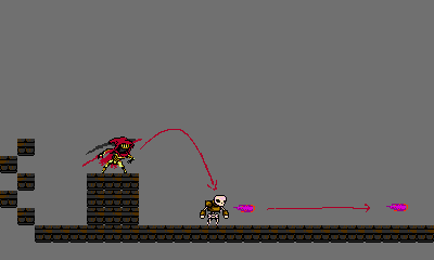
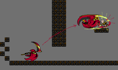
We came up with the Dash Slash- a super fast scythe slashing motion which cuts straight through the opponent! You can see early mockups of the move above. Specter would only be able to do it when near a slashable object or enemy. In fact, if he was near a slashable object, he would auto-target it.
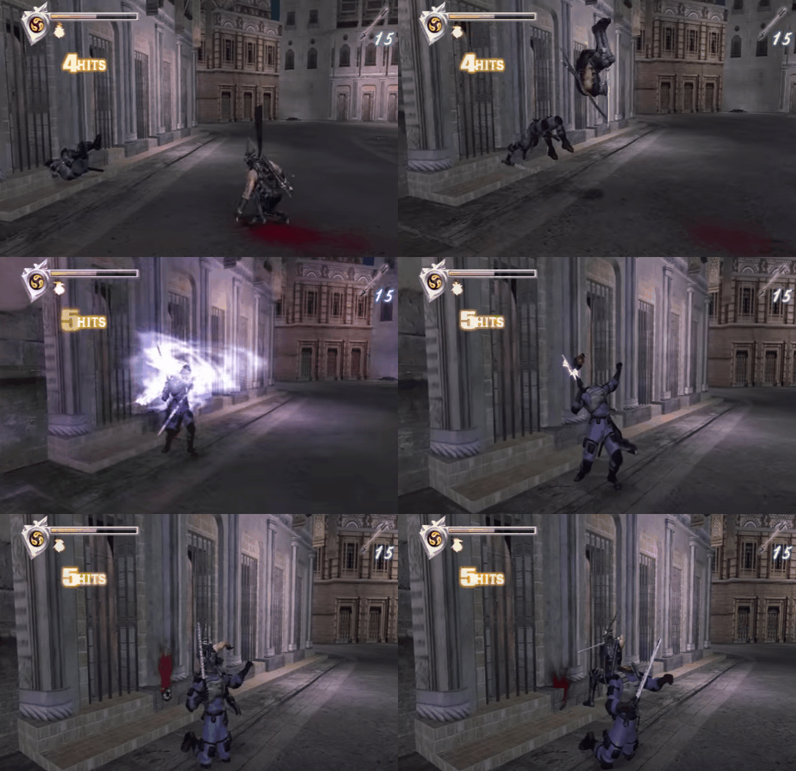
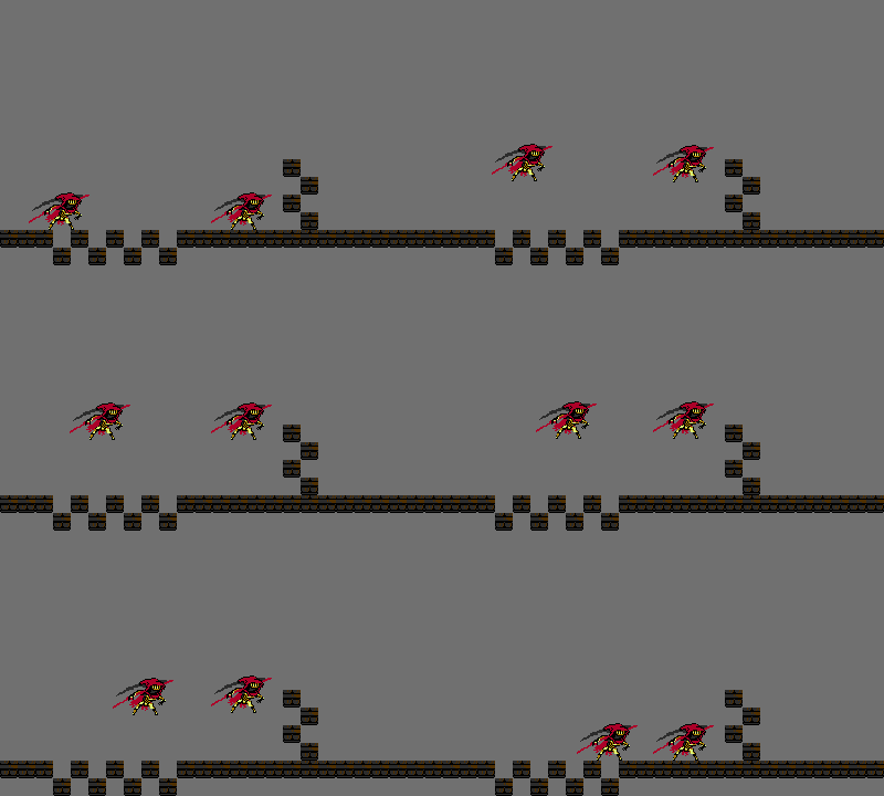
We again looked at Ninja Gaiden Black, which has a similar move called the Flying Swallow that feels great to execute. Since we’re making a platform game, the Dash Slash also had to majorly factor into the platforming! We made sure it covered lots of distance and allowed Specter Knight to rise or fall rapidly almost like a second jump.
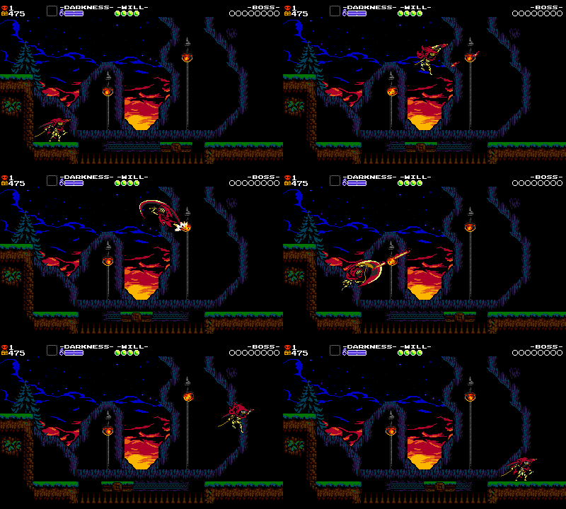
The move was also made short and chainable so Specter Knight could Dash Slash rows of objects repeatedly to do things like cross gaps. Not too dissimilar from Shovel Knight’s Shovel Drop!
Jumping
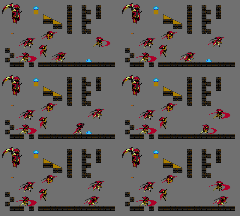
Since we wanted players to be dash slashing and wall running around, Specter had to have a short little jump. Plague Knight’s own little jumps resulted in lot’s of pit deaths, so Specter has a slight exaggerated hang time at the apex of his jump to give the player a moment to consider their next move. Although the end result is less extreme than the mockups above, they helped us visualize the action.
Regular Attacks
Initially, we thought about adding shurikens as a natural extension of a ninja move set. This was shot down early in favor of a fast, repeatable slash. The mockup shows that maybe Specter could have retained more velocity when moving and slashing at once to better emphasize momentum. We labored for days to make Specter Knight’s giant scythe animation fit into a small attack box!
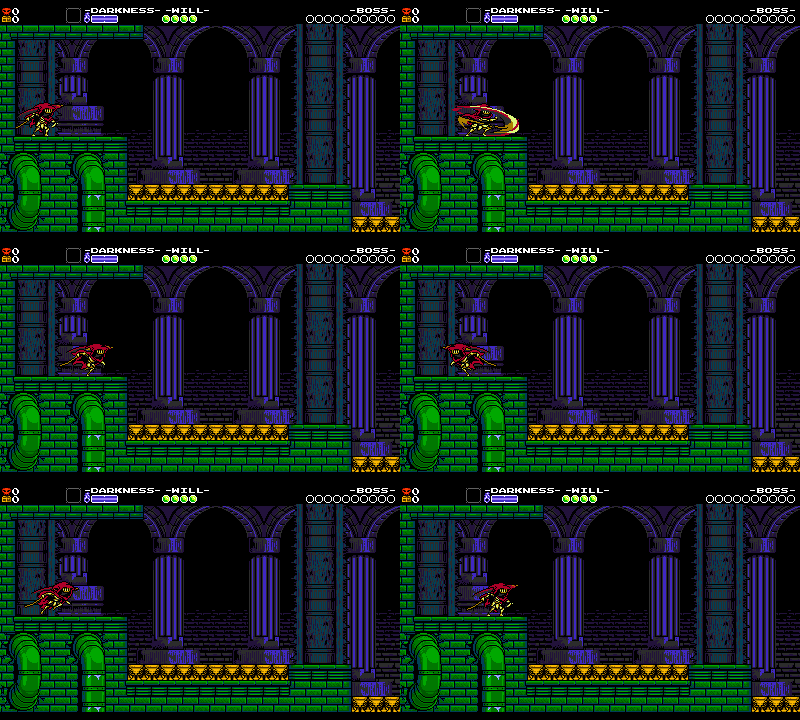
While jumping, Specter Knight can attack with the same slash as his ground attack but if he’s nearby enemies or objects, they will cause him to automatically Dash Slash to them. We struggled because players wanted an option to attack without flying forward. They wanted the dependability that dedicated button inputs provide, but we decided that the Dash Slash was something worth really figuring out. Dash Slashing and the regular attacks are two context sensitive actions mapped to the same button!
All-Powerful Curios!
Since Specter couldn’t access his boss moves all the time, they were instead reimagined as abilities that his subweapons could grant.
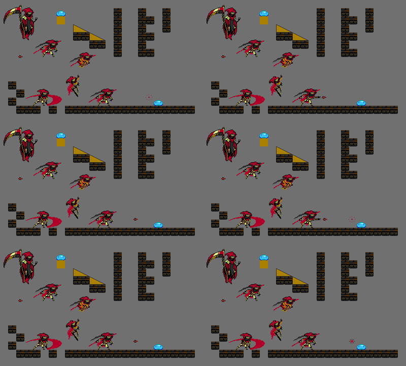
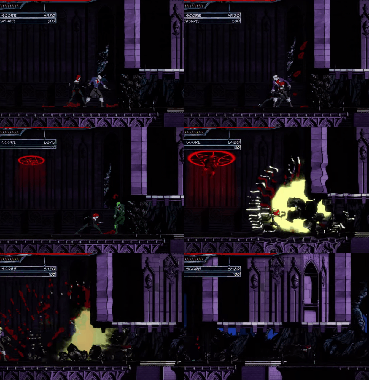
The Skeletal Sentry has an obvious parallel in the boss battle. Specter Knight can even squeeze his fist to explode the skeletons early: this is a cheeky reference to our previous work, BloodRayne: Betrayal. The direction that the skeleton shot, rate of fire, and how it reacted to enemy attacks was something that was often adjusted.
Judgement Rush was our shot at carrying over boss Specter Knight’s powerful homing scythe move. We’re surprised that such a seemingly game-breaking ability actually worked out to be a fun and interesting addition! While the benefits of passing through collision to the nearest enemy might have been obvious to skilled, skip-savy players, in iteration we also took care to make the subweapon less scary for novice players too. Taking away less Darkness if no target was found, not sticking in place for too long in the air, making sure you knew where Specter was headed, and ending in a familiar dash slash state once you reached the enemy.
The Hover Plume grants some limited flight, also similar to the boss battle. This fly feather relic was the subject of much derision by the level design team, as it was conveniently used to skip otherwise difficult sections. Many areas were specifically made “fly feather proof” to preserve the challenge.
The rest of the curios were created to address specific needs:
- Throwing Sickle is a long ranged move that can be used as an alternative to the Dash Slash in the air.
- Spider Scythe clears enemies off of the walls you want to climb.
- Will Skull can obviate health concerns as long as you have a spare moment to use it.
- Dread Talon kills high health or otherwise invincible enemies.
- Chronos Coin is useful to alleviate timing on tricky jumps.
- Bounding Soul attacks below you, which Specter cannot easily do.
- Barrier Lantern stops little hazards from interrupting your jumps.
- Shadow Mirror was a Custom Knight relic that we wanted to highlight more (although the mechanics differ slightly)!
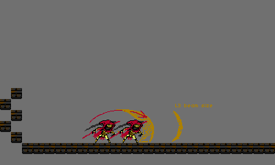
(Note that some of these images have an idea for “L3”, or level 3 Curios. Yes, we tried for 3 levels.. and only managed 2!)
Upgrading Subweapons! Finally!
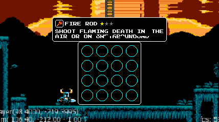
Early UI mockup for how upgraded relics and inventory would be displayed in Shovel Knight!
It’s somewhat of a joke among the team that we would never ship the game with relic upgrades. They would always be suggested and designed- after all, who wouldn’t want a Flare Rod that hits harder up to 3 levels max? A Chaos Orb that is larger? A fishing rod that is… fishier? As we would explore, we would discover that some relics didn’t lend themselves to upgrades. Menus seemed confusing. Upgrading just wouldn’t seem worth it! So we would invariably cut the feature. This has happened more than once!
For Specter Knight, we really tried to make the upgrades work and make them worthwhile!! Whether you were amassing an arsenal of options or making your favorite weapon even better! Like SK, we started with 3 levels of upgrades until eventually focusing it down to 2 to make the effects clearer. A rule we kept in mind was that upgrades should not potentially make a relic worse or majorly different in use. A projectile should not change to a bouncing projectile and the resource cost should not increase — even if the weapon’s effectiveness noticeably improved. We also wanted to avoid creating weapons which only became useful once upgraded or became overly dominant at maximum level.
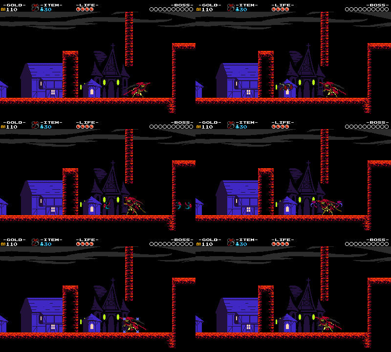
Level 3 Sickle! It really chewed up bosses, but we didn't want to make earlier levels worse to compensate.
Specter Knight’s already-powerful curios got even more powerful, and they ended up feeling both cool and useful. In the end, we think that Specter Knight’s relic set is our most fun kit yet!!
Feeling the Torment
There were a couple of problem spots in the mobility that we massaged out during the course of development.
Context Insensitivity
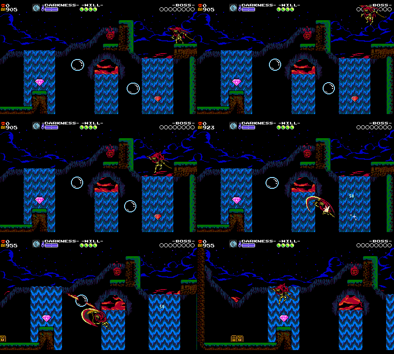
The Dash Slash was a cool move but testing revealed that players were very frustrated with it. They would think they’d be able to slash something, but then miss, plummeting into a pit. Platforming with Dash Slashing could also be too demanding, with tight timing windows. It felt unfair. The context was too sensitive!! Thankfully, we came up with a couple of solutions that changed things in a huge way.
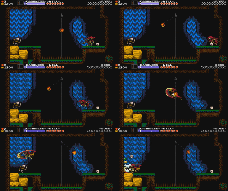
Can you believe Specter Knight used to not have a Dash Slash reticule that appears over slashable objects? Its addition was the most important change we made to make the Dash Slash understandable. It’s angled in the direction that Specter Knight will slash, and clearly shows when and where Specter Knight can slash.
Originally we thought that a change in pose for Specter Knight might be enough to communicate what direction he’d be slashing in but feedback from early players was universal: “He’s changing his pose? oh…I hadn’t noticed…” We learned that players don’t look at the character they are playing as so much as where that character is headed. The reticule also gave a better indication of the distance that the player needed to be from their intended target before they’d be able to slash through them. We had a big problem in players getting as close to targets as possible before slashing which resulted in even smaller windows of success and more confusing interactions. That little tear that appears over Specter Knight’s intended target is such an important component of the gameplay now that it’s difficult to imagine playing without it!
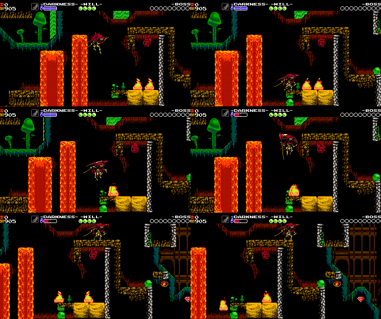
Secondly, we made sure to maximize the window of time for a successful dash slash. Specter Knight’s fall speed was slowed down since knowing when you’d be slashing up vs. slashing down often meant the difference of dying vs. successfully completing a room. Giving the player more time to see the switch really helped in understanding what was going to happen once the attack button was pressed. In addition to the game’s usual attack buffering, the first few frames of Specter Knight’s aerial slash continues to seek out a dash slash target, and will cancel into it if one is found before the attack comes out.
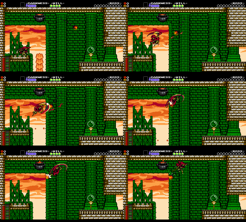
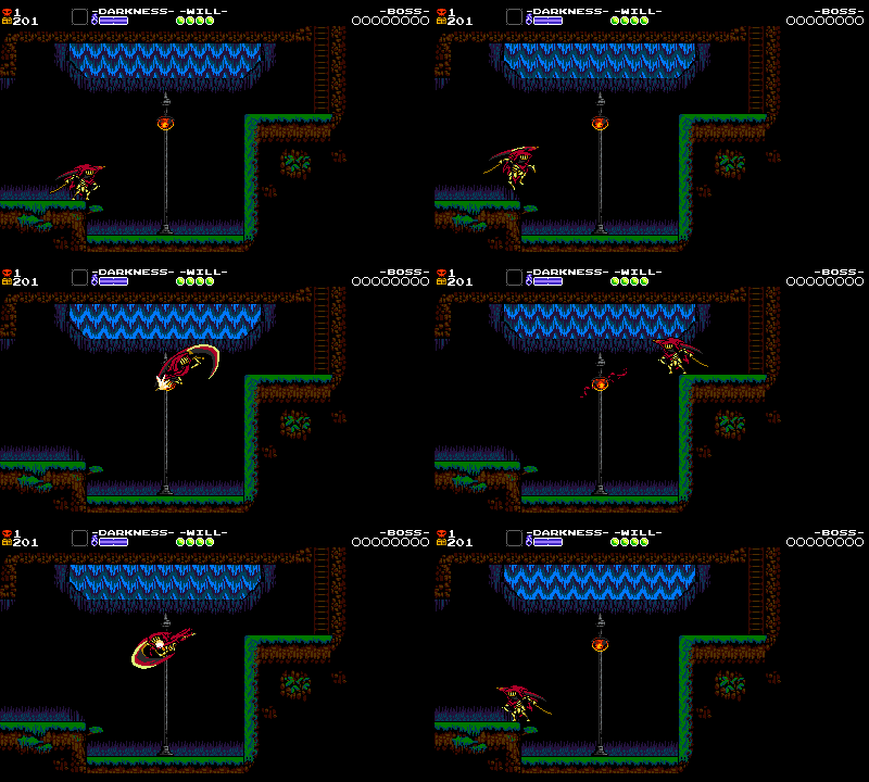
Notice that Specter is in his attack startup pose before it is overridden by the newly possible Dash Slash.
Similarly, if Specter Knight was previously in range to dash slash but just fell out of range before executing the attack, then he will be quietly moved to his previous valid position. While making improvements like this, we considered every additional frame of leniency a victory!
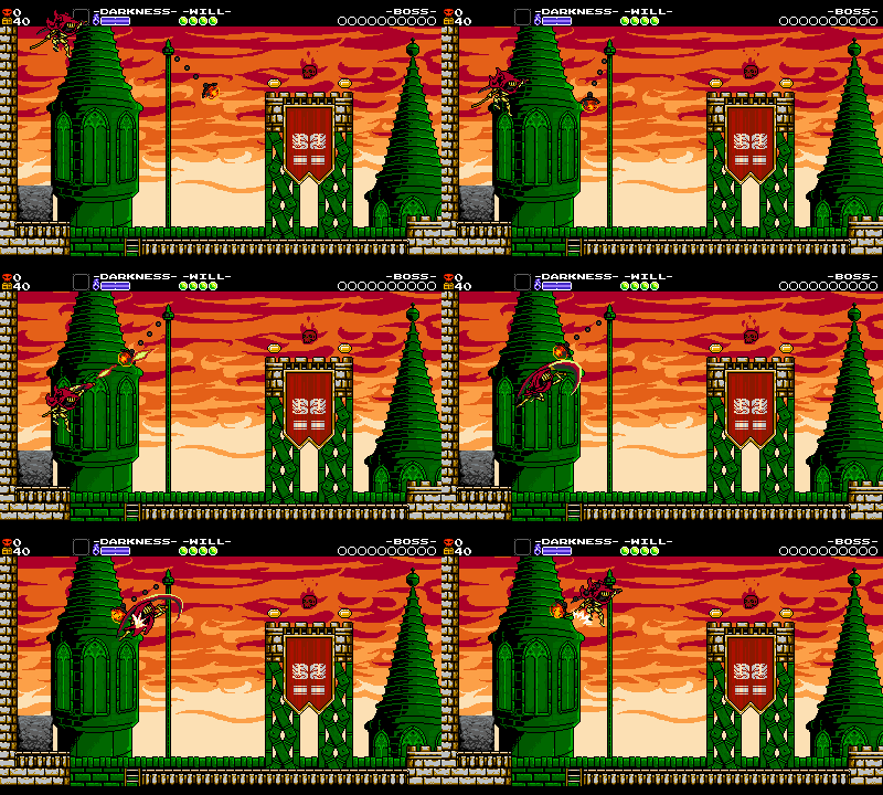
Notice how Specter moves up just slightly when beginning the Dash Slash.
With these additions and adjustments the problems were greatly alleviated!
Dash Dashin’ Away
Dash Slashing through enemies always felt fast and powerful, especially against smaller, single-hit foes! Unfortunately, moving into and through enemies could often put Specter in a bad position at the end of the Slash, causing unfair hits and damage that felt cheap.
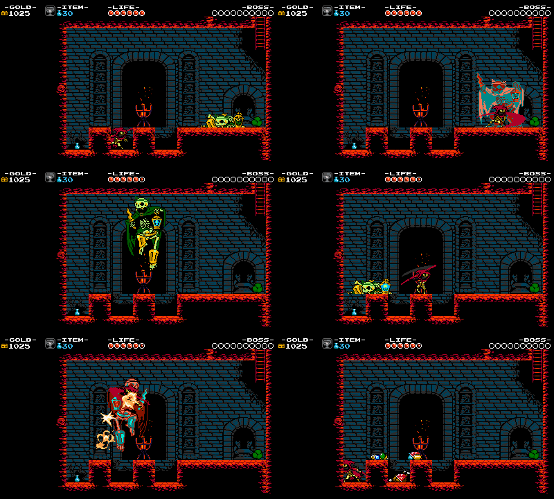
An early revision without bouncing where it's common to get caught inside enemy collision. Even with invulnerability you would need to frantically mash or hope for the best!
To prevent this issue, we created a “bounce” behavior that would knock Specter Knight away spinning and set him up for another hit, until he would slash through them on the last hit! The spin also tied in nicely with the spin that Specter enters when cresting a wall. It took lots of iteration to get this bounceback behavior feeling fair, but we think it landed in a good spot.
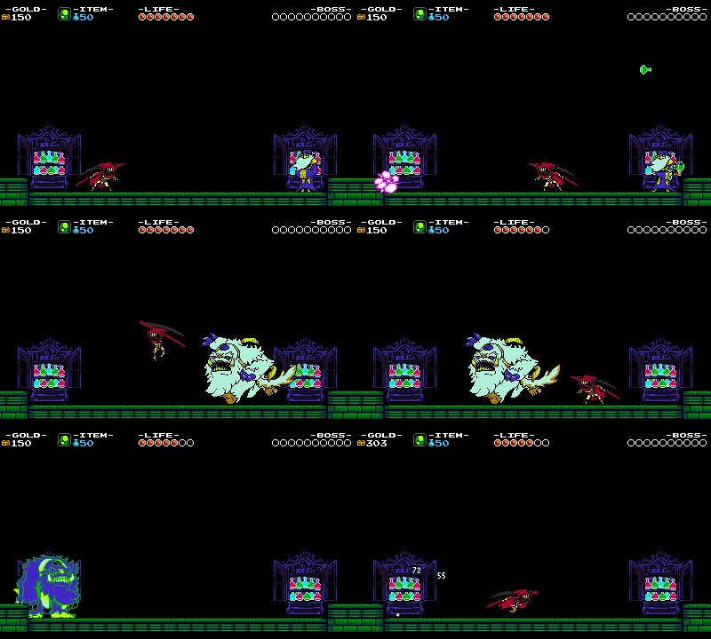
A heavier bounce like this failed to encourage successive attacks, and it was still too easy to end up in bad situations due to subtle spacing.
Also, dare we say this is a little like Sonic the Hedgehog’s homing attack?
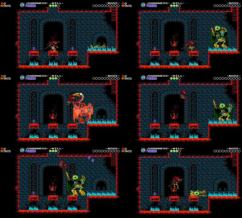
Ahh much less scary!
Larger Scythe attack
Remember how we had trouble fitting Specter’s slash into a small area? Even a small choice can have big repercussions! The attack is much longer horizontally than Shovel Knight’s, necessitating the placement of thick walls everywhere in levels so that Specter did not accidentally slash through them! Sometimes problems in mobility painfully result in laborious level design solutions!
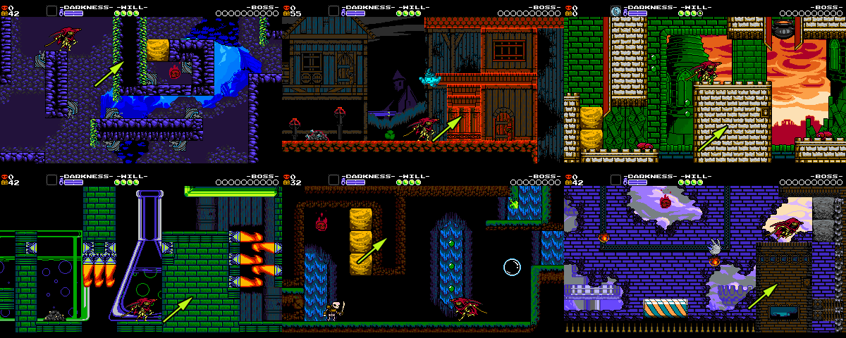
Wide walls had to be placed everywhere so Specter couldn't knock out nearby blocks!
Castlevania Style Subweapons!?
Initially, Specter Knight’s subweapons were supposed to be powerful because they would also be situational. It was planned that curios would only be found in boxes or dropped by enemies, channeling a little Castlevania! If you died, you would also lose the curio.
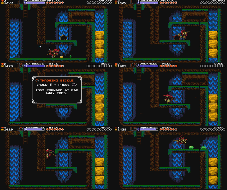
A curio uncovered! Those small shadowy creatures can also be found in the Tower hub!
These curio boxes were even implemented in game and playable as you can see above… but they just didn’t feel right. Only being able to have one relic felt limiting, and placing them in the stage made them feel like necessary power-ups as opposed to an arsenal of aids. This concept was also at odds with our desire to see weapon upgrades– why put down gold on an upgrade when you can’t even be sure when you’ll have access to it? We ended up back at our original Shovel Knight inventory system… but we wonder what might have been. Maybe for Specter of Torment 2!
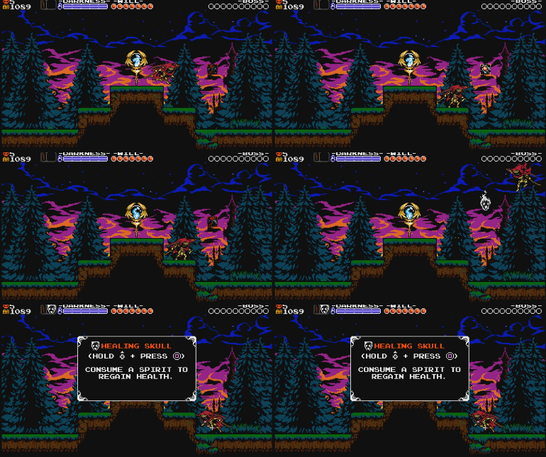
Time your slash just right to choose your weapon!
Curio Misfires
Our control scheme had a problem- Specter Knight’s twitchy in-air antics would cause players to instinctively press up or down while also pressing the attack button. And in Shovel Knight, Up + Attack fires your relic! Needless to say, we had lots of players misfiring their Curios and plummeting into pits when they were trying to Dash Slash. Breaking with tradition, we decided to map Specter Knight’s Curios to a THIRD button by default. We even rejiggered the relic button assignment menus. As lovers of spartan control schemes, this was a big move for us, but it helped a ton to make the game more playable. Oh gods of the NES, please have mercy!
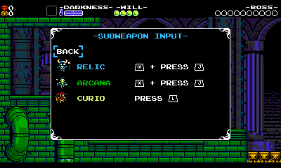
This image is likely many people's first time ever seeing this menu!
Ready to Reap!
There you go! The initial direction for Specter Knight guided the mobility, and lots of inspiration and iteration was required to make it all hang together in a cohesive fashion. We hope that seeing our design process helps both fans and developers understand what it’s like to develop and iterate on unique mobility and combat mechanics. There are many more details large and small that go into making a mobility set… are there any Specter Knight mobility details that you noticed, or maybe cool details that you noticed from other games? We hope you enjoy playing as Specter Knight!! Stay tuned for more Specter Knight design articles or check out some of our previous design articles, and let us know what you think!

