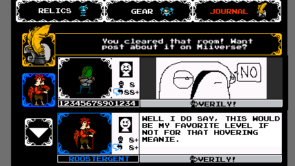
Shovel Knight is a game being initially released on 3 platforms: Nintendo Wii U, 3DS, and PC (Steam, Humble Store). Creating a new version of Shovel Knight isn’t as easy as pressing a button; taking on a new platform is no simple feat! Each new device brings new specs, controls, quirks, expectations, and features which need to be considered across the game. We don’t just want our game to run on the system, we want it to feel at home there too! So…when it came time to develop Shovel Knight on Wii U, we were already brainstorming about the wild world of Miiverse!
Miiverse Primer
First, let’s describe the Miiverse a bit! If you take a look at Nintendo’s Miiverse website you’ll see that “Miiverse is a service that lets you communicate with other players from around the world. It is accessible via Wii U and systems in the Nintendo 3DS family.”
At its core, Miiverse functions is like a video game themed social network that focuses on short messages, like Twitter. Almost every game on the Wii U gets its own Miiverse community. Players of all types gather to post text, drawings, and screenshots, all without exiting the game! These message are usually questions, impressions, game tips, funny moments, or sometimes some seriously impressive fan art. It’s like a fun forum of game discussion!
The Miiverse is cool because it brings players together. Even if we did nothing at all, Shovel Knight’s Miiverse community would be a haven for jubilant discussion. The only drawback is that you have to purposefully enter the Miiverse application, which disrupts gameplay.
This brings us to the other cool part of the Miiverse: developers can go a step further by integrating Miiverse posts directly into the game itself!
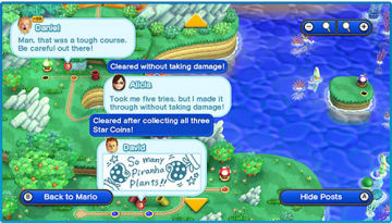
New Super Mario Bros. U prompts players to leave impressions: messages of joy when victorious and messages of pure frustration when you died! These messages are automatically displayed for the player, hopefully helping to create a shared experience.
Nintendo Land aggregates posts from players all around the world, displaying them in the game lobby to create the energetic feeling of being at an amusement park. Most recently, The Legend of Zelda: The Wind Waker HD upped the ante by creating a Miiverse-based environment themed to the game, and creating a Miiverse message delivery system: Tingle Bottles!
Knights On The Internet
The Miiverse’s features can encourage communication between players and brighten the entire experience for everyone! It’s nice because it’s built into the Wii U, meaning we don’t have to set up our own servers, account systems, and all that other web-y kind of stuff. So we decided to integrate Miiverse posts into the Wii U version of Shovel Knight! The goal here was to weave posts into the game so that the player could effortlessly and seamlessly play alongside others.
So began the brainstorming. We could put posts on our world map like Mario U…but we don’t have nearly as many levels as a Mario level, and our levels also take more time- you might finish Shovel Knight and only see a handful of posts! Also, Mario’s Miiverse implementation wasn’t granular enough; we wanted players to be able to place more specific and relevant messages. Maybe, we thought, we could let players leave posts at specific spots within levels? At this point, it was hard not to be reminded of a certain game that was challenging notions of gamers everywhere…dare I summon the name once more?
DEMON’S SOULS and DARK SOULS
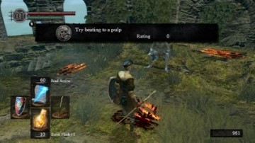
The “Souls” series blazed new trails for communication among players, allowing knights to help and hinder one another through a player messaging system. In these games, players can leave shared online messages in any area of the game by piecing together pre-made text fragments and scrawling them on the floor. These writings appear for other players, littering the halls and providing a glitter of hope in a harsh and unforgiving world. Being able to place messages directly next to a subject allowed the player more creativity and freedom for pointing out specific details.
This implementation seemed like a great idea for Shovel Knight, a game filled with secrets and traps. Maybe we could allow players to place ‘message objects’ right into the world of Shovel Knight!
With this plan, there would be tiny messages dropped all over, and the player could expand them by walking over them or pressing a button. This concept still brought up a few red flags for us. The player has to go out of their way to check a message. They would have to walk to each icon, or use some special menu to see more information. Players might go far out of their way for a post that really wasn’t helpful, or fall in battle when just trying to see another message! This goes against the idea that posts would be effortlessly readable.
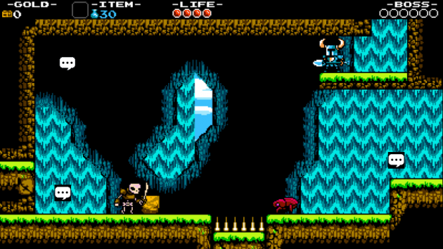
Another issue is that we’re cluttering the gameplay world with distracting graphics. We placed each and every pixel with care, so to add this level of distraction could get in the way seeing and enjoying the game. We also wanted to be sure that the core gameplay of every version remained absolutely intact, and these weird icons would be specific to this version of the game only. The goal has been that if you saw a screenshot of the game, you wouldn’t think “Oh, they’re playing *that* version”– you would just see a player in the middle of the Shovel Knight adventure!
Rooms for Improvement
We tried to resolve the problems of context and usability first. How could we let players talk about specific moments or places of the game, but not require the placement to be chosen by the player? The answer came by expanding our vision slightly.
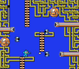
If we broaden our focus just a little bit, we realized that Shovel Knight already portions the gameplay in digestible chunks. Not in tiles! Those are too small! Think in rooms! If you’ve played classic 2D games, you’re probably already familiar with thinking about rooms. Classics like Mega Man present you with single screen, each one with a distinct challenge for you to overcome.
As a player, once you enter a new room you’re already thinking about the problem being presented. How do I progress to next room? Are those powerups worth the risk? How can I get past that enemy? When making an NES styled game like Shovel Knight, the distinction is made even more clear because enemies and objects disappear when you transition from room to room.
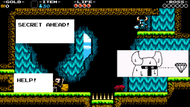
Since players are already thinking about challenges, objects, and enemies on a room to room basis– it would also make each room a great focal point for discussion. And that was the insight! We decided that in-game Miiverse posts would be categorized by room, so players would only see and write messages for that room. This allowed for great focus, without putting the onus of placement on the player!
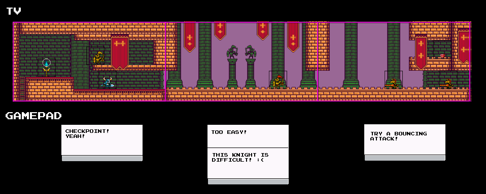
Messages are divvied up by room, and change on room transition.
Using the GamePad
To keep the gameplay screen completely unaltered, we decided to leverage another unique feature of the Wii U – the GamePad and its second screen! We were already using the GamePad’s touchscreen as a tabbed interface for things like quick selecting items and referencing collected gear. We added another tab for Miiverse posts. The Gamepad was transformed into a dedicated screen for peering into the Miiverse, a dashboard for writing and reading magical notes to yourself and all other Shovel Knights. We decided to theme it as something physical and meaningful, that you would carry with you at all times. We called it the Digger’s Diary!
Adding Features to The Digger’s Diary
Armed with a dedicated touch screen to feature the idea, we were able to greatly expand the graphics style and features involved. Posts no longer needed to be small to fit into the gameplay space, and the player could tap around with the touch screen. Here are some additional features that we built upon:
Avatars
On the normal Miiverse, all posts are accompanied by that player’s Mii avatar. This helps keep a consistent community feeling since each post is has a human face to it! Miis are user created through hundreds of options and have a very specific style for how they must be displayed. If we displayed a user’s Mii like how it looks in every other game, then this would be the first graphical piece in the entire game that breaks the illusion of 8-bit inspired pixel graphics. It would look pretty weird! And while I lightly joked about us redrawing all Mii character options in an 8-bit styled pixel graphics, it turns out that problem is much more interesting for a programmer to suggest than it is for a graphical artist to actually sit down and make it happen. After many angry looks, I decided to stop asking about this. We didn’t want to drop the idea of personalization, so we instead decided to feature our in-game characters as selectable avatars. This quickly took off in our testing group, as the team often ended up making posts in game as a specific character, imitating their dialogue or mannerisms to hilarious effect!
Adding characters as avatars unleashed a creative avalanche!
See More Posts Button
Sometimes a room can be crammed full of messages, and though the posts shuffle out after a time, it became tiresome to wait to view them. Adding this little button allows players a quick method for cycling through more diary entries.
Context Message Prompt
It’s not enough to just create the option to post- A big part of a community involves keeping the conversation going. We wanted to encourage players to post and maybe to post in ways that they might not have thought of…but we also don’t want to be intrusive for players who just want to play the game! While the post button can be used at any time to leave a message, it will occasionally flash gold and offer a suggestion to post about a specific situation in the game. This could be when defeating a boss! Or falling in battle many times in a row! We ended up using a light touch on these but a little bit can go a long way.
The Final Version Unearthed!
Now the Digger’s Diary has reached its final form! It’s a lightweight, passive window into the thoughts of other players. You can choose to browse through it or interact; either way, you won’t be taken out of the game too much. When a player creates a post, it will be attached to that particular room of the game — and every time they venture into a new room, new messages with information from across the world can light up the GamePad screen.
It’s an odd feeling to work on a feature like this. We design a lot of gameplay interactions with exact expectations for what the player will try to do, but for user driven content like this — it really can take any form once it is played by everyone! We have no idea how it will turn out, because we can’t test it on a large scale.
Will the lead-up screen before a boss be filled with fan-art for a particular Knight? Will secret rooms always be expertly detailed? Will players new to the platforming genre receive help from the sidelines and reach new heights of gameplay expertise? What about digging puns — where will they be buried? Either way, we’ll be watching Shovel Knight’s community closely to see! Thanks for reading, and please let us know your thoughts on the Digger’s Diary and the Miiverse!

