Checkpoints are a contentious subject when it comes to gameplay design. Especially in a retro style games, there are many schools of thought. First off, let’s define a checkpoint: for our purposes, it’s any mechanic that saves the player’s progress, allowing them to return to it in that position after dying or losing.
Some people think that repeating content is never good and copious checkpoints or even quicksaving should be implemented; think the quicksave ability in a game like Half Life, where you can save the game at any time. Other players are purists, and think progress shouldn’t be saved until you beat a stage! The Yacht Club thinks there is no hard and fast rule: it depends on the game you are trying to create, the emotions you’re trying to evoke, and the experience you want your players to have.
For Shovel Knight, we knew from the beginning that losing, lives, and checkpoints would be important to get right. Lack of checkpoints and hard limits can typically cause a lot of frustration in classic games. We wanted to retain the mechanic, but do away with the inherent frustration of having to repeat large swaths of content.
Iterating on checkpoint design was a slow and painful progression, but the result was worth it. There were 3 main versions of the checkpoint mechanic, so let’s go through them!
In the Beginning – Invisible Checkpoints
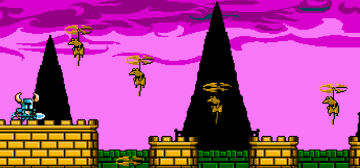
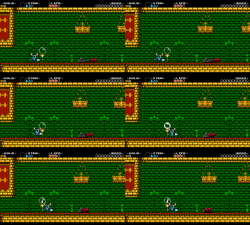
The first iteration of our checkpoints started was non-visual, similar to Mega Man. For example, when you entered the following area, a checkpoint would automatically be triggered, and next time you died, you would reappear in the same area. These checkpoints were visible to us when building the level, but not to the player.
We had a few concerns with this implementation. First off, we are fans of visual indicators. They give you something to strive for and prevent confusion. It’s always satisfying when you finally reach that checkpoint flag in Mario! The second issue is that to mitigate the difficulty we wanted to present, we were adding a LOT of invisible checkpoints. There were checkpoints everywhere, almost on every other screen…it was getting obsessive. So we needed to find a way to solve both these issues: show the player the checkpoint, and stop putting so many into the levels!
Try, Try, Try Again – Pay Checkpoint
Our next iteration became visual and had a little bit of a gameplay twist.
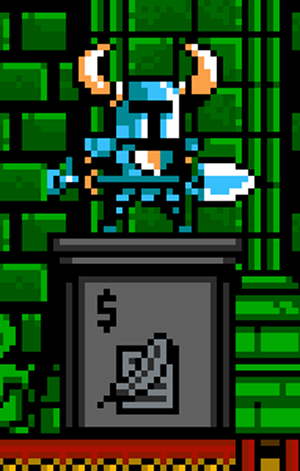
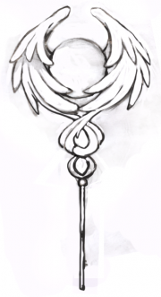
You may be saying to yourself, what the heck is going on in that image?! Well, that was the first problem with this iteration! Basically, this checkpoint required you to pay money to use it. The price would be on the front next to the dollar sign. You would then stand on the checkpoint, and if you had enough money, it would lower into the ground and activate. Otherwise, the checkpoint wouldn’t activate.
At first, we thought this was a really clever way of:
- enticing the player to seek more gold in the world
- limiting the amount of checkpoints the player might want to activate by attaching a value
- give players control over the difficulty by allowing them to choose
This iteration solved the 2 problems from the non-visual checkpoint, but raised a bunch more. First, it was complicated and unintuitive. Players didn’t understand what the object was. The second issue was having numbers on the checkpoint seemed boring. It’s not fun to have to do math when you’re in the middle of the action of a level. The 3rd issue was that this design punished novice players who needed help the most, but couldn’t afford the checkpoint cost!
The Final Product – Break In Case of Greed!
From this impasse, we didn’t quite know what to do. After a long sitdown, we arrived at an insight: what if we reversed the formula? Instead of paying for the checkpoint, what if you could get paid to deactivate it? This way, cocky players could opt for a reward, but would be sent waaaaay back if they failed!
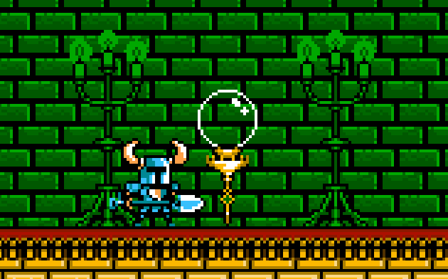
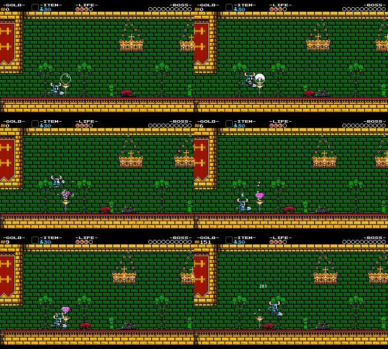
This insight helped us reach the final implementation of our checkpoint. Give it a look:
The way the final implementation works is if you walk by it, the checkpoint automatically triggers, and a fire ignites inside the glass. This solved the problem of players interacting with it to ignite it: you just walk by it and it works.
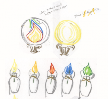
The torch also gave us another idea, which solved a problem with this checkpoint: how much money do you get from breaking it? We decided to tie the color and shape of the checkpoint’s flames to the color and shape of the money Shovel Knight collected. that way, players would have some idea of how valuable the checkpoint was, maybe enticing them to break it…
The color in the example above is grey, so we know that the checkpoint contains grey (not very valuable) gems.
The final problem making the checkpoint breakable, but not easy to break by accident. We solved this by requiring the checkpoint to be hit 3 times before it is broken. this also helps players to understand what is going on. If you hit at the checkpoint, it will crack, letting you know there is a way to interact with it. You also have to jump to hit it, making it even safer.
With this final version, we solved almost all of the problems of our last checkpoint. It clearly indicates to the player that progress has been made. It also allows you to control the difficulty; you can be daring and break the checkpoint for a reward and an extra challenge. It puts an emphasis on gold like the last iteration did. And though we sadly lost the emphasis on spending gold, we made up for it by rebalancing the economy to accommodate our new checkpoints!
We are really proud of this mechanic. It’s a thing of beauty… isn’t it? Wait a minute!?
Oh no! How do we teach the player that if they break the checkpoint, it will no longer function and they will return to the last checkpoint!? That’s a weird concept to even write, let alone understand!?
Say it Clearly with a Tally Screen
Even though we were in love with our checkpoint idea, we were stuck on the teaching issue for many months until a simple solution arose. Shovel Knight already displays a screen every time you die, to show the value of the gold you lost. But there is plenty of room on that screen…
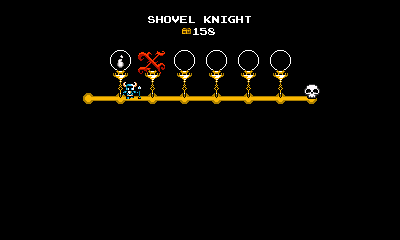
We added the checkpoints to the screen like so:
Using this method, we could show the player’s position in relation to the checkpoints. When you break one, it later shows up as an ‘X’ on the tally screen and Shovel Knight slides past it to the previous checkpoint. If the checkpoint is unbroken, it appears exactly as it does in the level!
This method shows exactly how the checkpoints function without us having to explain a word or take up any more of the player’s time! The only concern we had was with spoilers: displaying the entire level on the screen showed the length of the level! However, as we playtested, we found it provided the players with more incentive to finish the level than anything.
Ready for the Check!
So that’s the abbreviated story of how a simple design element can take months of implementation to reach a goal. Now imagine extending that to every object in the entire game. So much work! Let us know your feedback, and make sure to take advantage of that valuable checkpoint money in the final game… if you dare!

