Welcome, deck builders! When we last left off, we had created a self-contained card game on paper! In this part, we’ll talk about how the initial design of Joustus was implemented and how we extended it to accommodate the expanding scope of the platforming game.
Part 2 – Fleshing Out Joustus
It was a pretty straightforward process to recreate our paper card game prototype! Once we had our no-frills version up and running, there were a lot of kinks to work out in regards to displaying what was happening. How would we show a card being pushed? How would you know whose turn it was and if you were winning or losing? We kept these questions in mind as we progressed towards fleshing out the final layout.
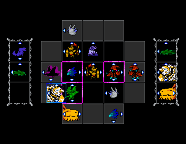
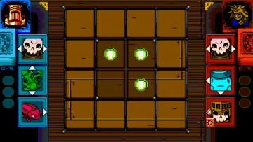
This was early playable Joustus with temp art! Not a lot of details or information, but it was a start!
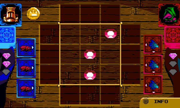
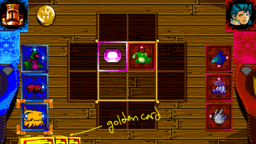
This mock up has some more information: a picture of you and your opponent, a coin to indicate turn order, a deck that can deplete, and some gem icons to indicate who claimed what. You can also see that the players have different colored cards and arrows!
What’s Gonna Happen If I Do This?
We realized that it would be challenging for the player to have to remember all of the card’s move options and abilities right off the bat. We developed a few ways to remedy this problem:
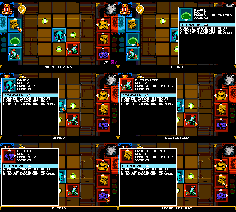
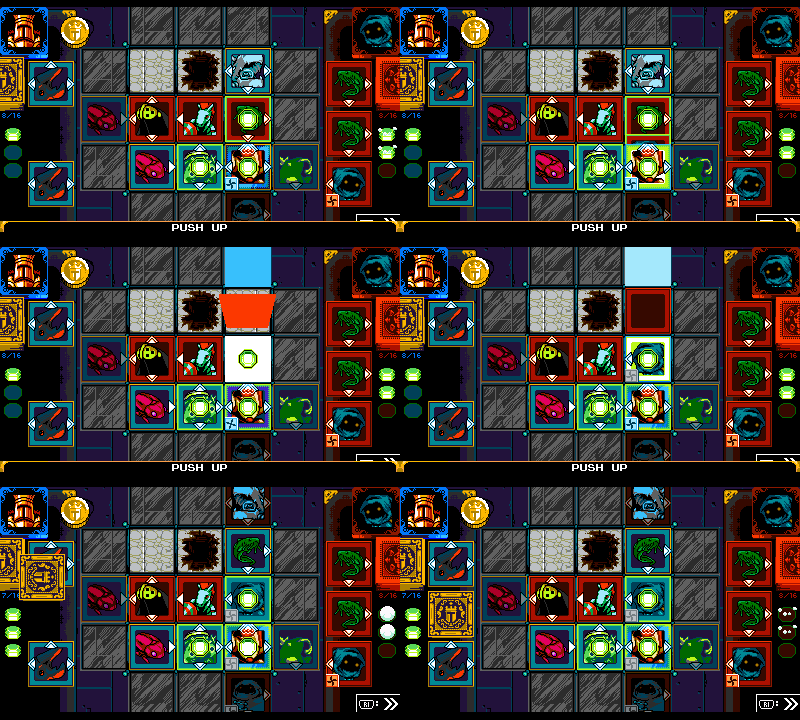
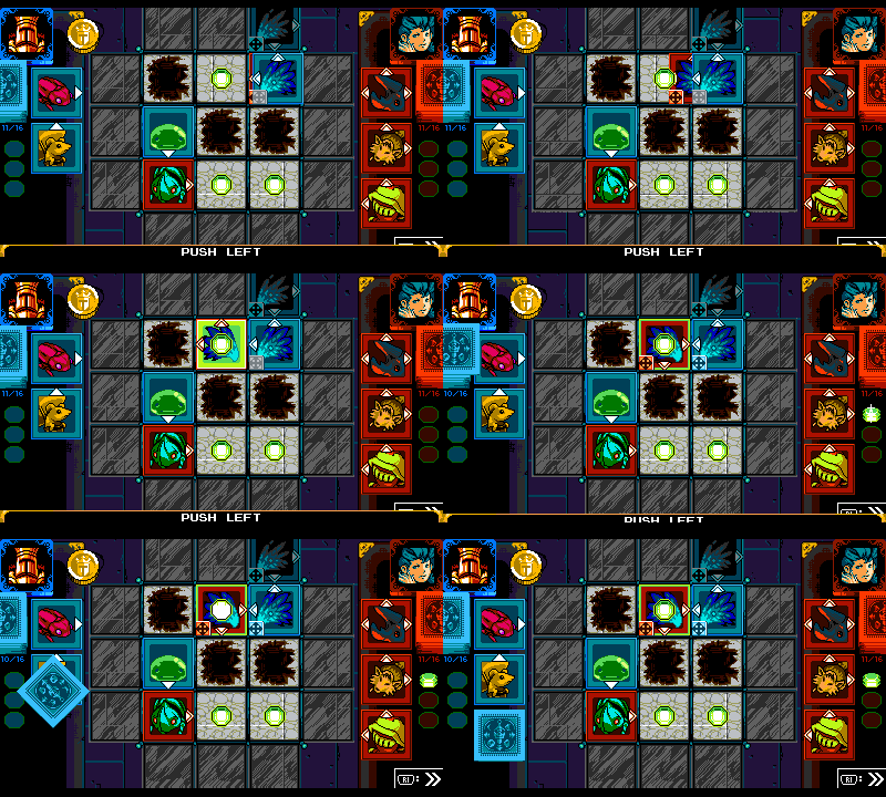
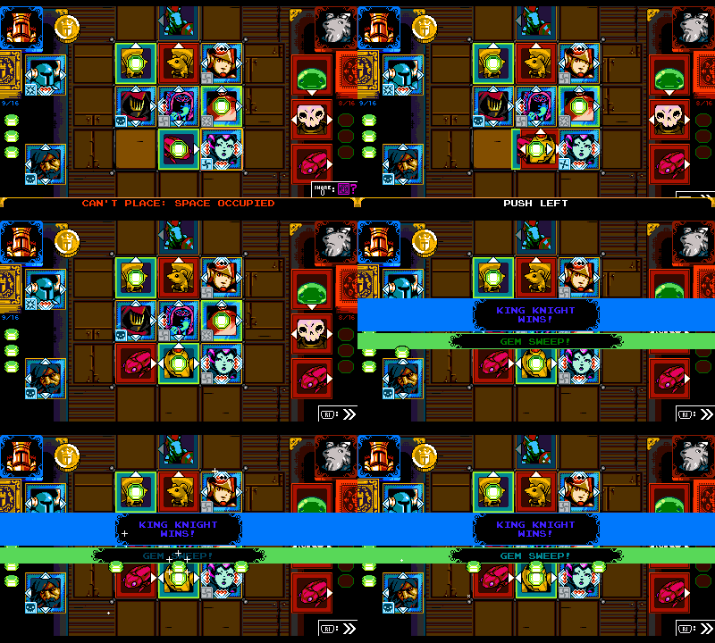
- Wherever you move your cursor, a preview animation shows what will happen if you place your card there.
- Instead of freely moving your card around, the input will force you to click through every possible action.
- The info bar at the bottom describes every action taken and gives instructions about the rules.
- You can examine a card and see its card info at any time.
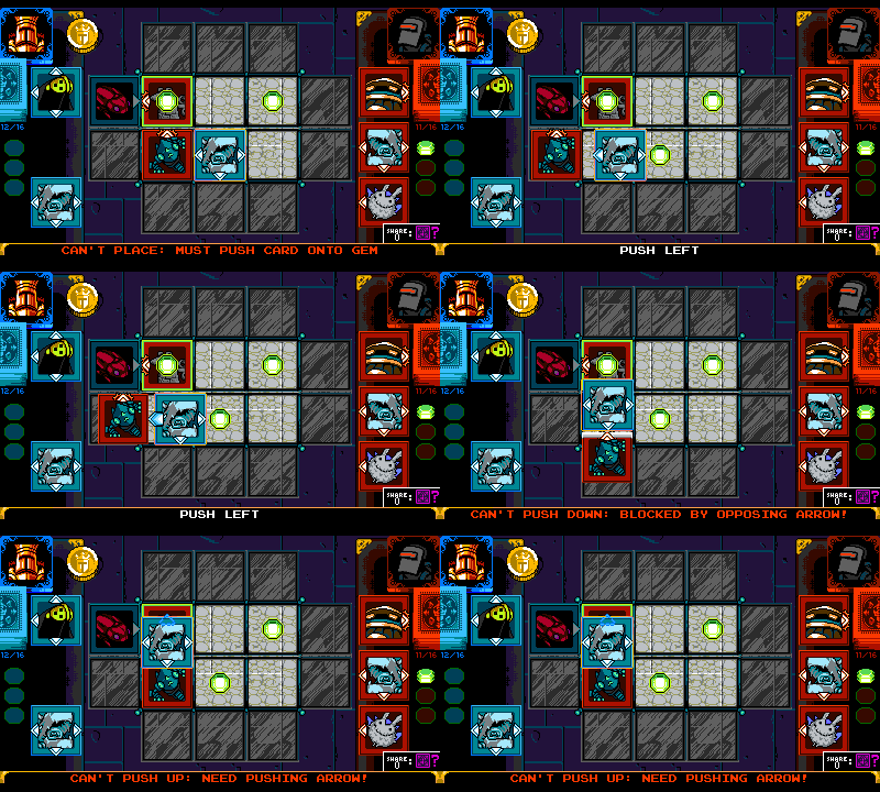
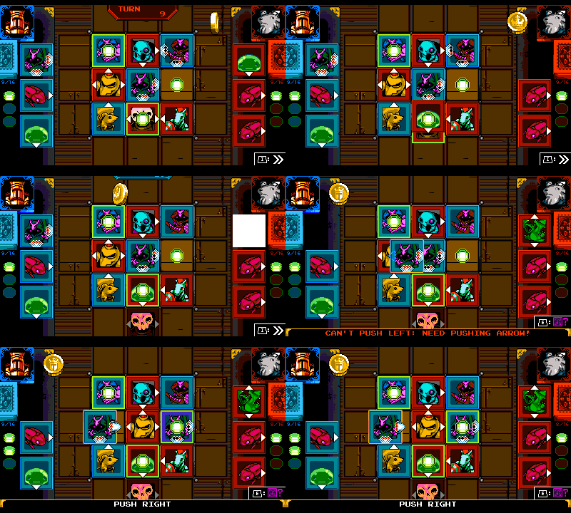
The info bar describes whether each move is valid and why. The preview shows why the move can't be made or what will occur if the move is made.
By putting the info front and center and describing the reasoning for everything, the player learns a little almost through osmosis.
Coming up with Card Abilities
We had a lot of ideas to extend the game beyond the single and double arrows. We wanted cards to have their own unique abilities! Such as the ability to blow up another card, flip its allegiance, push in many directions at once, or return from the graveyard! Our card concepts were conceptualized via a shared doc, as we often do with design brainstorms.
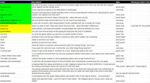
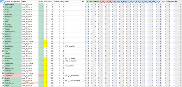
We use spreadsheets like this to brainstorm! This is just a tiny portion of all the ideas we come up with for any feature!
We quickly realized that there were complications to adding card complexity. If you wanted to blow up a card with a bomb, how would that even work? Could card abilities be something you can activate with a button press? This unfortunately would be too complicated and difficult to control. It also led to a new problem of how would they activate! We decided that it could trigger in other ways! Such as when you place a card down, when you push a card, or at the end of the turn. Some abilities could be tied to specific arrow directions creating a “bomb arrow”. While other passive attributes like ‘flying’ would always be active. The brainstorm ideas were categorized based upon the aforementioned criteria to see how they’d all fit in. We came up with:
- Arrows – special actions tied to arrow directions, activated by a variety of circumstances
- Abilities – special actions that are either always active, or happen if certain conditions are met
We decided that we’d have a maximum of one Arrow Type and one Ability per card. That gave us enough options to make dozens of unique card permutations, while also keeping it simple.
Single / Double Arrows
Double arrows were one of the only special arrow types prototyped on paper. They could push single arrows around, but treat other double arrows as equals. This was the simplest escalation we could imagine. We toyed with how arrows could be handled inside a given row or column- should they add up their power or stack up? Ultimately, we decided to keep simplicity! The strongest arrow in a row/column would be what combatted your placed card.
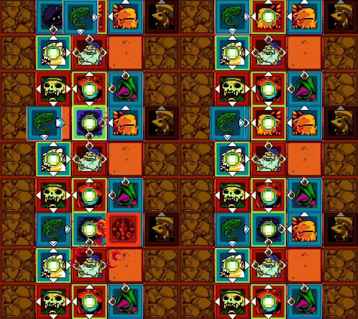
Bomb Arrows / Rocks
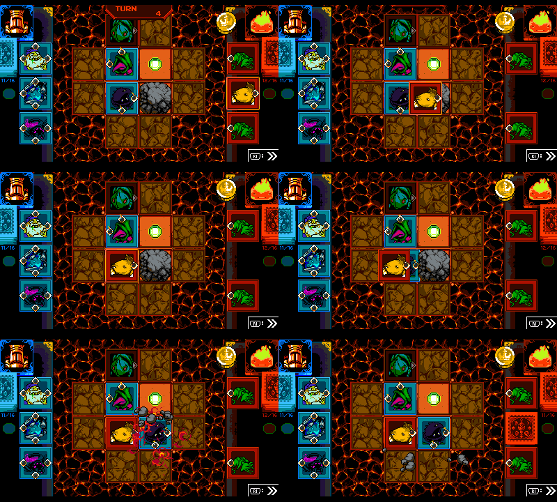
Bomb Arrows blow up a card instead of pushing it, removing it from the board. Besides being cool thematically, these cards are useful for clearing out space. Initially, you could use the bomb when you first placed it (which was too overpowered). We changed it so that bomb cards took one turn to “arm”. This lesson was applied to later designs like Conveyor Arrows.
Rocks were initially created to give Bomb Arrows more to do. This led to more questions! If a rock entered the playfield, did that space count as being occupied for the purposes of ending play? If I blow a rock up on my next turn while the squares were all filled on your turn, should the game end or not? We went back and forth, and decided that the game should end!
Conveyor Arrows
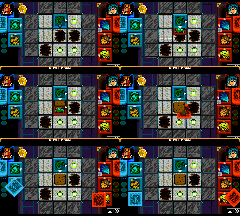
An arrow that pushes itself seemed like fun because you could set it up and then capitalize on it later. But when would the conveyor activate, and how far would it convey? We decided that it would start up only one turn after being placed, like the Bomb Arrow, and then attempt to move one square per turn. At first, they were set up to move every turn, but we wanted it to feel like they were on your team!
This card led to lots of fun! Especially when a card that seemed out of the game suddenly moved into a new spot! We had struggled with the order of operations: if you had a dozen Conveyor cards moving all over the board, what order would they go in? This confused everyone on the team…and still does! Thank goodness for all those previews.
In retrospect, it would’ve been cool to have a Bomb Conveyor arrow! Alas, our setup did not allow for that. Maybe next time?
Cascade Arrows
Cascade Arrows were borne of the desire to turn an opponent’s card into one of your own.
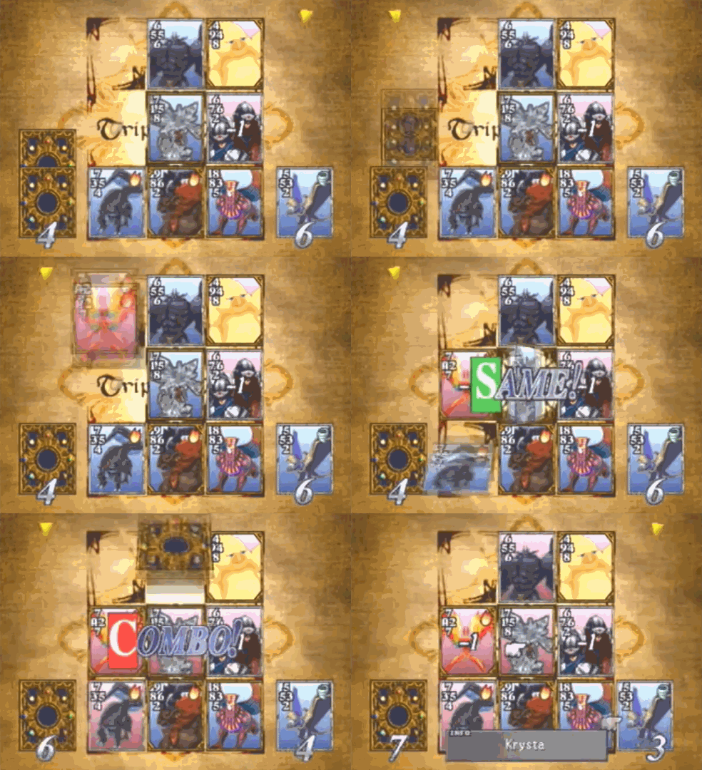
In Triple Triad, a rule called "Same" lets you claim your opponent's card if the numbers on the sides match.
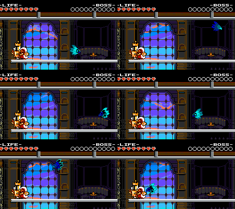
This complicated concept was made crystal clear by using imagery of a propeller flipping the cards over with its wind. This ability was deemed too powerful to use repeatedly (like a Bomb Arrow), so it was restricted to only work on the initial push. Cascade arrows turned out so great! It’s tremendously satisfying to flip over your opponents’ cards and achieve a Gem Sweep.
Countdown Arrows
What’s better than a double arrow? A Triple Arrow! We wanted to have them, but they seemed like they’d be too overwhelming, not to mention a little predictable and boring. We altered Triple Arrows into Countdown Arrows- Arrows that would become less powerful over time. Initially, the design called for them to reduce from 3 to 2 to 1 to 0 arrows, but that was too complicated. The countdown was also too fast if it counted every turn, like Conveyer Arrows. We altered the countdown to be every other turn. That way your own arrows would expire on your turn, so you could deal with them yourself instead of it benefiting your opponent! Countdown arrows became an interesting gambit to use if you thought you could win in a few turns!
Slam Property
It’s gratifying to clear a space on the board! Unfortunately, there weren’t many cards that allowed that. Slam cards arose from the idea of pushing a card away without your own card following after it. Originally, Slam cards were activated after one turn, like bombs! We decided that the ability wasn’t too overpowered and changed it to activate as soon as it was placed! The immediacy of Slam Cards makes them fun.
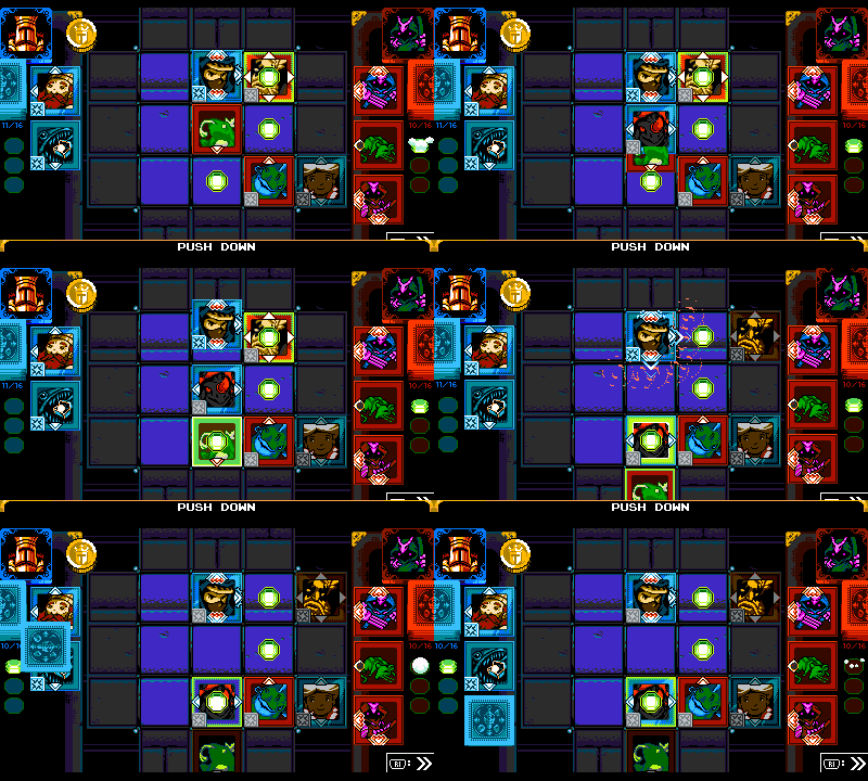
One note on being overpowered: the most overpowered card combination in the game is probably Bomb Arrow + Slam, because the bomb is armed and can destroy a card immediately!
Gravewalker Property
Players naturally want the power to subvert restrictive rules! That’s what Gravewalker cards do with the graveyard mechanic. This property was pretty straightforward to implement, simple to explain, and effective to use during matches. Great pains were taken to ensure that only cards featuring the dead or undead were given this property.
Switch Property
Arrows switching around was a natural idea! So, Switching was implemented early on. It was difficult to categorize, but we settled on “Switching” being a property. It could apply to whatever arrows the card already had but what directions would it switch, and when!? We decided that it would switch every time it was pushed. As far as the directions, we eventually supported all horizontal and vertical movement. It seemed intuitive enough that players would understand them and their symbols. We initially discussed making rotating Switch cards where all the arrows would move clockwise or counterclockwise, but it seemed too complicated.
Pit Squares
Like rocks, Pits were meant as one of the board escalations introduced when you entered a new Card House. World 3’s Card House had ‘flying’ as a placeholder property, where the ‘flying’ cards would be able to fly over pits. Once we got to World 3, this idea seemed a bit too boring. Instead, pits evolved into a spot into which a card would fall (and fill) once pushed. As with being bombed, the card returns to your deck with no permanent damage incurred!
Making all Manner of Cards
With all of the abilities and permutations collected, we whittled the possibilities down to a “close-to-final” final number of cards. In our spreadsheet, we decided who would and wouldn’t be made into a Joustus card. In the end, almost every character made the cut (excluding an enemy or two, and some village NPCs that did not appear in King of Cards. Variations of most common enemies like Wizzem and Goldarmor did not make the cut!).
Some rules were established for how the cards would be created and doled out:
- Character cards would all be unique (only 1 Shovel Knight card!)
- Character and enemy cards would be introduced at around the same time as their-in-game counterparts.
- The abilities of the cards should roughly correspond to the character represented.
- No repeats! No two cards should have the same exact arrow / ability combination.
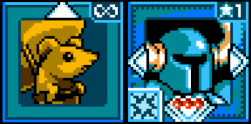
Here’s an example: Birder, an enemy in the game, moves diagonally and bounces at screen edges. In Joustus, Birder’s arrows are oriented diagonally and switch directions when pushed!
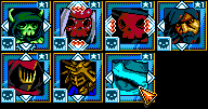
Getting this all right was an impossible juggling act. We couldn’t believe we figured it all out! There is one unique card we broke a rule to balance the game better…can you find it?
Gem Sweep!
In default Matches, there are 3 gems to claim, but what happens if you get all 3? Do you get something special? We (and many players) asked this question.
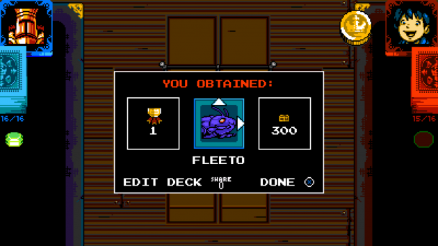
The answer was pretty straightforward! If you get a Gem Sweep and win by claiming all available gems, you would be allowed to choose a card for each claimed Gem! This required some menu rejiggering, but it was well worth it!
Varying Board Sizes
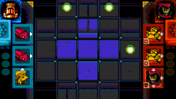
Joustus was conceived as a 3×3 grid with a 1-tile graveyard space. Experimentation showed us that other board sizes worked and added another layer of strategy as well! Removing graveyard squares around the edges of the board created a sense of claustrophobia. While making a larger board made the game take much longer (plus, you were able to see more of your deck.)
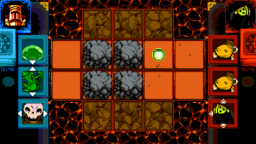
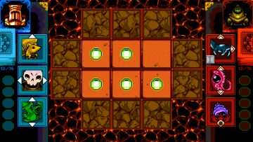
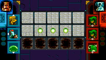
We ended up supporting a variety of grid types, but leaned on the default versions more heavily. The boards were all made to be thematically appropriate, especially the boss battles aboard the airship. Some examples:
- Mole Minion’s board is long, since he wields a long weapon.
- Greedy Treasure Knight has 5 gems on his small board.
- Polar Knight’s board is wide and dangerous along the bottom, just like the spike-lined floor in his boss battle.
- Phantom Striker’s board swaps the Graveyard’s position, forcing you to surround your foes in the Graveyard. Just like Phantom Striker!
- Specter Knight’s gems are also in the graveyard, forcing the player to dip a toe into undeath.
Cheating!
We wanted to include cheating in Joustus since it seemed like King Knight would be a cheater! Plus, we wanted to have a way for players to bypass a situation in a clever way if they wanted. Chester would sell these cheats, of course. We came up with 3 cheats based on player wants:
- Weakening the opponent’s deck – This became “Beeto Swap”, where your foe’s hands turn into weak Beeto cards.
- Claiming your opponent’s gems for yourself – This became “Gem Thief”, which flips your foe’s cards on a gem to become yours.
- Playing cards on the board without interference – This became “Play ’em all”, which lets you play 3 cards in a row.
But how would they be activated? The answer was a fun one – they’d appear ‘hidden’ slightly offscreen… just like how you might hide an actual card up your sleeve. Cheats were made expensive to create a real decision point- should you try and build a deck for a moderate cost, or pony up the big bucks to cheat your way out? We’re proud that the cheats aren’t silver bullets- there have been plenty of times we’ve used a cheat and still lost!
Millions of Menus
With all of these complicated systems, cards, card abilities, and more, we needed a way for players to view this information at a glance and understand it! Before we could categorize the information, we had to determine exactly what details players might want to see.
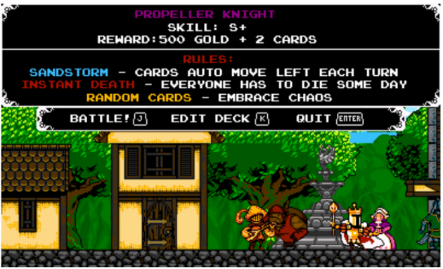
We knew there would be pre-match menus to show players the rules of the match. As well as post-match menus to show what happened afterward. We tried cramming as much information onto these screens as possible – the cards and gold you earned, the reason the game ended, and all the options for what could happen next. Eventually, the majority of this information was streamlined and stripped away to avoid overwhelming the player.
We wanted there to be menus during the match to help inform the player on how to make their next move. A bar was created on the bottom to provide instant info. Additionally, hovering over a card displayed more info about the card specifically.
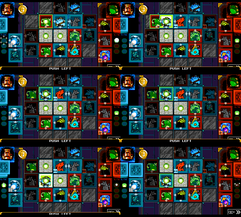
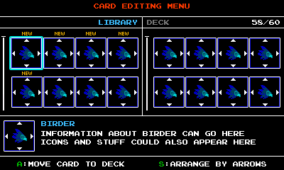
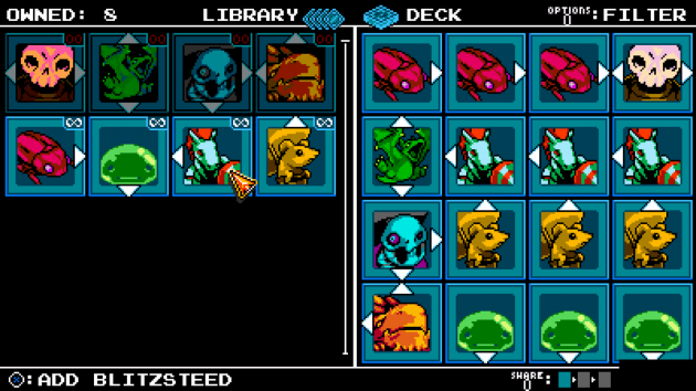
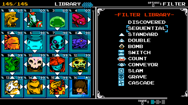
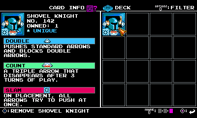
There would also be a series of management menus so players could see and organize the cards they’d collected and their customized deck. We had big scrolling lists of cards, but it was impossible to compare your library to your hand on separate screens. To remedy this issue, we divided the screen into 2 panels. That way, you could see the library on one side and the deck on the other.
The mockup on the left dedicated too much space to ‘card info’. We ended up going with the final version on the right that displayeded twice as many cards. More menus were conceived later on to help players build their decks:
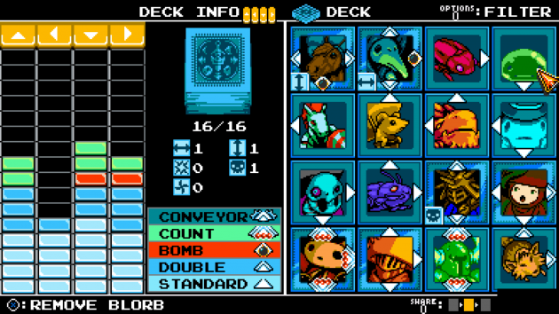
- An overview of your deck’s properties – deck info. We came up with the “Klax” visuals to help try and make it easier to visualize how many arrows of each type are in a deck.
- A filter to further narrow down your library.
- Card info would also be available here.
It was a huge challenge to design the filters and info screens with so little screen real estate!
Whoa, That’s a Giant Mini-Game!
Fleshing out Joustus’ mechanics took a lot of thought and required several iterations. Every mechanical complication needed to be cohesive with the other parts, displayed onscreen, and easily communicated to the player!
That’s only for the self-contained game of Joustus! We haven’t even talked about how Joustus was integrated into the rest of King of Cards! In the 3rd and final article, we’ll talk about creating the vast metagame behind Joustus!

