From Concept to Implementation
A lot of thought goes into creating all of the characters you interact with during the course of a Shovel Knight adventure! You may have asked yourself: How does Yacht Club decide on a character design? Do they sketch out ideas first or go right to making sprites? Why are there so many horse people?
Some questions don’t have easy answers, but today we can at least shine some light on our process of creating and animating an NPC (non-player character ) for Shovel Knight: King of Cards—The Hengineer.
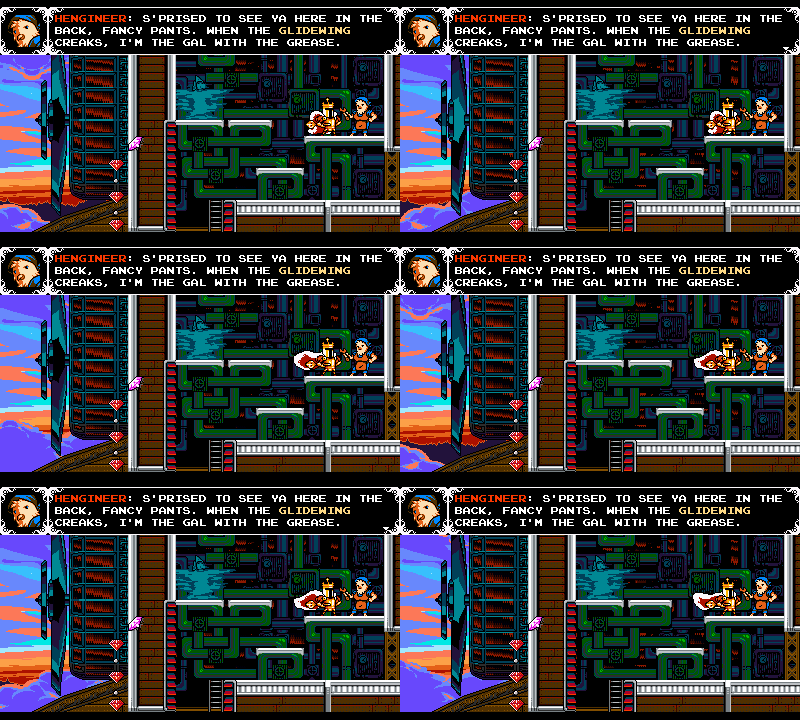
Behold- the Hengineer. Many revisions were required to reach her final form!
Placeholders First
Most NPC characters you’ll meet throughout the course of a Shovel Knight game will have been added with specific gameplay intent in mind. Generally found in a safe area, NPCs are there to impart a bit of feature-teaching dialogue, to pass off a crucial item, or to set you on a challenge. Most of the time, we implement NPCs as a default horse person sprite while we figure out their gameplay function.
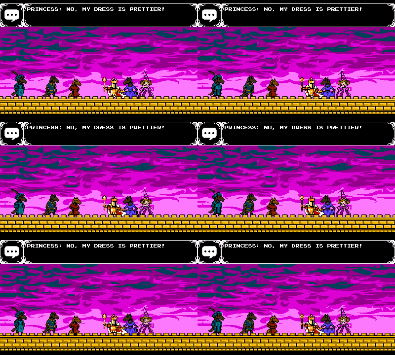
Horse people everywhere act as stand-ins for NPCs! Later, they'll be replaced by final art. Some may even stay horses!
Later in development, we’ll know which NPCs we’re going to need new designs for, and start to create new art to fill out the world.
Character Concept
When it comes time to create a new character, we’ll ask ourselves some questions:
- What is this character’s function? What will they have to do?
- How do they fit within King Knight’s adventure thematically?
- How do they fit into the world at large? Shovel Knight world at large?
In this instance, we needed someone to act as a one-stop-shop for King Knight’s ability upgrades. This character would be a passenger on the Glidewing, the airship hub of King of Cards. They’d imbue King Knight with special abilities such as an upgraded Shoulder Bash or a magnet to attract nearby gold when spinning around. We figured this passenger could be a bird, like Cooper, the Glidewing’s rooster captain. With these ideas in mind, we started on concept sketches.
Concept Art Sketches
To create a character sprite, we don’t really need a highly-rendered piece of art, just something that can inform the pixel art. During the pixeling process, a lot can change! Details from the sketch do not always translate directly to the pixel version and vice-versa. Later, the character’s illustrated design can be finalized based on the sprite.
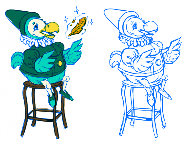
An 'archimedes' bird nerd merchant. This design later become the Hengineer.
We sketched a few concepts including the dodo above. We wanted to have a bird merchant, but weren’t quite sure where to go with it, or how this character might interact with King Knight. At first, we considered the NPC could award King Knight upgrades via magic, so a wizard-type would make sense. However, since the crew is flying around on an airship—a technical marvel of engineering ingenuity—what if they upgraded King Knight using a wrench instead!?
We went back to our thematics and brainstormed who else might be aboard an airship—maybe crew members like an engineer or a navigator or a pilot. We looked back at old war posters for inspiration and authenticity as well.
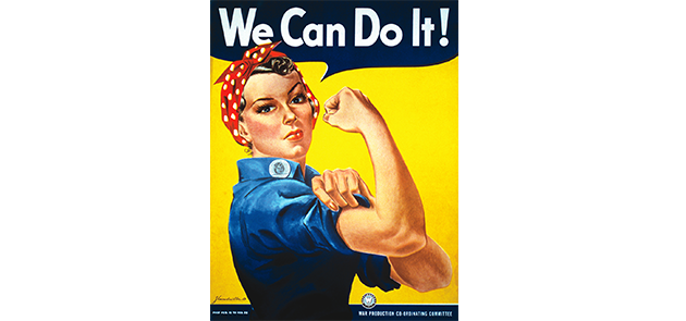
Rip off war propaganda? We can do it!
It seemed fitting that we egg-secute on giving the crew another fowl-weathered friend! We settled on the idea of a chicken with mechanical inclinations–a Hengineer! The idea of a tough hen in the engine room appealed to us. We sketched some variations:
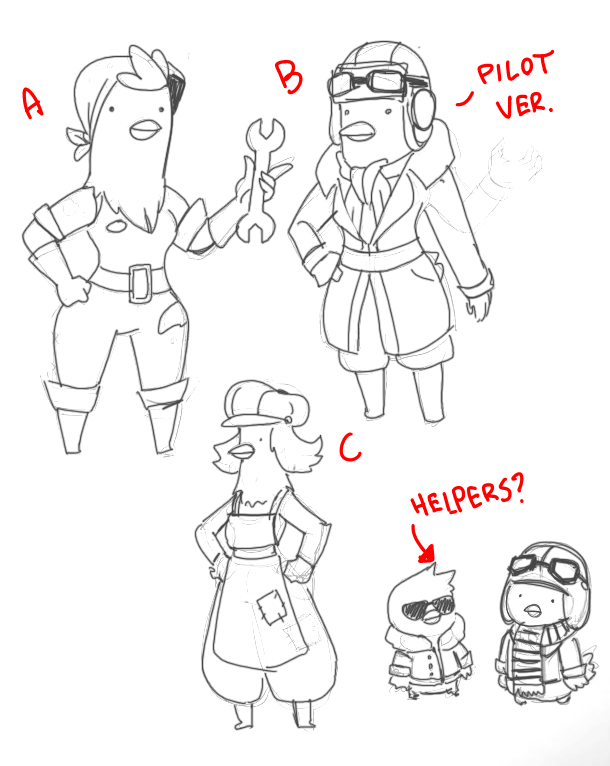
Sketching out concepts. The plan to give Hengineer little “helpers” didn’t hatch, but it sure would've been cute!
We all really liked the “A” concept a lot, so we used that as the starting point for the sprite. The Hengineer would be a wrench-wielding, overall-ed hen.
Creating the Pixel Model
Crucial to the process is making sure the sprite’s size and visual style match the other characters in the world. You don’t want a character to be over or under-rendered in a way that feels inconsistent or they will look out of place.
Shovel Knight visuals generally adhere to the same restrictions as NES titles, which means a sprite shouldn’t make use of more than 4 colors (including black or transparency). In some cases—like in classic Mega Man on NES, for example—characters were built using multiple sprites. Mega Man’s sprite appears to contain 5 colors because his face and body are actually two separate sprites! In our case, we’re not limited by NES hardware, but to maintain a level of 8-bit visual consistency we try not to use more than 5 colors in a single sprite.

Mega Man uses multiple sprites to achieve 5 colors per sprite + transparency! We just cheat.
On the far right of the image below, you can see a version of sketch “A” (from above) in sprite form. It’s a good start, but Hengineer’s silhouette felt a bit generic here, so the work apron from sketch “C” was brought in to provide some color contrast and help give her a more interesting shape. Orange helps provide a complementary color contrast against the blue.
Variations on Hengineer's sprite design. These sprites had too many colors and required simplification afterward.
Choosing an Idle Pose
Many characters in Shovel Knight hold an “Idle” pose while they stand around. Sometimes they walk back and forth as well, but generally they just bob in place. We won’t go into the details of why we made this choice, but it certainly limits our options for character acting! Therefore, the Idle pose is carefully chosen to impart the most thematic info possible. Details like the way a character stands, any props they’re holding, and their expression can all speak volumes. The idle pose is likely the way you’ll see a character represented most often, so it’s important that it tells you a lot about them at a glance!
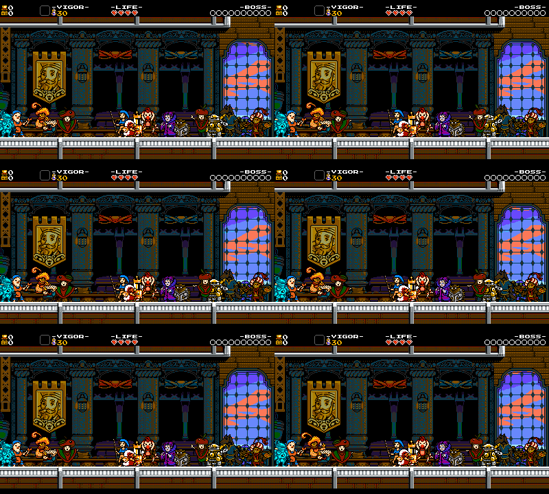
Oodles of Idles!
In Hengineer’s case, her pose needed to convey her confident, hard-working, grease monkey personality. The poses above were all meant to showcase this. In the first, she confidently slings a giant wrench over her shoulder, ready to work! In another, you can see her flexing her wing in a stance reminiscent of Rosie the Riveter. Ultimately, we settled on a pose with one hand placed confidently on her hip and the other holding her wrench out so it’s clearly visible to the player. This hopefully indicates her role as mechanic/upgrade NPC, which would be further reinforced by her animations when she upgrades you.
While not the final sprite, here we’ve chosen Hengineer’s Idle pose.
Next comes settling on a size! Hengineer’s sprite was made smaller to better match King Knight’s height. This way King Knight doesn’t seem TOO short compared to everyone else! Hengineer’s pixels were also adjusted, and the colors reduced, to better match other Shovel Knight characters. Now she fits right in!
The final Hengineer sprite standing next to King Knight.
Here’s a full timelapse of the changes Hengineer’s sprite went through. Pretty egg-citing, right!?

Hengineer sprite time lapse.
Making Animations!
Even with a great idle pose, Hengineer isn’t ready to be placed in-game. There are a whole bunch of animations to make in order to bring her to life! Her design documentation will include an asset list full of animations based on her function when interacting with the player. We always have the option to add more or decide we don’t need some, but having this list helps estimate our work load. We won’t detail the full animation process just now, but below you can see some of Hengineer’s finalized animations to give you an idea.

Idle – Hengineer’s default pose; she’s just standing around looking busy until you talk with her! Our idles are generally all 2 frames with no extra animations! Just a gentle bob.

Wave – NPCs that have something to tell or sell to a player will usually play a looping gesture animation. This pose should be different from the Idle as it’s used to grab the player’s attention. Here, Hengineer takes on a more dynamic pose—wrench raised in the air and beak flapping open so the player notices her!
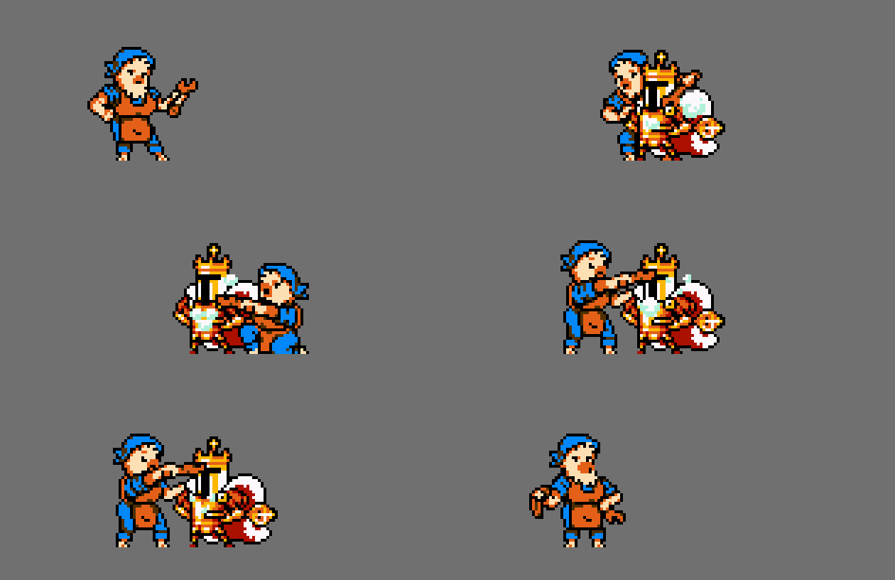
Upgrade – This animation mockup shows Hengineer serving her main purpose: wrenching, cranking and upgrading King Knight’s abilities! She wipes her brow after a job well-done. (King Knight demands perfection!) A dynamic animation like this is, hopefully, a treat for the player after having purchased an upgrade.
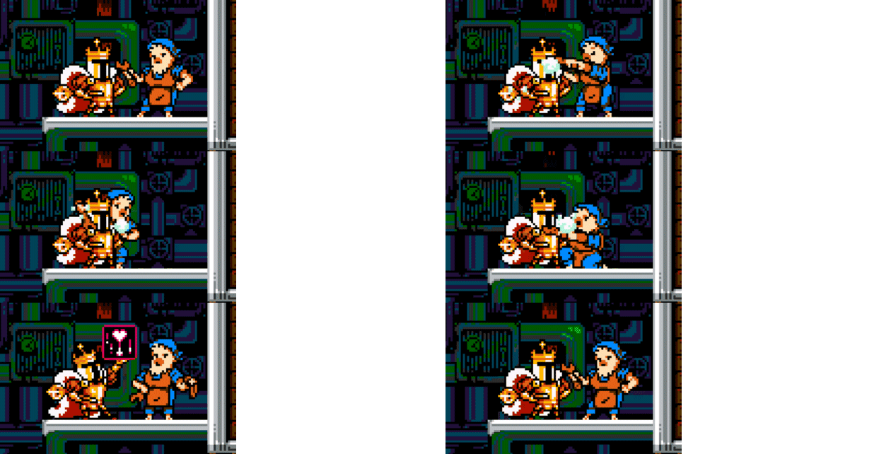
Finally, the assets are ready to be implemented in code. Here is Hengineer acting out her upgrade animation in-game, with the frame count and timings slightly tweaked so the player has more time to enjoy it! Wow, this really makes getting an upgrade more thrilling!
And that’s how it all “clucks” together! Like poultry in motion, now you know how we create a Shovel Knight character from concept, to sketch, to sprite, to implementation!
More Character Creation time lapses!
Each sprite goes on a unique journey from conception to completion. Here are a few additional time lapse examples of characters from King of Cards!

Doe, the stag-geringly dashing pilot of The Glidewing, got a chest tuft enhancement and his shirt unbuttoned after a few revisions. Clearly we thought he needed to be sexier.

Traitorus' may look evil, but his big-brained head was made smaller and color less pallid so he'd at least look more human.

Gouache, the sloth painter, works hard, but doesn’t always appreciate critical feedback. You can see that he had to shrink in size and lose a color (our max is 5!)

Duelist Di didn’t veer too far from her initial concept, but was repaletted to match the other ghosts in the game. Her weapon was also changed to match the Heirloom received in-game
Thanks For Reading!
We hope you enjoyed this little look into our spriting process. If you’re interested in trying some pixel spriting for yourself, we’ve compiled a few resources used commonly at Yacht Club Games:
ttps://www.spriters-resource.com/ – An enormous pixel art repository full of sprite sheets from almost any game imaginable!
https://www.cosmigo.com/pixel_animation_software/downloads – Pro Motion is the pixel art software of choice for us!
Best of luck on your own pixel progress!
