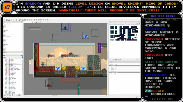
We’ve gone over our level design process from macro to micro – but what’s the final process to make a level feel polished and frictionless? Well, it’s not just one thing, sometimes it feels like a thousand tiny things constantly buzzing around in our brains! But polishing levels isn’t done by “feel”, it’s done by establishing and adhering to a set of guidelines. Each level is once more analyzed as each element is adjusted into place using our Secret Techniques!
This is by no means an exhaustive list, but it should provide some insight into the more nuanced areas of our polish process.
Chapter 5: Secret Techniques
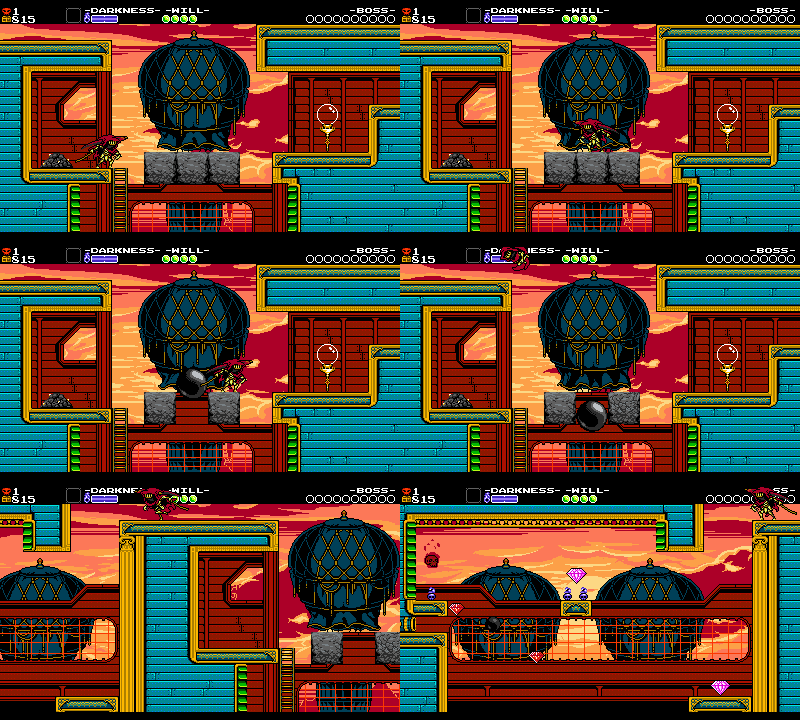
The Opening Vista!
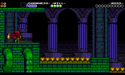
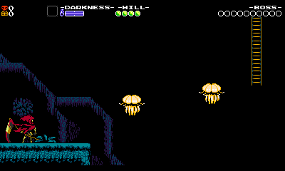
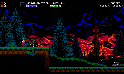
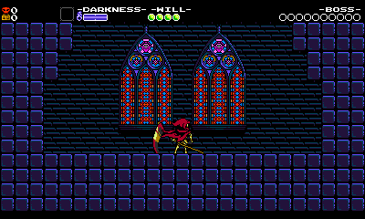
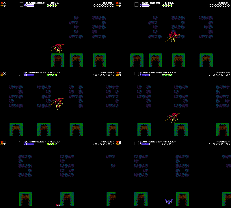
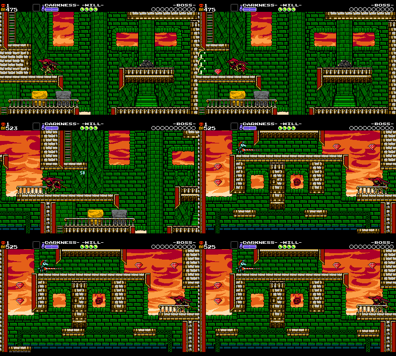
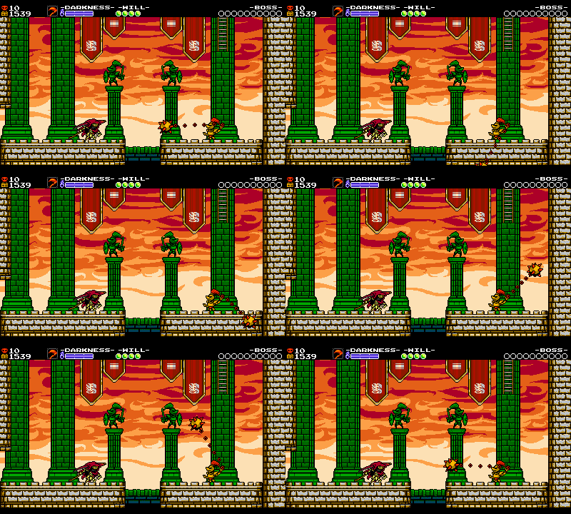
We generally try and make the first room of a stage dramatic and memorable. First impressions only happen once!
…drama!!!
Here are some guidelines we use:
- No objects or enemies should look cut off by the screen edge.
- There should be a clear pathway to go (or in the tower example, the clear pathway idea is deliberately subverted!)
- You should get an idea of the stage’s tone/theme right away.
Comfortable Jumps
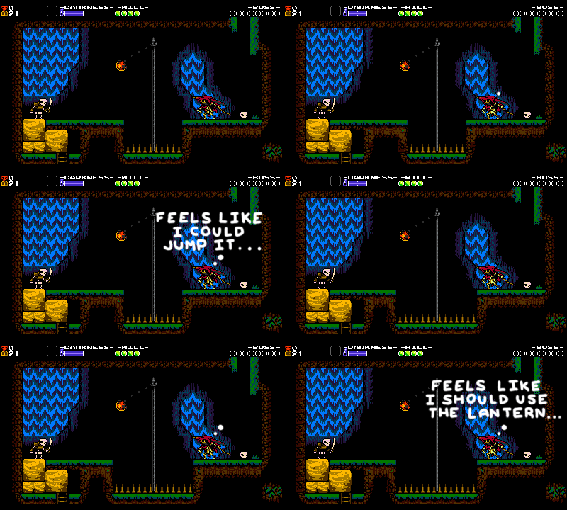
Specter Knight can jump gaps that are up to 5 tiles wide, but we avoid building gaps that wide into our level design. If the player is intended to jump somewhere, they should be able to jump there comfortably, with a few tiles of wiggle room. In fact, platforming challenges typically don’t ask the player to jump more than 3 or 4 tiles.
In 2D Mario games, depending on how fast you’re running before you jump, your jump distance can vary wildly. Here in Super Mario Bros, for example, you can jump anywhere between 4 and 10 tiles! And still, most levels in Super Mario Bros never ask you to jump more than 2 or 3 tiles at a time. The challenge comes from how the platforming overlaps with the enemies and objects around it, and rarely from the jumps themselves.
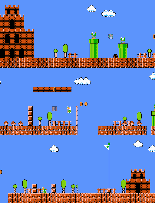
Even in World 8-1, one of the hardest stages in the game, nothing gets close to that 10 tile maximum.
We’re not here to test whether the player can successfully press the jump button 0.01 seconds before they run off the ledge. Our challenges should be more interesting than that! But still, that extra jump distance is useful because it enables us to rely more on our enemies and hazards. Even though Specter Knight is usually jumping 3 tiles, that extra power gives the player enough wiggle room to reasonably handle the Blorbs and Beetos that are waiting for them on the other side.
Avoiding that 5 or 6 tile distance also removes ambiguity from our setups. Either we want you to jump there, and it’s 3 or 4 tiles away, or we don’t, and it’s 7 or 8 tiles away. If you can’t jump there, it shouldn’t look like you can.
Clear Routing
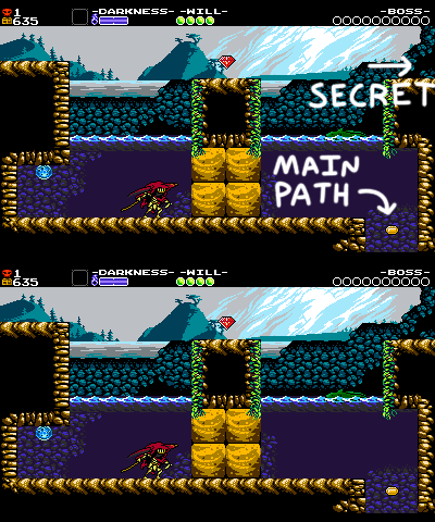
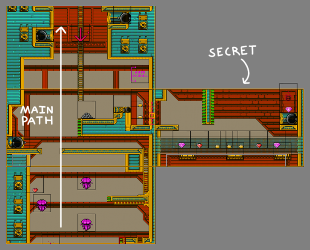
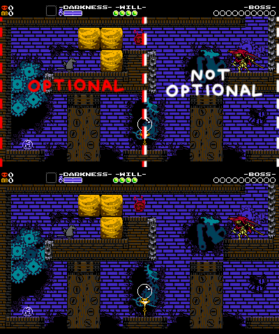
Shovel Knight levels are fairly linear, but occasionally you’ll find an optional room off to the side of the main path. But how is the player supposed to know which one’s the secret, and which one’s the main path? Here are some rules we follow to make alternate paths feel alternate:
- Secret paths are generally headed in a different direction than where the main path has been going.
- Secret paths are more generally more difficult to navigate to than the main path.
- Many secret rooms are hidden behind breakable walls, so the player gets trained to always check these out before continuing onward.
- If you do find a secret, most of them are also only a screen’s width, meaning that you can tell it’s a dead end from the moment you enter.
It can be pretty hard to make that distinction clear! As the designer, it might seem obvious where to go since you know all the rooms by heart, but you must put yourself in a novice’s shoes and really think about where the game is actually telling you to go. To better illustrate the problem, let’s look at some rooms with unclear routing.
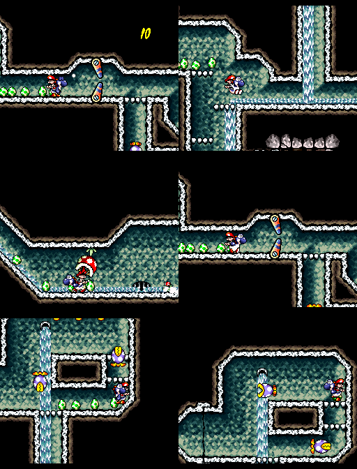
Here in Yoshi’s Island, Yoshi spends the opening of the level always heading right. Later, when the player has a choice between continuing right, or heading down – it seems like down would be the quick diversion and the rest of the level would be to the right, but it’s actually the other way around. The downward path leads you to a steep slope that you can’t climb back from, while the path to the right contains a red coin needed to 100% the stage. Situations like this occur when a game isn’t consistent about where you need to go, so it’s hard to intuit the routing of the level without resorting to frustrating trial and error.
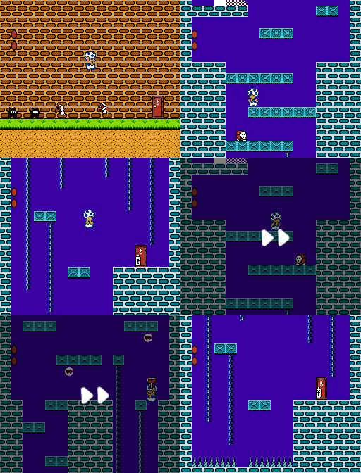
Here in Super Mario Bros. 2, upon entering this room you have to choose between going up or going down, but it’s pretty much a coin flip which way you choose. The game hasn’t really favored one direction over another thus far – the first level has sections that go up and sections that go down, and since then the player’s just been moving to the right. In the gif above, Toad chooses to descend first, but at the bottom all he finds is a locked door, and it turns out the key is all the way at the top of the room!
I’m sure you can think of plenty of times in countless videogames where this has happened to you! But getting lost and backtracking aren’t elements we’re interested in including in a Shovel Knight game, so we avoid the confusion altogether by establishing and sticking to a specific visual language for secret areas.
Most dead-end rooms are hidden behind breakable walls, so the player gets trained to always check these out before continuing onward. Most of these rooms are also only a screen’s width, meaning that you can it’s a dead end from the moment you enter. The longer you go before seeing the end of the room scroll into view, the more anxious you get from wondering if you accidentally went down the main path first.
Sometimes we don’t even need a breakable wall for the routing to remain clear, because Shovel Knight’s vertical screen transitions are one-way. The player knows that if they fall down there, they can’t get back up, so they therefore know to check the room to the right first before heading down. But there’s other rules we work with to make the routing feel intuitive.
Secret areas in Shovel Knight are generally off to the “side”, wherever that may be. If you’re in a section where the rooms go up or down, then the secret’s on the left or right. Likewise if you’re in a section where the rooms are going to the right, then the secret will be above or below. The main path in a Shovel Knight game never goes to the left, so any exits going left are always a dead giveaway as well.
Entering secret areas also always offers more friction than following the main path. Sometimes they’re gated by clever and involved setups, but at the very least you’ve got to break through a wall or climb up above the screen. If you could just waltz right into a secret room you might think it were the main path, so the challenge of the secret area needs to start before you even enter the room.
All put together, these rules ensure that the player can always “feel” which way to go, without ever needing to tell the player outright.
Symmetry
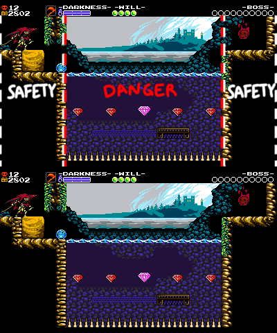
When the player enters any new room, their eyes scan for the exit, hazards, treasure, and secrets. The more complicated the room’s layout, the harder it is to search for all that information. So we often use symmetry as a means to help focus the room down to its most critical ideas. It also simply looks pleasing to the eye!
Additionally, when the level layout seems the same on both sides, it highlights the differences between the sides. This helps the player focus more on whatever elements we’re trying to highlight.
Here, the symmetry helps downplay the room’s platforming elements and shines a spotlight on the Mace Goldarmor. Of course, symmetry can be a bad thing too, like if the gameplay was mirrored on both sides of the room – then it would be repetitive!
Spacing Consistency
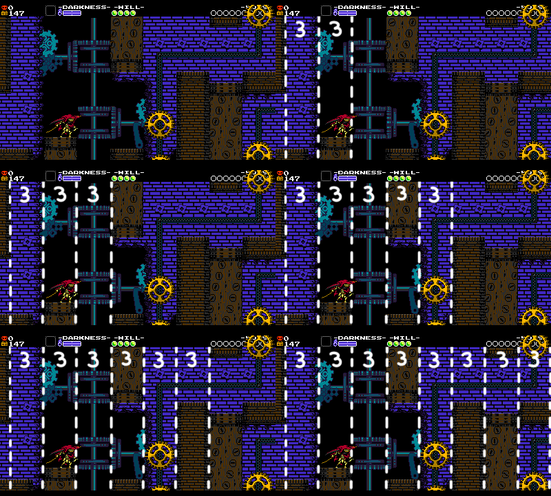
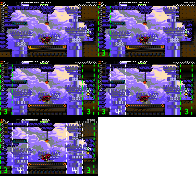
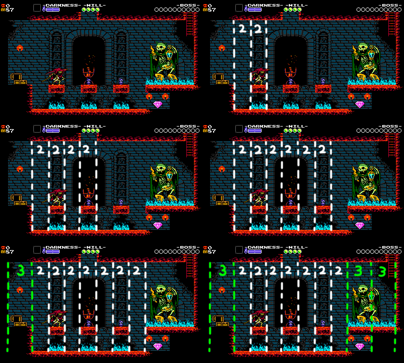
Throughout all of Shovel Knight’s rooms, we strive to build structures with consistent sizes of collision. Since humans’ brains are good at recognizing patterns, this subtly helps the player intuit the layout of the room.
This room is laid out in sections that are consistently 3 tiles wide. This lets the player fully internalize the platform spacing and solely focus on the hazards.
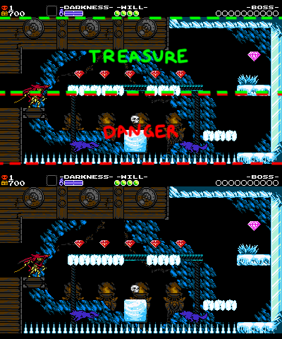
In these rooms, different components of the room utilize different spacing patterns. On the left, the areas that are considered safe are both on 3’s, while the dangerous areas of the screen are on 4’s. In the room on the right, we space out the lower areas on 2’s, while the upper areas are on 3’s. This helps the little maze in the center of the room feel more claustrophobic and dangerous than the larger, open platforms above.
This is not an exact science – but trying to think in patterns like this can help the level design feel more intuitive and intentional.
Thick Platforms
More often than not, we try to avoid making platforms that are only a single tile thick. This happens for a number of reasons!
- Collision is the only thing keeping the player from falling off the screen at any given time, so it’s important that collision in general feels like a big, chunky, solid, safe thing that you can really hold on to!
- Larger blocks of collision look cleaner visually, and are thus easier for the player to parse when their eyes first scan the room.
- For Specter Knight specifically, larger pieces of collision mean the player has more of an opportunity to climb along the wall, potentially saving players from a slightly mistimed jump or helping them out of a pit!
- Because most of the game is built from thick collision, seeing thin collision now seems extra scary, and we can use that to create tension!
Precision Gem Placement
The position of every gem in the game must be considered. Here’s some best practices!
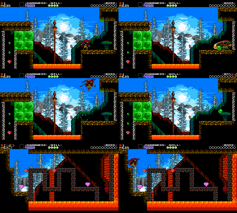
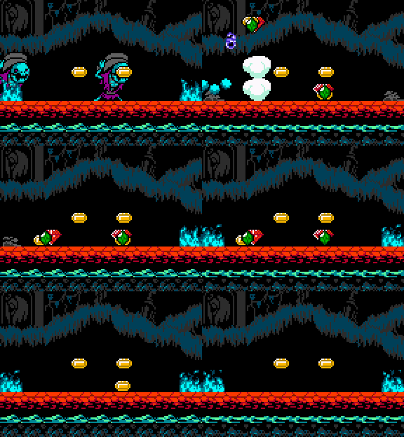
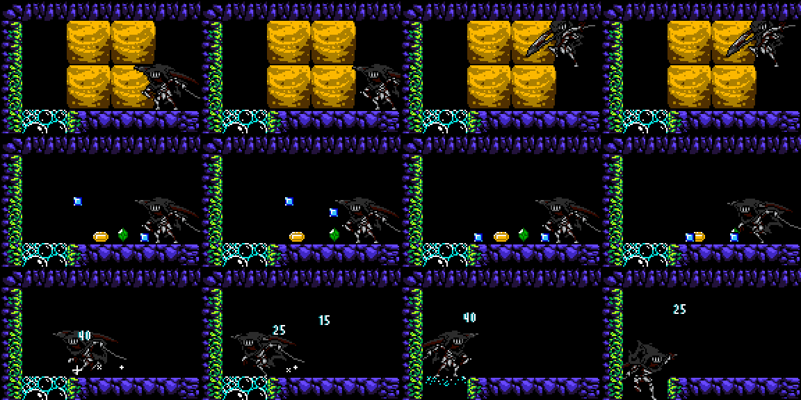
Place collectible gems slightly off the ground, so that the player can tell the difference between a gem that dropped from an enemy, that will eventually disappear, and a gem that’s a permanent part of the level design.
Offset gems in dirt blocks in such a way that if the player breaks the blocks but fails to collect the gems, they all land on the ground with appropriate spacing and no overlapping. This way you can see each gem you’ll pick up!
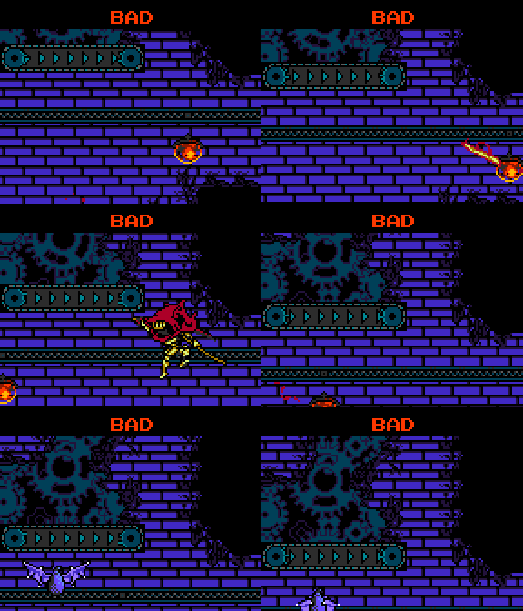
Perfect Synchronization
Wherever an object rides along a track, we time it such that it lines up cleanly and consistently with the other objects in the scene. In this Pridemoor room, for example, each moving platform is sent at a steady frequency, such that the player can internalize the necessary timing. If the platforms were placed with uneven spacing, the player might accidentally miss them unfairly.
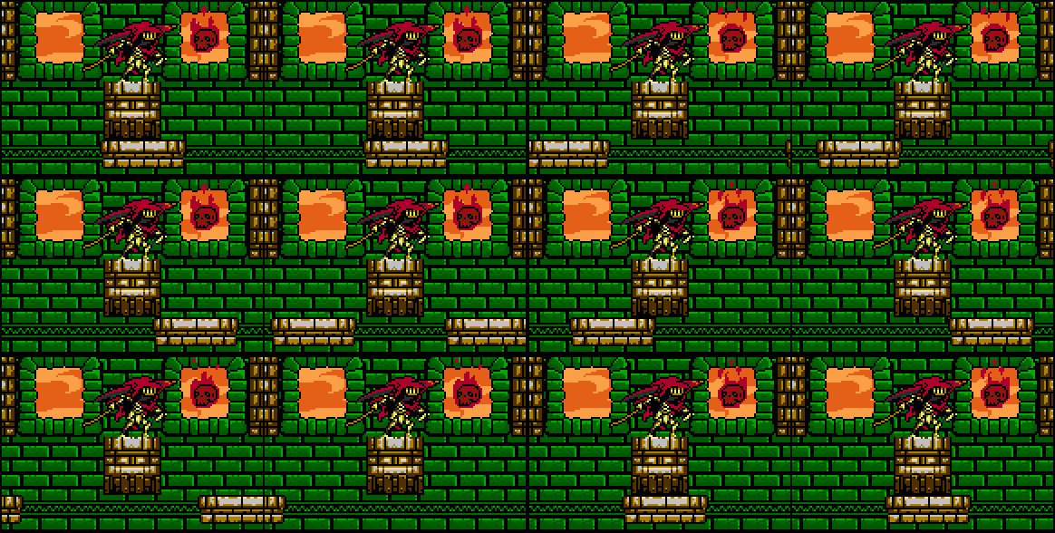
On the left, the platforms have equal spacing, but on the right, each successive platform is a tile off.
This careful timing of objects exists everywhere in our level design! In the following example, note how each cannonball lines up with each moving platform, so no matter when the player hops down there, they always have an open opportunity to dash slash the cannonball and grab the skull!

We wouldn’t want all the objects to be out of sync just because the player decided to make a sandwich while leaving the game running!
Or, check out how all these burners in Explodatorium are in sync with one another. With sound especially, this helps establish a rhythm for the player to follow, enabling them to tackle complex new areas with confidence.
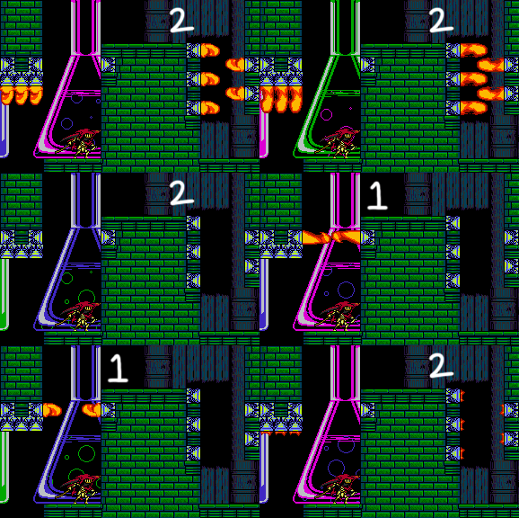
Having an opposite timed set of burners on-screen gives the player an offbeat that helps them keep rhythm even more easily!
The Secret’s Out
We hope that it’s been interesting to hear about our Secret Techniques! There are many more that we didn’t go into detail on, and these are by no means hard and fast rules! It was a blast to implement these techniques as we constructed Specter of Torment, since we could see how much more polished and fun the game was getting.
Thanks For Reading!
Wow, was that really 5 articles worth of level design chat? It all went by so fast! And there’s still so much more we could talk about…
That’s a lot of information to internalize, but like anything it gets easier the more we practice. When we actually sit down to make a level nowadays, the process looks a lot more organic! Check out this time-lapse of developing one of Specter Knight’s amiibo Challenge Levels to see what we mean.
Whether you’re a level lord yourself or just an enthusiast of the craft, we hope you found this insightful and interesting! We may do more of these in the future, so please let us know what you thought or if you’d like to hear more about a specific subject.
Resources
Just can’t get enough level design?! Check out some of these resources and keep the party going!
- To construct our levels, we use a modified version of a free map editor called Tiled! Give it a download and you could put a level together just like the pros!
- When talking about level design ideas, it’s not uncommon for us to reference stuff like “that one part in Mega Man 2” or “that part with all the cannonballs in Mario 3”. A great resource for finding and analyzing all those moments is VG Maps, a website cataloging the level designs of countless games. They even have a page for Shovel Knight maps!
- Have you heard of Super Mario Maker? It’s a really robust game, with tons of tools for designing 2D platforming levels! If you have the means, and are interested in applying some of these lessons yourself, try building some Mario Maker levels and sending us your codes!
- Ready to read even more? Check out Shmupulations! They’ve got loads of translated interviews with legendary game developers.
YCG Streams!
Throughout Shovel Knight’s development we’ve streamed ourselves working on programming, art, illustration and even level design! We’ll probably do the same for our next project, so make sure to follow us on Twitch if you’re interested in tuning in!

