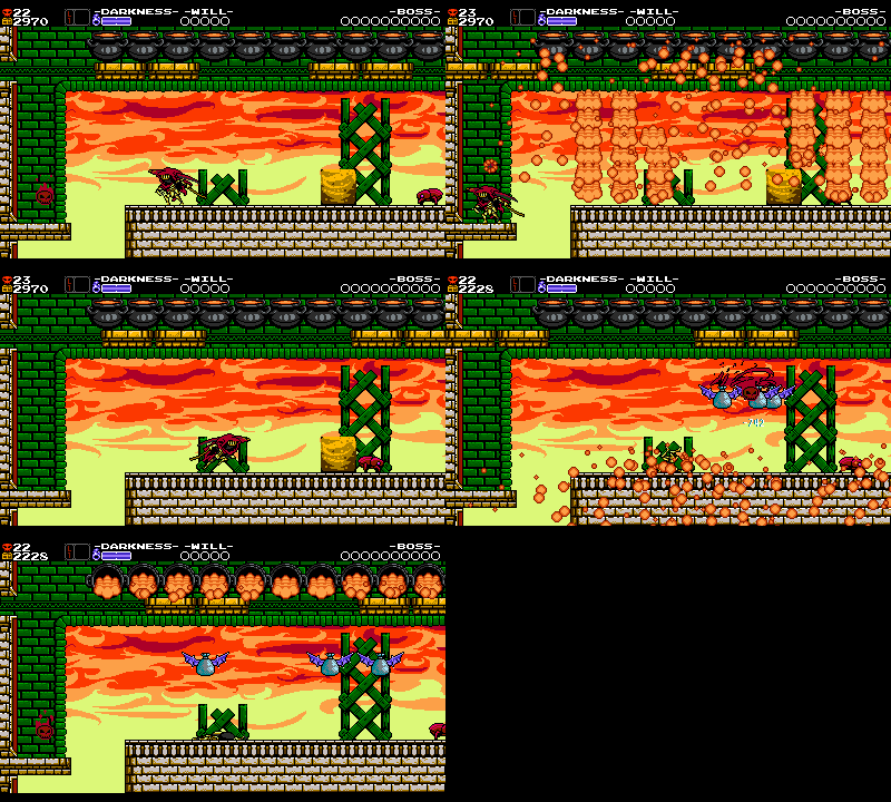
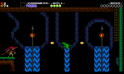
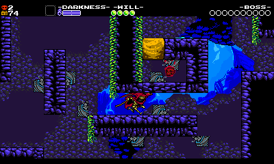
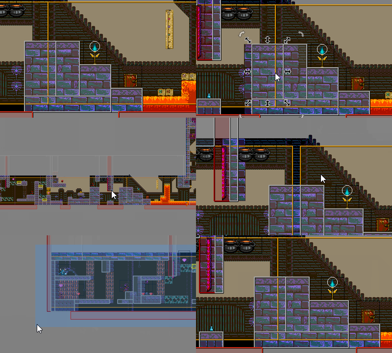
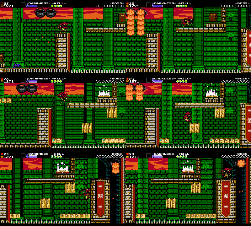
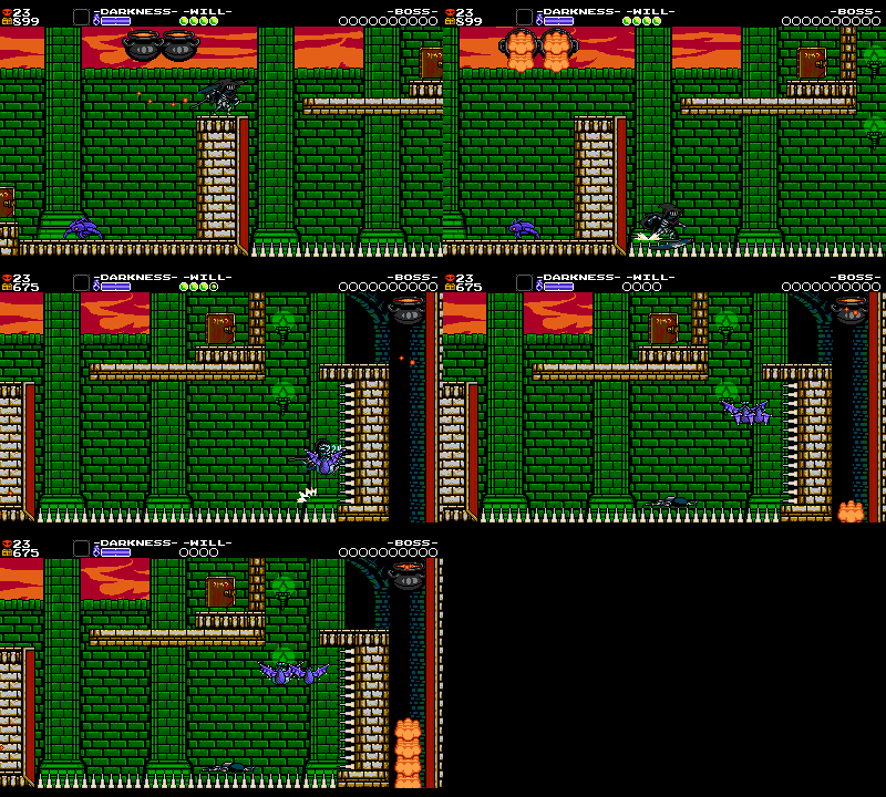
Once a level’s rooms are all in place, the game really starts coming together. Perhaps the level is playable from start to finish, and maybe it’s fun too! But we’re not done yet. It’s at this point that the team really starts scrutinizing the level as an organic unit, then revisit everything one sequence at a time as we block in more final placements and smooth out rough parts. The result should be a ‘done’ level where only final touches remain! For Specter of Torment, that process took about 4 intensive months.
Chapter 3: Polishing Placements
Pickups
In every stage, we must consider the placement of pickups, meaning items that the player collects! Pickups are stubbed in throughout development, but we must also turn a more critical eye toward them at some point to ensure that they’re balanced and cohesive. Different considerations are developed for each pickup, and often times rules are added as the content is honed.
Health

How often should health refills appear, and where? First, it’d be good to define what health is! In Specter of Torment, health is a resource that you lose when you take damage from enemies or the environment. When your health runs out, you go back to the last checkpoint. When you collect a health refill, your health is restored a certain amount depending on what type of food you consume. Health acts as a measure of the player’s capability to avoid damage. It determines how careful you need to be – if you have a lot of it, you can carelessly barge around without being too worried about the repercussions. If you have low, it’s scary! In short: if we want to relieve tension, we add health pickups.
How much is too much health? How will players actually play the game? Playtesting would be great, but until the game is in a showable format, we have to make educated guesses. We’ll play through the level, and test each other’s levels, trying to imagine when a player might need some health! If we want the level to be harder and the player to be more cautious, we remove pickups. Many times we will hide a health pickup slightly off the beaten path, rewarding cautious and meticulous players with some more leeway to explore further. This lets a player’s skill in one area (exploration) help them with another area that they might be struggling with (combat).
As always with crafting levels, certain situations make this process more complicated.
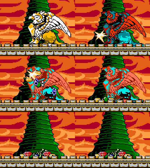
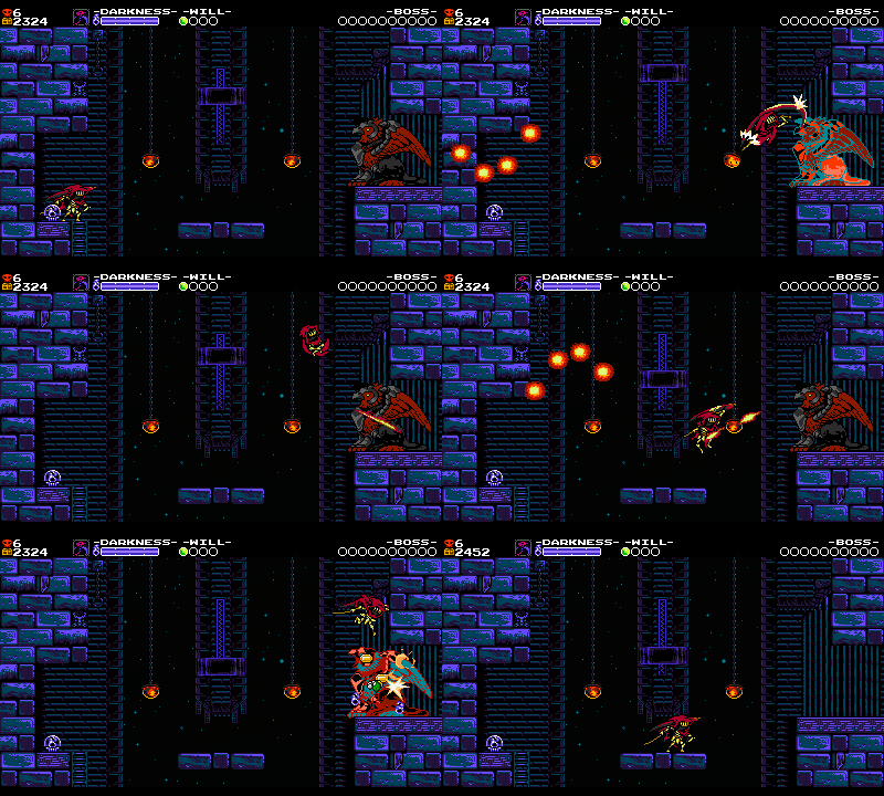
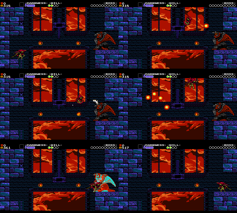
For example, minibosses like Griffoth or Dozedrake generally drop health after they’re defeated, whether we like it or not! That means that if you beat them, the tension is dissolved for the next area. This usually works well with pacing because defeating a miniboss is usually a good time for a break, but it removes one way to control the stage’s tension. As a result, we must be careful placing health too closely before or after a miniboss. In the final stages of the game, minibosses drop bombs instead of health, upping the tension instead!
Also, consider mystery platters, which randomly drop an apple, turkey, or an explosive bomb. In areas where the player might need health, these can provide some exciting variety – but they’re hard to depend on as a level designer or a player. The amount of randomness can be frustrating if you really needed that health.
Lastly, Specter of Torment features a much more nonlinear stage order than its predecessors. We could no longer assume roughly how many health upgrades the player had, and the variance could be enormous! We had to strike a balance of being slightly more generous with health without being heavy-handed about it and dissolving the tension of parts that were supposed to be difficult.
Health and Checkpoints
For the most part, wherever we place checkpoints, we also place some health. This is for two reasons:
- Checkpoints are already a good indication that a hard section was just completed, and the player probably could use some health.
- We never want the player to feel like they should jump in a pit after reaching a checkpoint in order to respawn with full health.
These health pickups in particular are pretty tricky to place! They tend to be hidden in the walls, since putting them on the main path feels redundant if the player is to fall in battle and respawn at that checkpoint.
Gems

Note how the different values are all distinguishable in their size and shape!
The gems littered throughout our stages are an extremely valuable resource – both to players and designers alike! Gems are very useful for leading the player around. Everyone wants gems! As such, they can be used to lead players or direct attention in important ways. Let’s look at a few examples!
Gems as Breadcrumbs
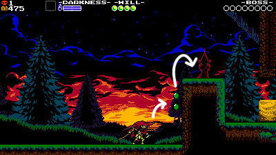
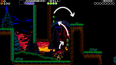
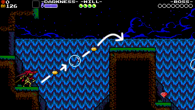
The most common use of the gem, by far, is to reinforce the intended route through the room. Especially in the early stages of the game, we make liberal use of gems to hint at where to go while the player is still learning their character’s abilities.
As the game progresses, we try and ease up on these types of gems, since the game can start to feel too hand-holding if there’s a trail of breadcrumbs through every single setup in the game. Since Specter Knight’s mobility gives the player so many options for moving around the room we were especially heavy-handed with our gem placement for most of Specter of Torment’s development. Gems were cluttering every single screen! So in the last months of development we removed nearly half of them, bringing things more in line with the other campaigns.
Gems as Difficulty Modifiers
Sometimes gems are intentionally placed out of the way to create extra, optional challenge.
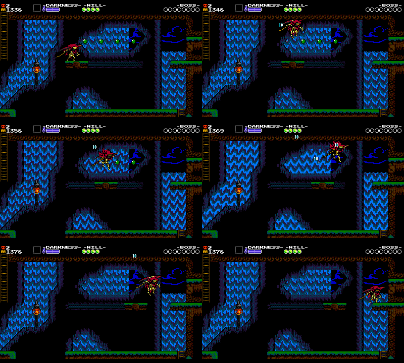
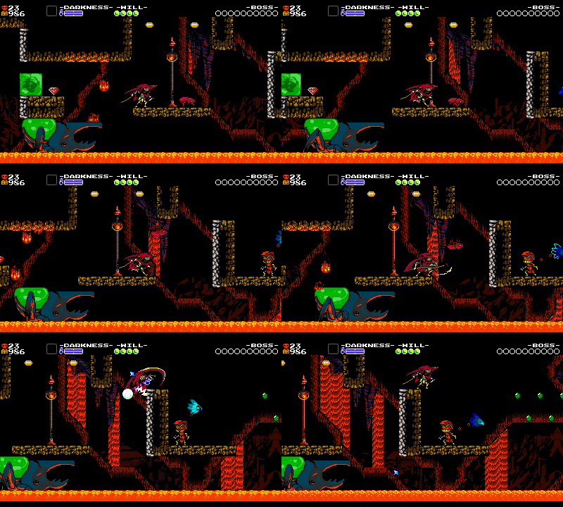
By placing these gems just above where Specter Knight stands while he’s riding on the platform, we can introduce a little bit of spice to an otherwise straightforward setup.
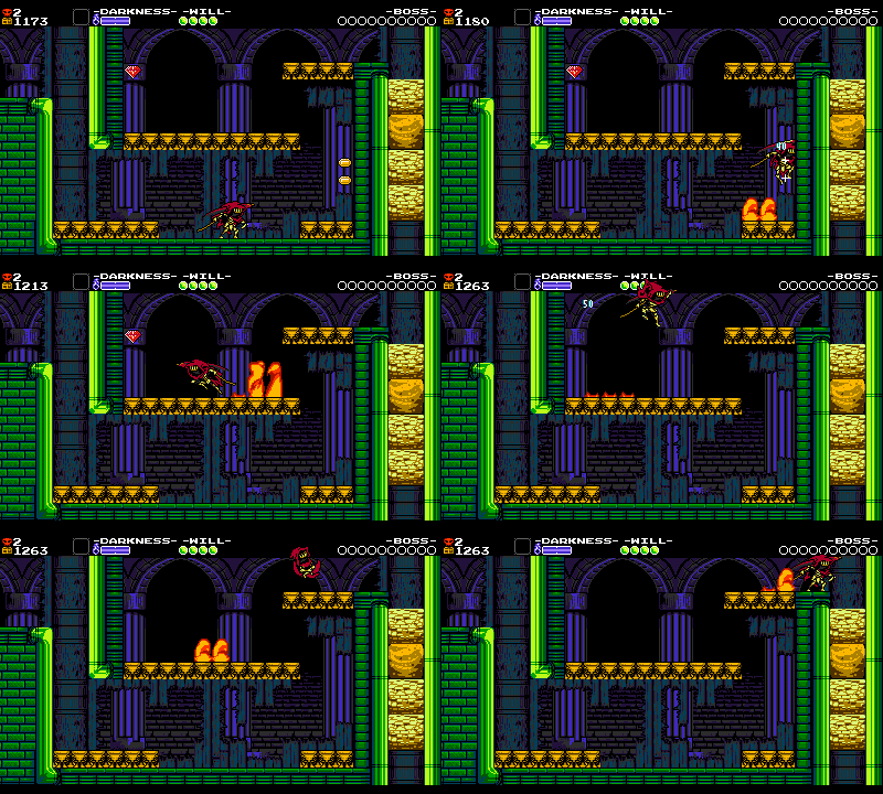
This red gem is placed at a dead end, and grabbing it means having to contend with the burners below in a new way! You could simply avoid it altogether and jump up above early, but the room gets some added depth with its inclusion.
This category of gem shows up very frequently throughout our level design. They’re an excellent tool for encouraging riskier, more interesting play-styles without demanding too much of every player.
Gems as Clues
Big, shiny gems instantly grab the player’s attention when they enter a new screen. So we’ll often place gems in places we want your eyeballs to be drawn to.
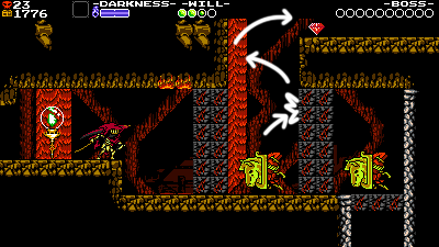
This red gem at the top of the screen directs the player’s attention toward the ledge above, leading to a secret room on the right. If the player breaks the explosive blocks below, they can’t make it up there – so this gem helps establish the player’s priorities before it’s too late!
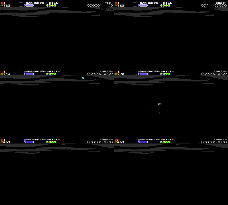
In this room, gems are placed on the edges of these perilous platforms. Because you can see and hear when each gem is collected, they clue you in to where the edges of the platforms are, even when the screen is totally shrouded in darkness.
Gems as Safety
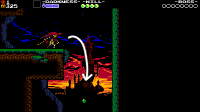
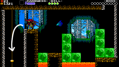
These gems at the bottom of the screen tell the player that it’s safe to fall down here. Sometimes it can be a little difficult telling the difference between a screen transition and a death pit, but gems help reassure the player. If that were a death pit, there’d be no safe way to grab the gem, after all!
More on Gems
You probably know that breaking checkpoints in Shovel Knight causes gems to spill out – but did you know that the color of each checkpoint corresponds to how much gold it will yield? That means we have to set the gold value of every single checkpoint in the game!
Each checkpoint’s value roughly describes the difficulty of the previous gameplay section, since that’s the stuff you’ll have to replay if you break that checkpoint and fall in battle! They also generally increase as the game goes on and the stages get harder. For Specter of Torment, however, since the player is given the choice to pick any level from the start of the game, we had to standardize these values more than usual!
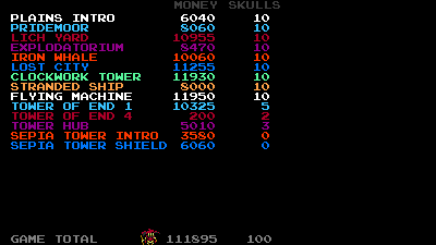
We also have to make sure the game’s gold totals are relatively balanced across all the stages. To make this easier, we made a handy tool to check the current totals of each stage. This isn’t an exact science – some levels have more secrets than others, some enemies naturally drop more gold than others upon defeat, and players are more likely to lose money in certain types of hazards. But it helps get us in the ballpark of a balanced economy.
Darkness

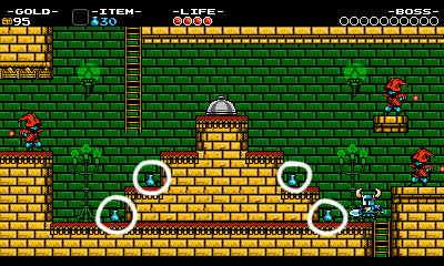
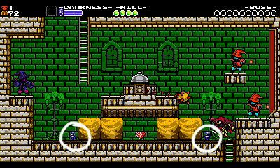
Darkness is a resource that lets Specter use his Curios- it’s basically your magic meter. Those Curios are powerful though, so we don’t want to have these Darkness jugs everywhere or Curios would be too spammable! We tried to put Darkness in places we thought players might need to rely on Curios, or as a reward after a tough portion of the stage. Specter of Torment has another complication- Specter Knight automatically regains some darkness as he defeats enemies. As a result, we ended up placing far fewer Darkness jugs near enemies.
Magic placement had to be thinned out because Specter Knight gets darkness back from enemies!
Another issue arose because the levels could be chosen nonlinearly – it basically made ramping Darkness Jugs impossible from level to level! In a linear game, we could’ve tapered the magic off over the course of the game to increase its scarcity. Changes in structure can clearly have big effects!
Red Skulls

In Plague of Shadows, we placed 30 unique collectible Cipher Coins in each level. We did this to help create rewarding daredevil paths for Plague Knight to Bomb Burst through within existing Shovel Knight rooms, but it was definitely a lot to keep track of. 10 seemed like an ideal number for Specter – it let us hide them a variety of challenging spots, while still making each one feel valuable.
Since you don’t lose the skulls you’ve collected when you respawn, our biggest consideration with these pickups was making sure players were never driven to grab them, intentionally fall to their death, and then respawn at a checkpoint and move on.
Earlier in development, to combat this, we briefly made it so that if you died on the same screen, the skull would leave your inventory and hover over to its original position! We didn’t like this solution because it introduced too much ambiguity. It wasn’t immediately clear why the skull wasn’t collecting or when it would count as collected, and ultimately we decided that most of these issues could instead be better solved through clever level design.
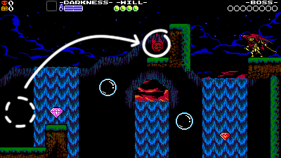
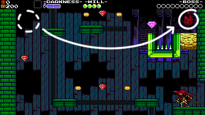
Lots of secret rooms like the ones above were designed as loops where the skull could be placed at the end, so the player would grab the skull at the end of the challenge, rather than the middle of it. If the level design was set up correctly, the challenge of getting to the Skull was the hard part, and dying afterward didn’t feel like a cheat of the system.
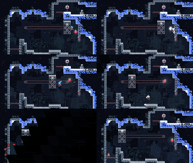
However, the idea of having to “bank” your Red Skulls eventually was implemented… in a completely different game! In 2018’s Celeste, some strawberry collectables won’t collect until you leave the area or complete the challenge. But although it didn’t make sense for Specter of Torment, it does for Celeste, since you always respawn at the start of each room, and the loop of dying and respawning is much shorter. A game’s mechanics design and level design are deeply intertwined, and what works for one game won’t always work for another!
Reexamining Rooms
How do you know when a room is totally done? Well… sometimes it isn’t always clear! If something feels off, there are some questions you can ask to try and narrow in on what the problem might be. Try looking at it from another point of view!
Clarity
Are all the room’s elements clearly working in service of the intention of the room?
As we’ve seen, the enemies and objects in a stage have to work together in fun ways. But sometimes an element will stick out from a room and keep it from being cohesive. It could be a gem that leads you somewhere nonsensical, a spot that looks like a secret but isn’t, or an enemy that’s just stuck in a corner to fill space. It can be easy to click down an enemy or two to fill out the rest of a sparse room, or to carelessly place treasure without giving it much thought. But players can notice when something doesn’t fit into a pattern. If everything’s not all designed to work together for some purpose, then it’ll feel random or disconnected to the player too.
It can be tough to tell when something is out of place, since the mechanics of controlling a Shovel Knight character are always satisfying on their own. When you’re jumpin’ around and fightin’ enemies as Specter Knight, it’s hard not to have fun, even when the level design isn’t yet fully developed! But we have to stop and think – is it all congealing? Could the level layout be facilitating even more fun?
Density
Does the room feel too cluttered, or too sparse? An open or constricted area can have a big impact on how the player perceives the room.
On the left, the sparse layout helps focus the player on the action. On the right, dense spacing creates a scary claustrophobic effect.
Sometimes there’s too much space in-between ideas, and not enough fun on a given screen. Or there’s too many ideas in the room, with too many distracting elements! We’ll sometimes have to separate ideas out, or the design intention might be lost.
A lot of the time, the intention of the room is working, but we need just a few more tiles of breathing room for the player. It’s often not until the room’s totally settled that you can tell exactly how much space it needs.
This sandwiched room needs more space, but adding a small bit of length means having to shift the remaining components of the level over to accommodate. Some levels contain dozens of art layers and objects to shift…one piece at a time! Throughout the development of all five Shovel Knight games, this was an all too frequent and tedious level design task. On our next project, no matter the genre, we’re already thinking about ways to streamline this part of the job!
Difficulty Spikes
Difficulty balancing is one of the hardest things to get right. We work at balancing it through every stage of development, and polishing is no different. We can now look at each area and determine if it’s too hard or easy at both a macro or micro level.
We almost always make the game too difficult, then pull back and make it easier later in development. This is mostly because the longer we develop the game, the better we get at playing it! It’s good to take a step back and recalibrate towards the end of development to make sure our setups aren’t getting too challenging. Here are some examples.
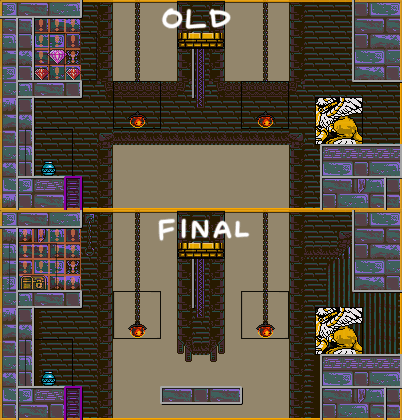
In an older version of this Tower of Fate room, we didn’t have a platform at the bottom, so you’d have to repeatedly Dash-Slash around to avoid getting knocked down into the room below. This was a compelling setup, but it was notably more difficult than anything else in the level.
Every stage usually receives a handful of cordial nerfs like this. After all, a severe spike in difficulty could make the player give up and miss out on all of the cool rooms that follow!
Flexibility
Is there any space for some added flexibility to how you tackle the room?
It’s great that the critical path through the room is clear and engaging, but it also ideally creates space for emergent fun if you use a more advanced strategy. Let’s look at some examples!
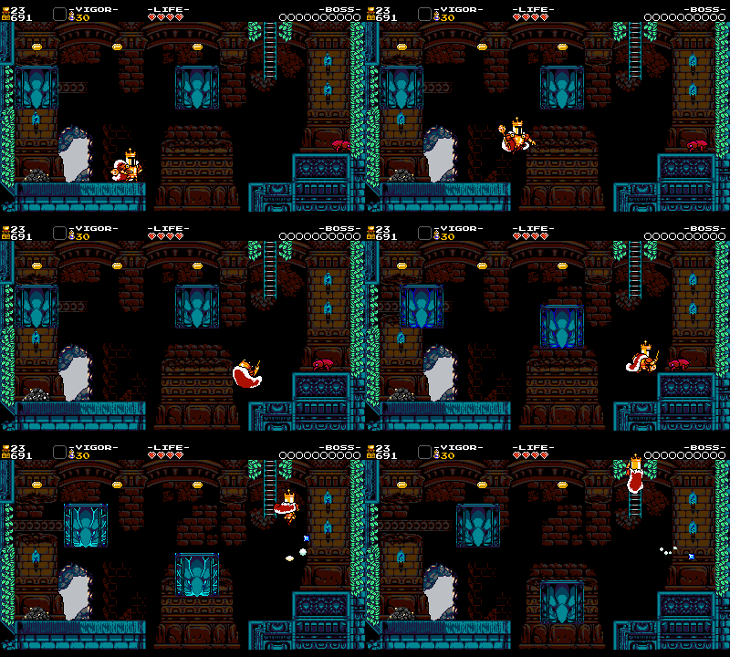
Having some dynamic objects like these chunks of breakable collision can introduce flexibility. You could break all the collision first and then fight the Goldarmor, or you could break it out strategically and use it to your benefit. Letting the player experiment with different approaches to the same problem adds replayability and helps break up the linearity.
Having multiple overtly distinct paths through the room can add flexibility too. Here, the player can climb the middle structure, or brave the enclosed tunnel below for some extra gold. Even the positioning of the Wizzems is adding flexibility to the room – by keeping them out of the player’s path, the player has to decide whether or not they want to clear them out before tackling the room.
All together, these elements give the player a ton of options for self-directing the difficulty, and plotting their own path. Though we have to be careful when opening the room up like this – too many paths or options and things can start to get confusing, quick!
Shortcuts
Similar to adding flexibility to the level design, adding shortcuts gives the player more options for how they tackle a room. But since a shortcut skips valuable room content, we have to make sure they’re obscure enough not to detract from the core intention of the room. Nonetheless, even the smallest shortcut can dramatically increase the replayability of the stage, especially in rooms that might feel too linear or too rudimentary to an experienced player.
Let’s go through a few of our favorite shortcuts in Specter of Torment:
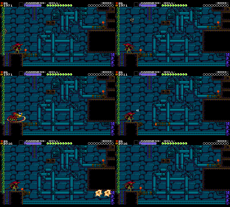
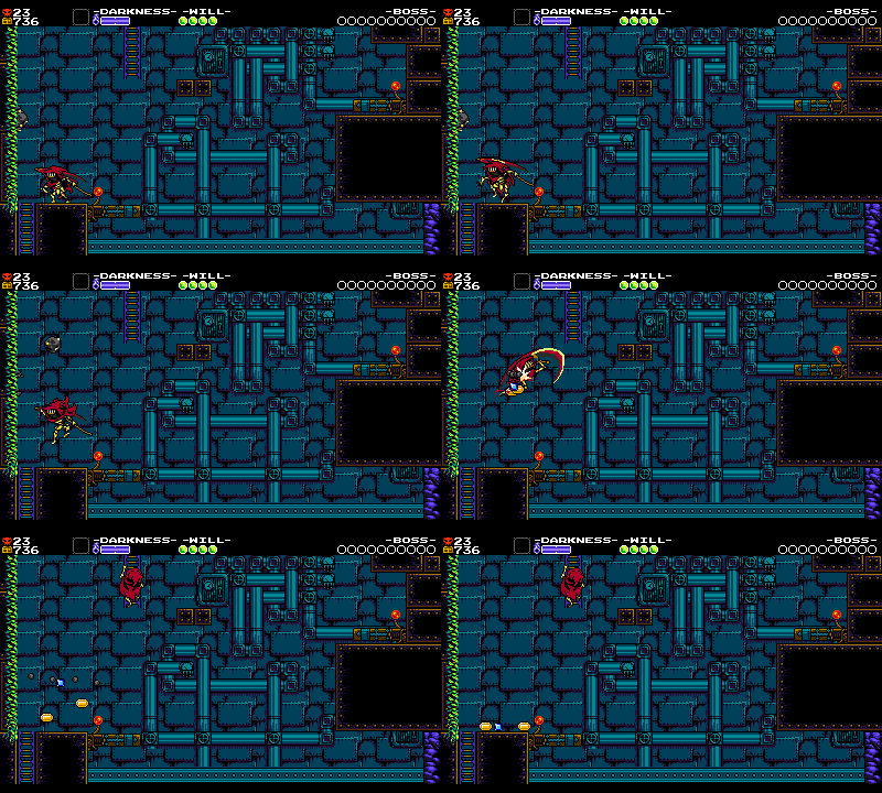
Iron Whale – Room 21
On the left is a dig clod whose primary function is coercing the player into activating the missile ride (since the dig clod lands right next to its lever). However, if you time it right, you can Dash Slash the dig clod in mid-air to reach the ladder above! If we placed the dig clod lower, it would still serve its primary purpose, but – by raising it just a few tiles – we can squeeze some extra fun out of it. Small changes like this can bring some interesting depth to an otherwise straightforward room.
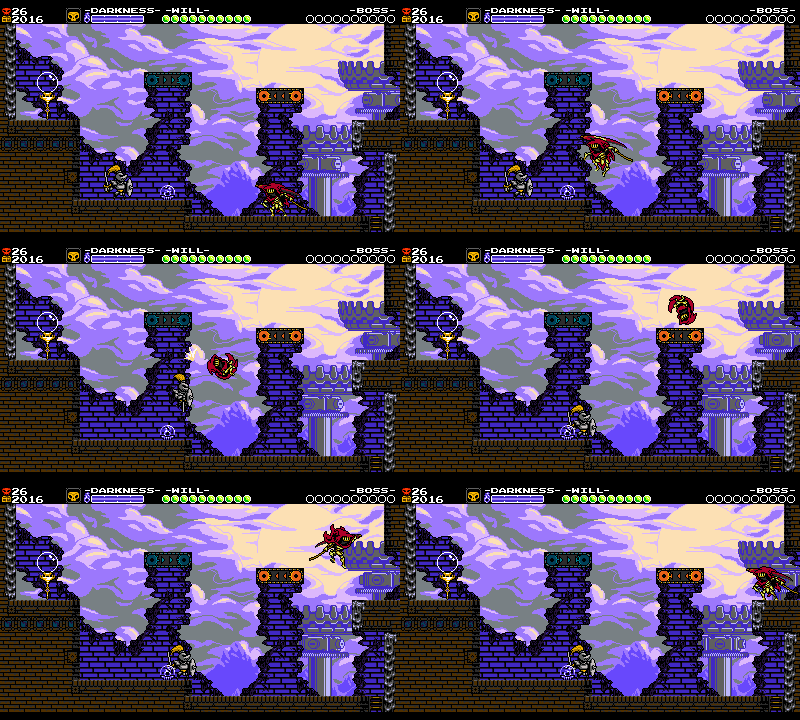
Clockwork Tower – Room 20
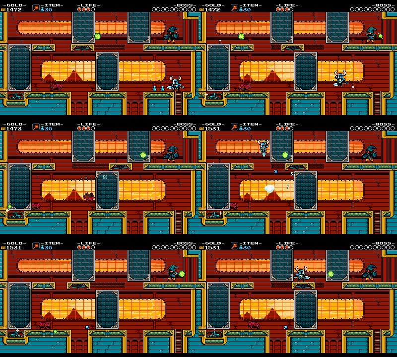
Over in the Clockwork Tower, you’ll encounter this Goldarmor that invites you to a formidable, tense fight right before you reach a checkpoint.
The conveyor belt platforms are placed high enough away that it’s clear your main path requires fighting the Goldarmor and heading left to the checkpoint. But that’s not all you can do! By Dash-Slashing with precise timing, you can pull off a wall-climb and jump to the platform above. That difficult-to-reach platform was originally at the same height as the one on the left, but we moved it down a tile to give the player more options, and to give the room a bit more depth.
One of the interesting things about Specter Knight’s mobility, after all, is that Dash-Slashing into enemies organically moves him around the space, so it only makes sense to build level designs that can take advantage of that.
Another cool thing about this setup is that grabbing the ledge early makes you miss the checkpoint, which is great! It asks the player a fun question: should you double back for safety or forge ahead?
Lich Yard – Room 3
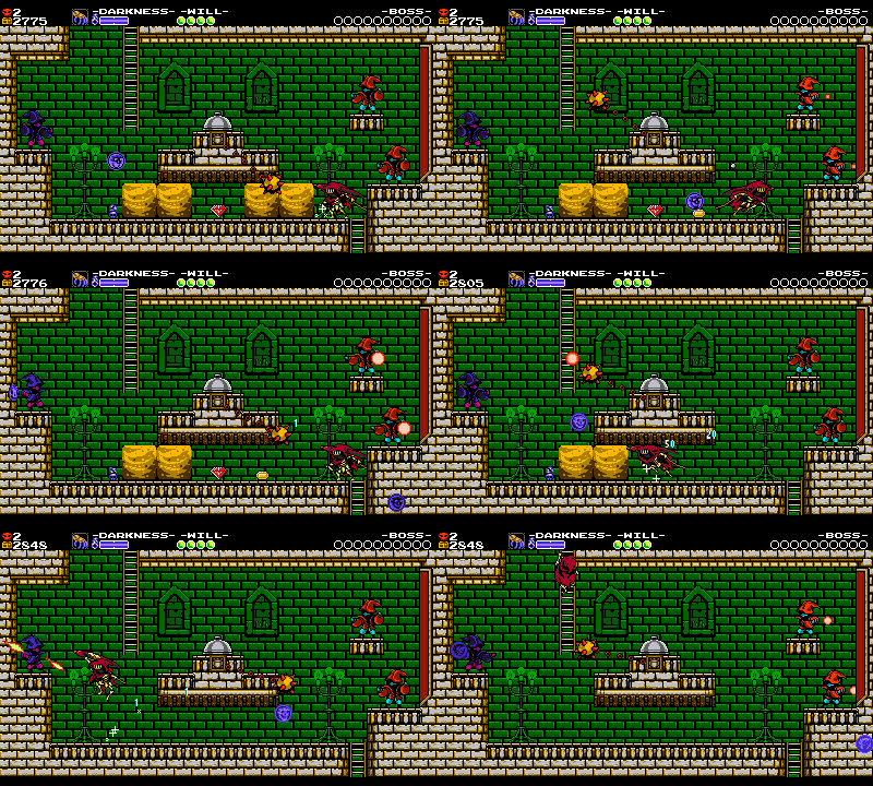
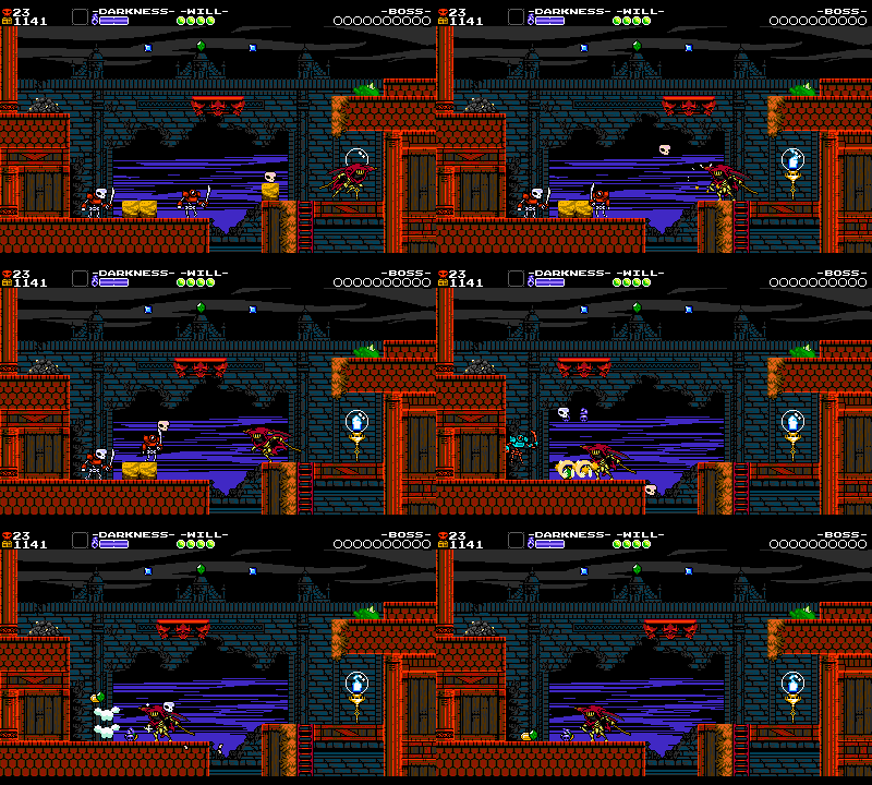
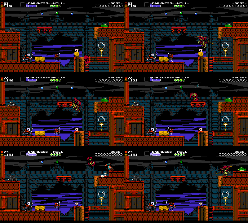
In this Lich Yard room, there’s a lone skull resting atop a dirt block. That tiny, innocuous dirt block is actually doing two big things for this room! First, it invites the player to slash it, which causes the skull to start bouncing around, hitting the skeletons across the gap. If there were no dirt block there to stop you, then you could still hit the skull around, but it’s more likely that you’d run past and ignore it. Having the dirt block there showcases that interaction, strengthening the skull’s purpose and placement.
Even cooler, the dirt block also gives a savvy player just enough height to reach the moving platform above, allowing them to skip the skeletons entirely. Neat! Without that tiny dirt block, it would still be a totally fine room, but its inclusion really pushes the room over the line from good to great.
Plains of Passage – Room 14
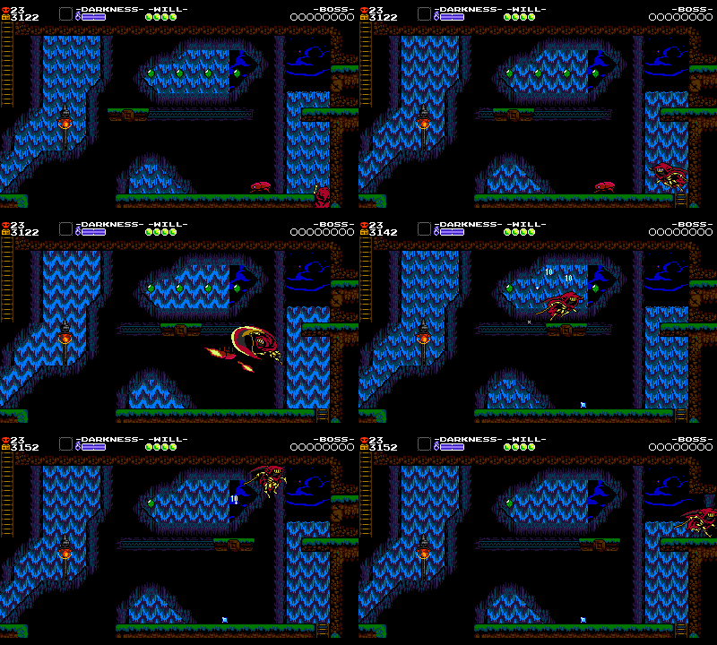
These types of shortcuts are arguably most crucial in the Plains of Passage! Being the first level, an advanced player is going to be challenged the least here, so it’s important that they still have ways to have fun demonstrating their mastery of the game.
In this room, you can use the Beeto to get up to the moving platform earlier than usual. We think this behavior is pretty fun, so we made sure to build many similar opportunities. Next time you play a Shovel Knight campaign, be on the lookout for cool skips whenever you see a Beeto!
Note that none of these additions ever detract from the core intentions of the room, but they give the player a bit more freedom in how they tackle things.
Optional Mobility and Heirloom Utility!
Now that the level design affords regular ol’ Specter Knight lots of fun options, we have to make sure we’re not missing any fun opportunities for players that love to experiment with Curios and Armors. Let’s look at this Pridemoor Keep room for an example.
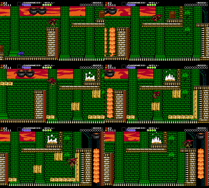
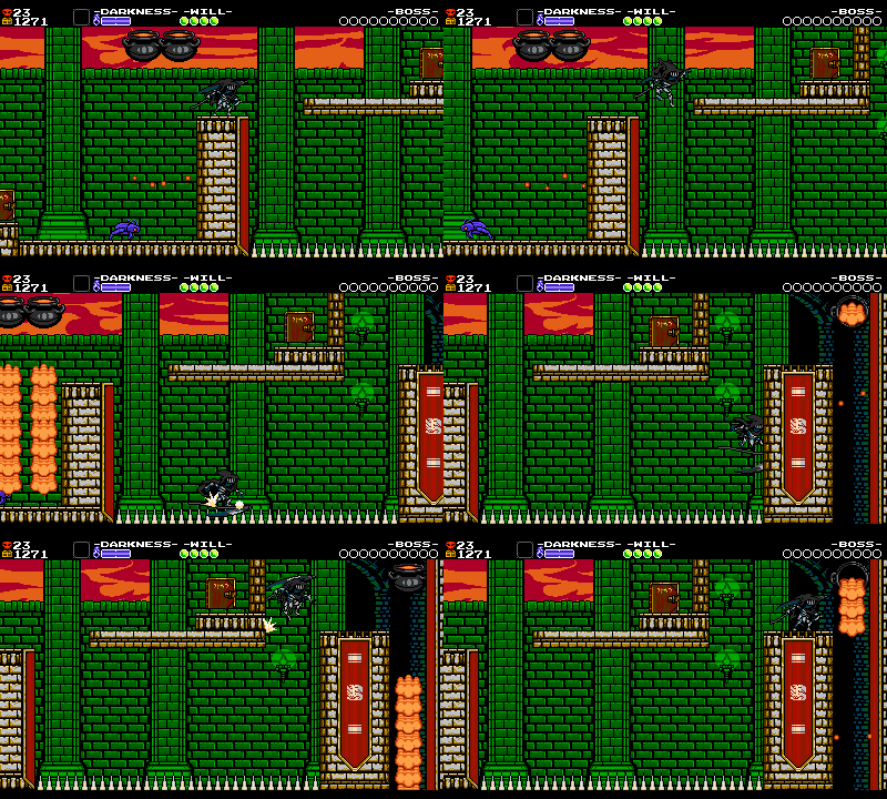
In this room, you’ve gotta activate the Spellbook and scamper across the platforms before they time out. But because the right wall has spikes, you couldn’t continue if you tried to use the Rail Mail to grind through the room. Lame!
By taking out the spikes on the right, using the Rail Mail becomes possible. It’s a simple change that doesn’t affect the original setup in any meaningful way, but makes the game more interesting for skatin’ Specters.
Considerations like this necessitate subtle changes to many rooms! Sometimes there’s a cool Curio opportunity we want to encourage so we add more Darkness pickups. Or sometimes something like the Fly Feather makes the challenge too trivial, so we raise the walls or extend a pit to make it a bit harder to “cheese”. In any case, tiny changes like these can make some already solid rooms even better.
Polished.. But Not Final
While not exhaustive, we hope this chapter shows some of our thought process when taking a level from rough to polished. From smaller details like pickups, to larger structural examinations like difficulty spikes, there’s a lot to consider. After ‘kicking the tires’ like this on a stage, and getting some play testing in, we’ll generally be pretty confident about a stage.
But it’s not done yet! Every level still needs to be scrutinized and made uniform to ensure they all fit together. We’ll take some passes at smoothing out levels in the next chapter!

