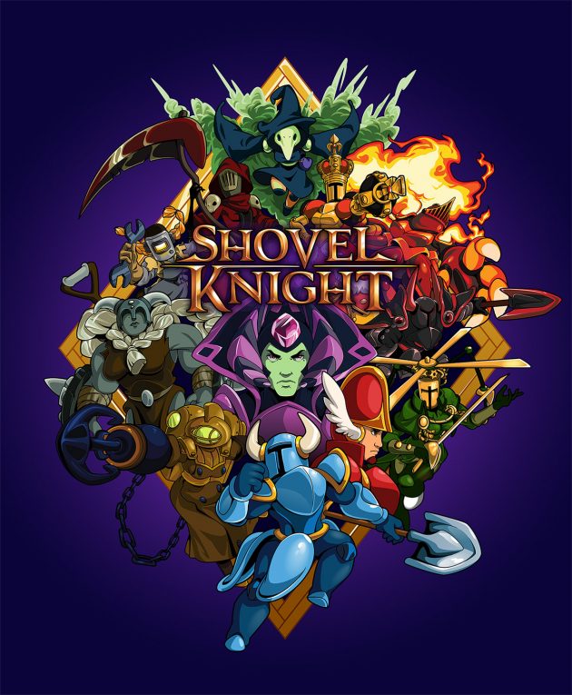
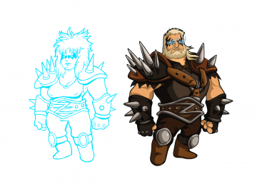
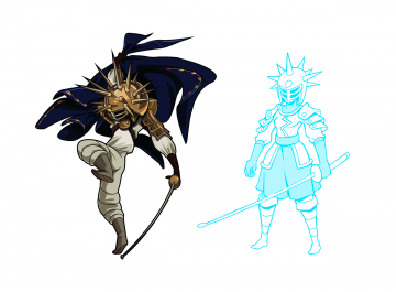
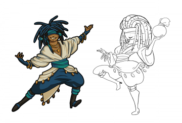
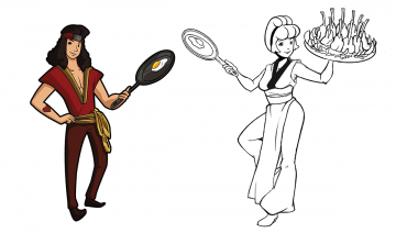
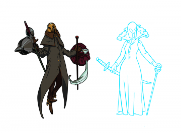
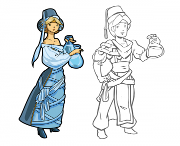
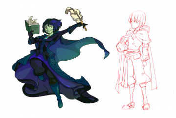
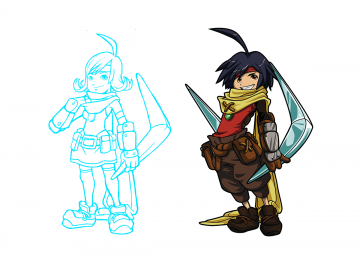
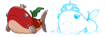
Shovel Knight is a game which draws on what we loved about designs from the 80s. But some of those 80s concepts can be a bit outmoded today, especially in regards to gender. After making some missteps with previous projects, we wanted to make sure that Shovel Knight was more inclusive and not so regressive. That’s one of the reasons we worked to make Shield Knight’s character an equal partner to Shovel Knight, someone he fights alongside at the end, instead of just a ‘damsel in distress’.
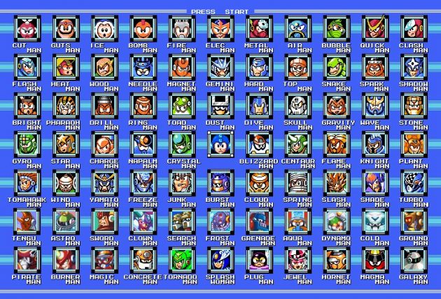
However, we already had made an oversight with the balance of characters in Shovel Knight- almost all of the main characters were male! Thinking back, many games during the 80s didn’t have too much in the way of representation- Mega Man is almost entirely a boy’s club, or even the cast of Super Mario Bros. 3. The female cast in both of those games consists of either token additions or damsels in distress. We wanted to do something to better address this oversight, but the designs were all done and the game was in production. But… it just didn’t make sense to ignore a huge chunk of the world’s population when we are trying to make something for everyone! Luckily, the Kickstarter funding model let us offer an option: Body Swap!
What is Body Swap?
The concept behind Body Swap (originally called Gender Swap) was that all of the male characters would become female, and vice versa. But after some discussions both internal and external, we quickly realized that we could do more than just a simple reversing of all the genders of the characters. After all, there is an enormous spectrum of genders or labels that players might want to customize! However, we also had to balance the scope of the feature, so we came up with this feature set:
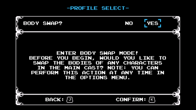
We would create the opposite bodies for our main characters: Shovel Knight and Shield Knight, Enchantress, Black Knight, and all the Knights of the Order of No Quarter. Each of these character swaps could be controlled independently, to give whatever mix of character bodies the player wanted. Finally, in English, the pronouns for each of the characters could also be swapped, so you could have a female character, referred to as her, with a masculine body or vice versa! This would all be controlled by a simple menu. Here’s how it turned out!
Notice the use of male and female symbols- we thought these symbols would be more inclusive than written labels. This menu can be accessed at any point during the game, so you don’t have to commit to a version at the start of the game!
Here’s a look at the text in game. For example “Save Her” would become “Save Him”:
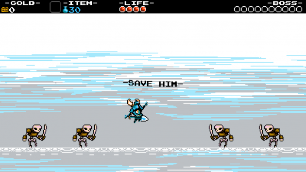
So, those are the basics. It’s been a little difficult to make design decisions like these, as we aren’t a team well versed in gender issues. But we always try to do the best to listen to our community, and make things that hopefully everyone can enjoy!
Designing Body Swap
Now for the fun part- the actual designs of the characters! One of the big inspirations for Body Swap was an episode of Adventure Time called “Fionna and Cake”, which was essentially a Body Swap version of the cartoon! When we saw that, it got us even more interested in creating cool designs for our “new” characters. With that enthusiasm, we set to work!
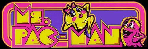
But… we were really attached to our current designs, and we didn’t want them to change too much just because of the body of the character. Adding gendered symbols like bows or dresses just wouldn’t do either- it would be a regressive “Ms. Pac Man” problem all over again! We had to create new character designs that were very true to their characters! To do so, we created some guidelines:
- Body swaps should be exactly as gendered as the original character. For instance, it’s really difficult to tell that Plague Knight is male in the first place! Therefore, Plague Knight’s female body should be a little tough to tell too. Meanwhile a handsome character like Propeller Knight could have a sexier female version! The designs should be balanced with their counterparts.
- The characters shouldn’t look like they are cross dressing, ie putting Shovel Knight in a dress. The outfits should look natural, not “another version” of something.
- Body Swaps should match the existing personality of the characters exactly. After all, the dialogue would be exactly the same, and the boss battles and mannerisms of the characters.
- Gameplay must remain identical! The Body Swaps have the same hitboxes and code as the original characters. This means that the sizes and shapes of the characters had to be identical to their original forms.
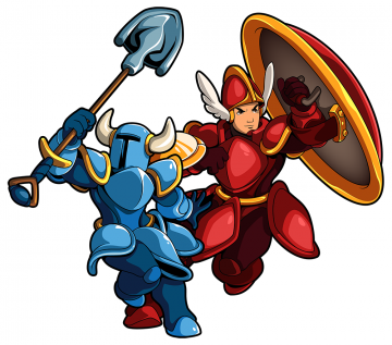
- Characters should be differentiable in pixel art. There is a surprising amount of tweaking to even get the characters to look clean and readable in pixel. With the Body Swaps, we had the additional challenge of making the characters look different than their counterparts, and still look readable! This was an enormous challenge.
- Both versions should be equally cool!
Ok! Enough explanation and rules! Let’s see the designs! We’ll give a little explanation on the design process for each one.
King Knight
Let’s begin with the first Order of No Quarter member we ever created! King Knight! King Knight was good for bending, testing, and addressing all the limitations of our ruleset. Here is the initial sketch we did:
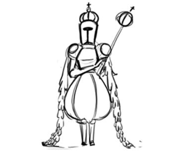
A queen is the most obvious direction, and we believed we could make it work inside our own restrictions. Even though it is a character in a dress, it works for the character’s theming.
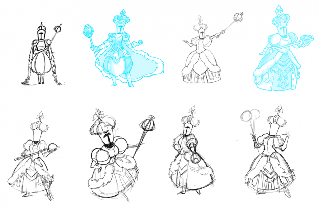
Here, we explore a bit with her personality and attire. Notice how the second from the top left is a bit too close to the original version. The version in the top right felt pretty close, but it had to receive a boost in King Knight’s silly personality, which was explored in the row below.
King Knight Final Concept:
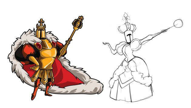
At this point we felt ready to jump to pixel. Here’s King Knight’s First Draft in pixel:
This looked great, although the hat and helmet broke our cross-dress rule a bit. It looked like the original King Knight just threw on a new hat, so we had to make some small revisions for the Final Sprite!

What a decadent dandy!
Note, we felt this character deserved a full name change – Queen Knight. We felt that since those titles (king and queen) are so strongly gendered, we should make the change in this situation.
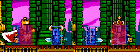
The image above gives a little look into our development tools. The outline shows a player’s collide box with the world. The blue boxes are for their defense hit box. And red is where they attack. This image illustrates how keeping the same sizes and shapes in the form allowed us to keep the gameplay 100% consistent, so we can ensure the same fun experience!
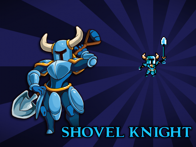
Shovel Knight
For Shovel Knight, we started out with some very basic ideas. Since we don’t have a face to work with, the easiest way to illustrate a more feminine form was to change the body shape.
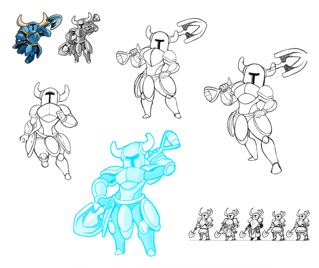
These are some of the more experimental designs. Adjustments were made to include metal skirts, segmented armor plating, circular pauldrons, etc. When compared to the original Shovel Knight design, we found that the female version started to lose her charm the more unique we tried to make her look.
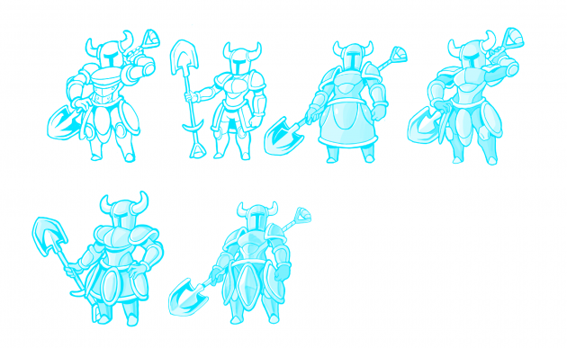
Large changes like adding a chainmail skirt or long flowing hair to Shovel Knight defined the character in a way we had not intended. By the end, the body swapped version of our main protagonist looked relatively close to our original concept. Aside from the shape of the body, the changes that were made to the armor are so lateral that some people might not even be able to spot the differences.
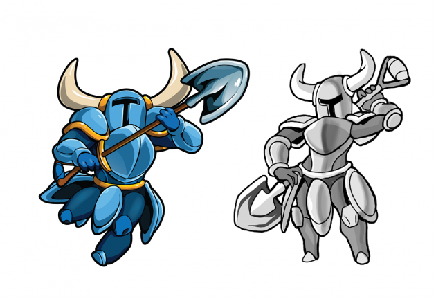
Although the changes that were made were arguably minor, we’re happy with the final look of female Shovel Knight. We wanted the lead of our game to have the same impact regardless of gender, and this design accomplishes that goal.
Shield Knight
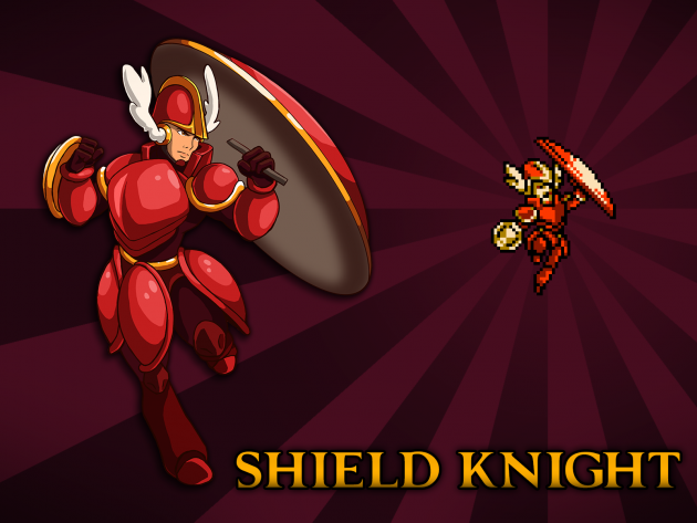
When it came to Shield Knight, we went with the same basic principle; keep the simplicity of the armor while changing the shape of the body. But we still explored designs with skirts. Again, they didn’t make the cut!
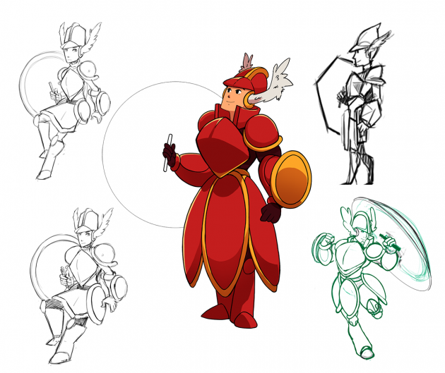
Here is the final sketch of male Shield Knight. Aesthetically, he looks much closer to his female counterpart than Shovel Knight does to her doppelganger! If you look closely, you’ll notice some of the ornamental particulars of his armor, such as the golden band across his chest plate, are missing. The pauldrons as well as his helmet have also been reduced in size to appear more masculine.

Female shield knight is very spirited and embodies adventure! We believe the male version nicely captures the essence the female design displayed.
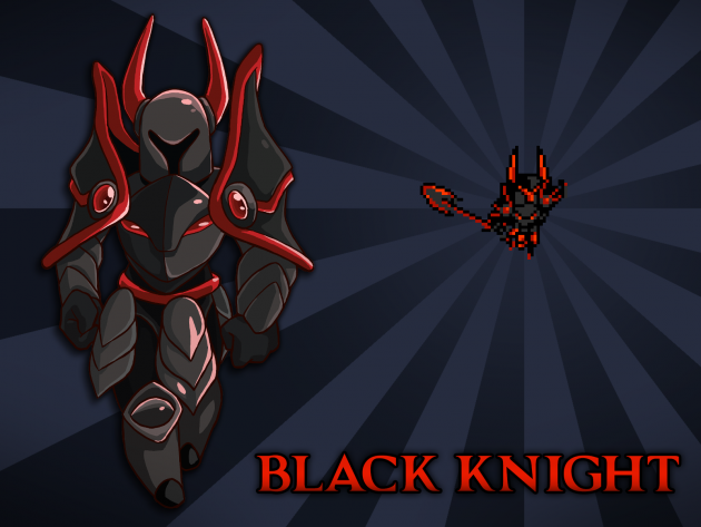
Black Knight
With Black Knight’s body swap design, we wanted to focus less on the body and more the design of the armor. We tried to create pieces that enforced slight tweaks to the silhouette – the pauldrons were a big force in achieving that direction. The tassets were added to try to provide a more menacing look. The gems on his chest are supposed to look like eyes! But they’re just decoration, otherwise…would Black Knight have two mouths to feed?
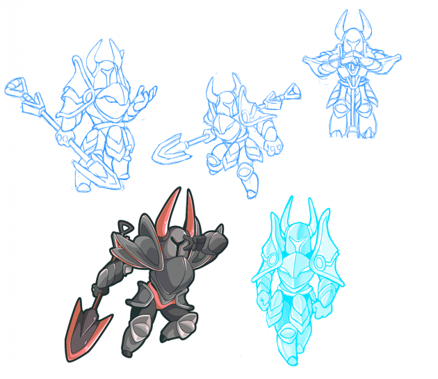
We’re pretty happy with where it landed! The armor is imposing, but still very sleek. Both bodies for Black Knight remain androgynous.
Enchantress
The “Enchanter” was one of the first body swap concepts we explored, and it led to creating a lot of the rules above! He went in many different directions before we got the design right.
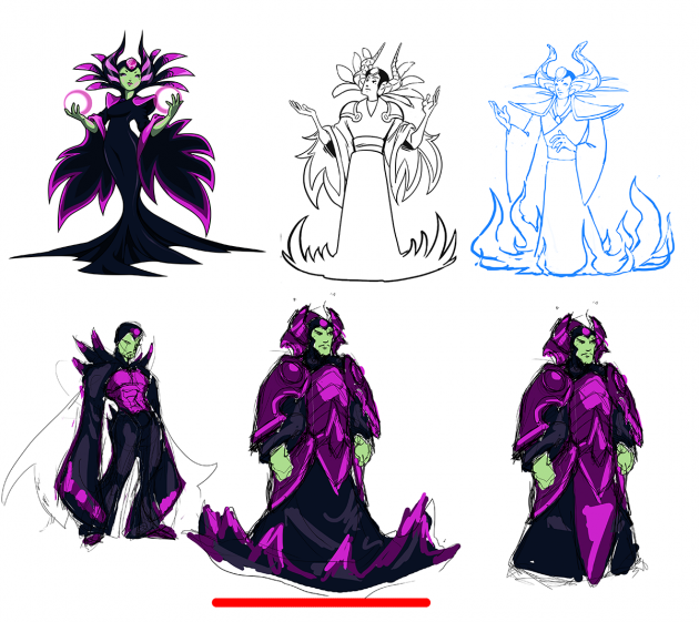
The original design was inspired by traditional Japanese attire, so we started with a kimono/robes that would feel similar in a male counterpart. This didn’t capture the original’s essence quite right. We moved towards a bulkier samurai inspired design instead. One of our artists was likely playing a lot of Ganondorf in Smash, as you can see elements of his same cold, mean spirit in this design.

The enchanter was the first design we made that was vastly different from the original. But we found it still captured the same striking, cold disposition of the original design.
Mole Knight
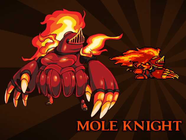
Mole Knight’s body shape reminded us of an opera singer’s body type, so we started there. The big breakthrough discovery was twisting the fire on Mole Knight’s head to mimic hair!
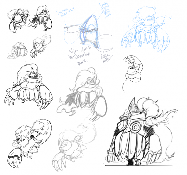
Does that mean masculine Mole Knight is balding? The designs began arguably more complex than the masculine counterpart, and we did our best to simplify it.
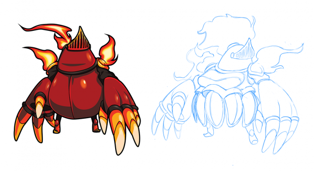
But in the end (like how a female opera costume is usually more complex than a masculine costume) we added more segmented pieces of armor and other elements overall.
Plague Knight
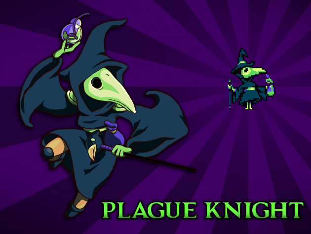
Plague Knight was particularly tricky due to not leaning particularly one way or the other in the gender spectrum. So we decided a costume change was the best way to distinguish the two forms.
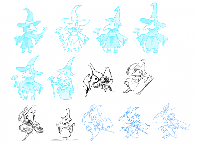
The idea was that Plague Knight shouldn’t be a character who is interested in fashion, but rather a person who wakes up, dresses in simple attire, and does alchemy all day.
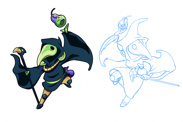
We found the small details where the hood turns into a witch hat to be charming! We thought about changing the eyes to be more almond shape or possibly shrinking the beak, but it didn’t feel appropriate.
Polar Knight
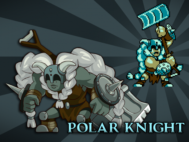
Polar Knight’s biggest challenge was how to create a character that had the same thickness and squarish body. Remember, the hitboxes are a key feature to the design, and Polar Knight didn’t have much room to play around with in this regard.
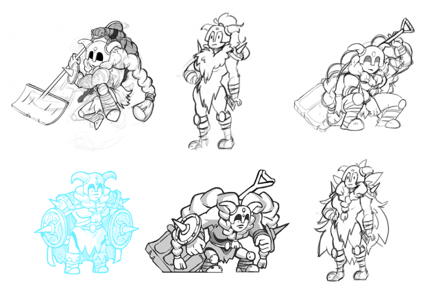
Besides the concern for hitboxes, Polar Knight’s original design effectively communicates his personality: a stoic, hulking, immovable mountain of a man and the female version needed to do the same. We tried a couple things to widen her shape including adding huge shoulder pads and armor but that all felt external to her. When that didn’t work, more simple designs were made, but they tended to lose the hulking character that Polar Knight embodies. The brilliant discovery that led us on our current path was the idea of giant, thick hair braids. That afforded us the opportunity to maintain her pose and attitude and also let her have the same broad proportions that her hitboxes demanded!
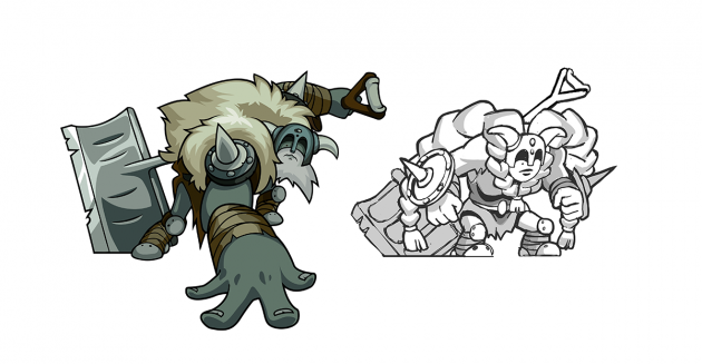
Instead of having spiked shoulder pads, we moved those elements to her forearms. Overall, Polar Knight was one of the toughest designs, but maybe the most successful!
Propeller Knight
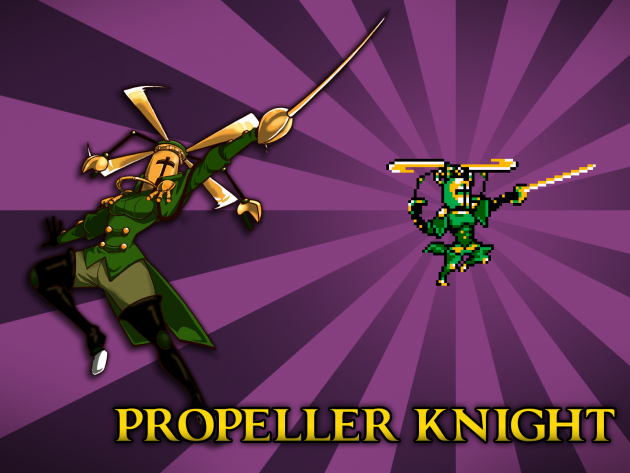
Propeller Knight is very confident – you might describe him as a lady’s man (or a man’s man!). Embracing the elegant masculinity that the original design exuded, we pursued a body type with more curvy, exaggerated feminine features.
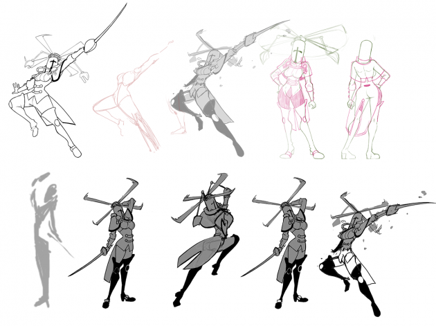
Feminine propeller knight is just as sexy as masculine propeller knight and both counterparts are more than willing to flaunt it in all their poses! Since an exaggerated personality is always easier to work through than the more subtle approaches in the other characters, this design was one of the easiest – it went through very little iteration.
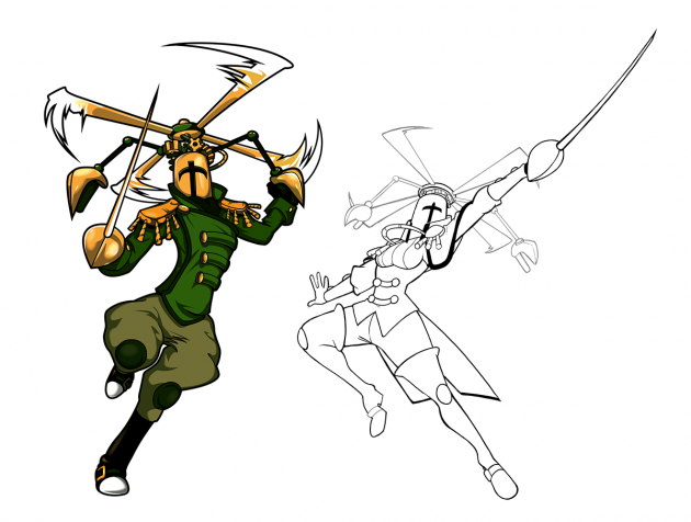
As you can see, the designs for Propeller Knight are on the far ends of the masculine/feminine spectrum. It’s fun that we were able to create a wide range based on the original designs.
Specter Knight
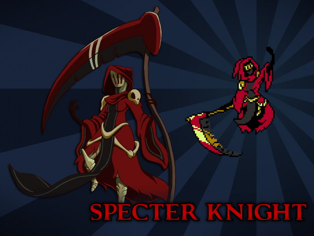
For Specter Knight, who already has a flowing cloak, we tried designing some more elaborate dresses while keeping her motifs the same: bones, skulls, and tattered but ornamental clothing. These ended up being a little hard to differentiate from the masculine Specter, so we went even further, even making a few designs that looked like a Yurei (that style of long-haired weirdo seen in ‘The Ring’). However, these additions ended up being too complex, ornate, or otherwise superfluous.
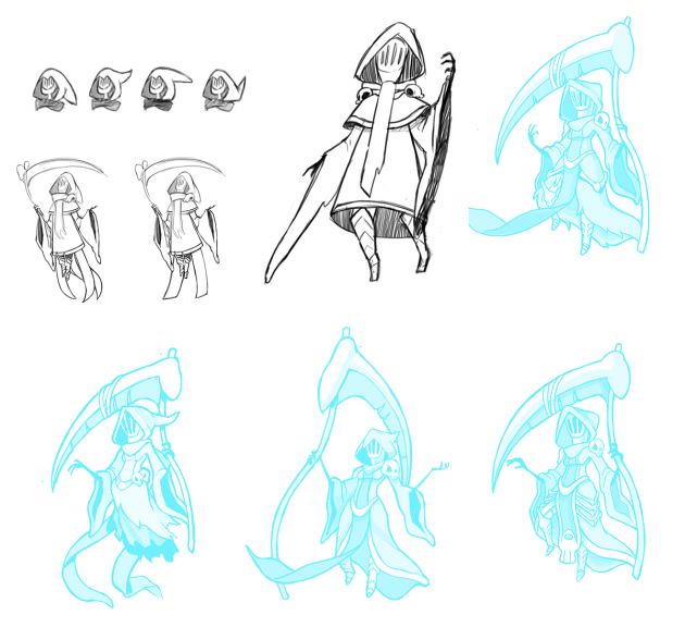
The final design for feminine Specter Knight retains the tattered dress, and has a little bone ornamentation here and there. Her design in the concept art looks a little more stout than masculine Specter Knight, but it’s the dress and pose- she actually is the same size. Once again, making the characters fit into the same visual space was paramount.
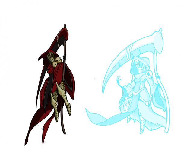
Here’s the final in all her glory! While this design is awesome, we’d really love to see a “Specter of Torment” version of her some day, with exposed underlying armor. It would have been cool to change up her weapon too, maybe a bone scythe or something. But we wanted to remain closer to the original intention of the character.
Tinker Knight
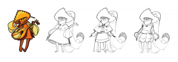
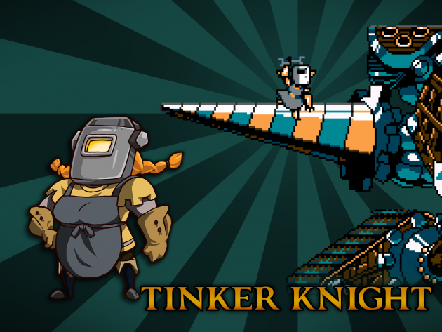
Because she’s so tiny, there wasn’t a lot of room to work with Tinker Knight’s design. The pixel model is so small that we were worried about the differences even showing up! We figured we could enhance the effect by making the animation poses a bit different, but we still needed to explore the design. We ended up changing her design only by about 10%, and adding some no-nonsense ponytails for this hardworking character.
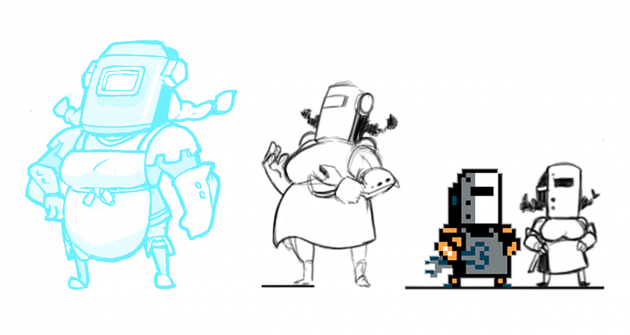
The design worked surprisingly well, given the limited changes! But something was still missing. The masculine Tinker Knight has a deep gouge in his mask, so we decided to give female tinker a new detail like that. We added an extra bolt onto her mask, figuring that she added it to repair some previous damage or something.
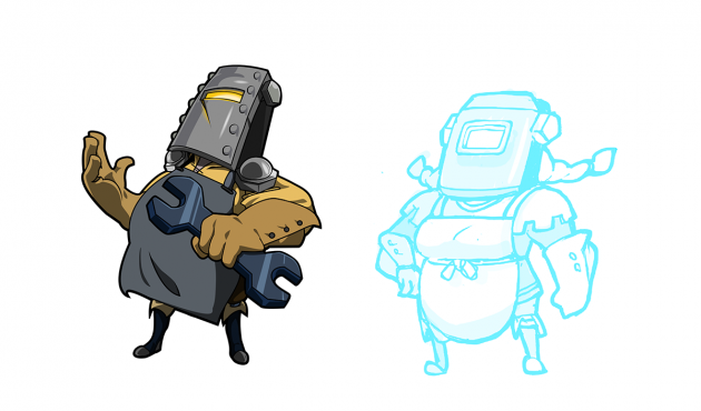
Hey… if you put the male and female Tinker Knight next to each other, they really look like an adorable tinkering couple, don’t you think? Sometimes, the smallest changes are the most effective ones!
Treasure Knight
Treasure Knight provided a similar challenge to Polar Knight- creating a female character that allowed a similar size and silhouette to work within the boundaries of the hit boxes. And like Polar Knight, this character was one of the most fun to redesign! Treasure Knight’s arrogance was important to capture, too.
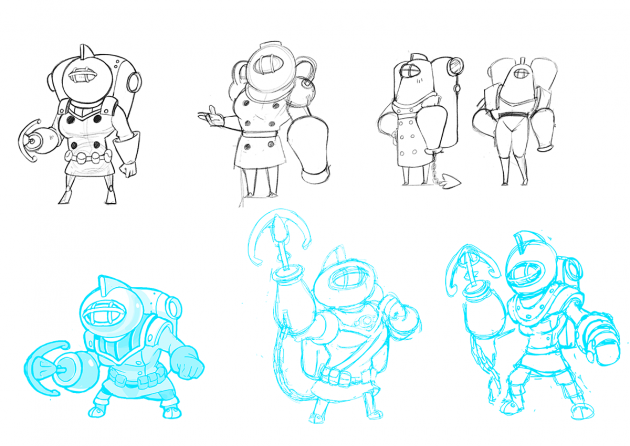
First, we decided to make the oxygen tank on her back into a dual-chambered one, to bulk out her form a bit more. We looked to the dual-chambered jetpack in The Rocketeer, that old 90’s classic, for inspiration. Male Treasure Knight wears a weird kind of bomber jacket, but a trenchcoat felt more natural for female Treasure Knight, especially with the added bulk it afforded. Essentially, it’s just an elongated version of the jacket! For her mask, we tried to riff on the original design, but it looked too top heavy and awkward. Instead, we swapped it for an oval design, but retained the characteristic fin and mask shape.
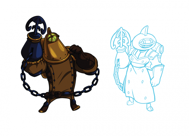
With her haughty pose and waist-cinched trench coat, Treasure Knight almost looks like a film noir gumshoe! We all fell in love with this design. Though she is a bit more bottom heavy, the oxygen tanks allowed us to retain the pixel form and keep her in line with the other design.
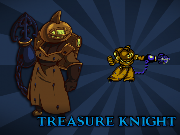
Well! That’s all of them! But you can’t know for sure you’re done unless you see all the new designs in an amazing group shot, right? What do you think?!
Conclusion
Let us know if you have any questions or thoughts about our process with Body Swap throughout the course of Shovel Knight’s development. Games and the game industry can always be improved and made even better in regard to welcoming everyone. We hope we’re taking steps in the right direction, being open about our process, admitting our difficulties, and letting as many people into our game and its development as possible. We also really hope everyone likes Body Swap and has fun seeing their favorite characters in a new way! Hopefully we can bring smiles to more faces! Stay tuned as we’ll be revealing more of the designs over the coming week.
Bonus!
Although we only officially made Body Swaps for the main cast, we couldn’t resist having a little fun with our other characters too!

