This is the first text field. If you are writing a post, this field is the default for the “excerpt” (aka the-stuff-that-shows-up-on-the-homepage). You can customize what shows up there by checking the “include in excerpt” boxes alongside images.
The first two paragraphs get some cool extra large sized text. David thinks it’s super hipster. I made the banner above to show him what hipster really looks like, which makes these two paragraphs look really tame. Yeah!
Small, left positioned image that links to an external URL. I think they look cute nestled into the armpit of the text.
This paragraph is in a text field that comes after the small image. The floated image aligns with the top of the paragraph immediately following it. Small images are 180px wide by any height. But you can upload whatever size you want that’s bigger than this and it’ll resize it for you. This is the third paragraph, which automatically shrinks the font and width of paragraphs so you can settle into your power reading mode. If you’ve made it this far into the post you’ll keep reading. Zoom zoom. Power read. Go.
This is a Heading 3
Melius fabellas vix ei. Ea eligendi voluptatibus usu, ei quis prima forensibus his. Ei fabulas feugait appellantur his. Ne salutandi gloriatur eos.
- An unordered list: Vel an decore aliquam similique. Solet utamur at vix, graece ceteros similique sed ex.
- Hinc salutatus dignissim ut has, choro laoreet no sed. Vidisse evertitur ea vis, te vim homero mucius. Quidam vocibus nam cu. Omnes argumentum ea vim.
- Mentitum
- Eu duo agam liber omittam, vis mentitum prodesset concludaturque id, ut congue aperiam vel. Ut has noluisse deserunt forensibus, te vis tota error persequeris.
Medium, right positioned image. You can add links to a caption. Write HTML.
This paragraph is in a text field that comes after the medium image on the right. Medium images are 360px wide on large screens, 300px on tablets and smaller. If you upload a large image it’ll shrink it down to size for you. You’ll have the option of linking it to a lightbox to view the full size image.
Some filler: Eum ut aperiri signiferumque, est ne natum quodsi philosophia. Per in sonet adversarium. Duo et voluptua delectus, zril petentium vituperata eos ea. Cu diam appareat vulputate has, vim altera melius conceptam et. At usu erat brute vulputate, in agam bonorum signiferumque sea. At cum veri scaevola, vel probo molestie an.
This Heading 2 wraps over multiple lines. Borders included. The piano is the best instrument.
And some filler text: Lorem ipsum dolor sit amet, qui oblique corpora scriptorem te. Eum ea etiam posidonium, eu sit ullum vocibus. Ei quo novum detraxit insolens. Quot iriure molestie no usu. Has eirmod assentior ne, ancillae facilisi adipiscing nam ei. Labore aliquid feugiat an vix, ea sea simul vidisse explicari.
Large images are 630px wide, the full width of a typical paragraph. This one’s going to a lightbox.
Eos id graece ignota suavitate, ut quem copiosae pri, cum ut maiestatis signiferumque. Lorem inani mundi ne eam. Ea tritani perfecto deserunt quo.
Above is an image gallery. Galleries resize depending on how many images you have in them. They look the best if you use images of all the same proportion. Since they break images into rows of 5, galleries with 6, 11, 16, etc.. images aren’t ideal. Let’s be frank. They’re kind of ugly.
- Numbered list
- Second is the best.
- Third is the one with the hairiest chest.
- and
- we are going to
- make it very, very
- long.
- This way we can see how it looks
- when we get to
- double digits, baby!
- And the cow jumped over the fiddle jumped over the woot, we’ve made it to a new line. How’s that? Stellar.
Large images are 1020px wide when they can be. Use sparingly as they are mega big. Or don’t, I suppose. Big images are cool looking. When you are making images for the web, be sure to “Save for Web” in Photoshop or Illustrator. JPEGs set to high, very high, or maximum are good. PNGs are cool if you want some transparency, but I don’t think you’ll need that. Perhaps PNGs are smaller file sizes for your pixel art. Either works. GIFs, too, but who uses those. Unless they’re animated. That’s cool. SVGs are supported mostly, but some IE users probably will complain. They may complain anyways.
Here’s a quote from an IE6 user:
i once was looking for this website but I couldn’t find it because even google doesn’t look right on my computer. and then i ate some cheese and crackers. I think some got under my shift key SO NOW I SPORADICALLY TYPE IN ALL CAPS.
I CAN’T CONTROL CASe very well, you see. but i know how to use an em dash.
—johnny
And some more filler text: Ludus pertinax an vis, qui feugait senserit ne. Tempor discere salutatus vix ut, ex graecis intellegam mel. In sed populo tamquam veritus, mea inani deleniti eu. Veri facete has ei, ut dicat delenit per. Et insolens ullamcorper definitionem nec, id mea solum docendi.
This video is large. They can also be extra large. Vimeo and YouTube are supported.
And some filler text: Cu pro inimicus dissentiet, iudico nonumes percipit ex sea, ne sit ridens suscipit appellantur. Aliquid suscipiantur has in. Has ad iusto veniam ocurreret, quo saepe elaboraret ne. Ei vix solet audire oblique, legere semper lucilius cum et, vide omnium expetenda at usu.
Mea eu dicant libris intellegat, per velit paulo incorrupte in. Duo et facete impetus, in est nibh civibus. Ad eam esse aliquip utroque. Purto vocent scripta cum te.
/* code */
pre.prettyprint {

	ol{
		border: 1px solid #eee;
		overflow-x: scroll;
		background: #eee;
		margin:0 0 1em 0;
		padding-top:7px;
	}
	li{
		margin-left:46px;
		margin-bottom: 0;
		padding-bottom: .5em;
		background-color: #fafafa;
		-moz-tab-size: 2;
		tab-size: 2;
	}
	li:hover{
		background-color: #f9ffd2;
	}
}
The code above is the css that is styling the code box. Pretty meta, I know. Solid. There’s also some css that google wrote, but it’s lame and compressed and doesn’t look pretty so it’s not included. Check out that 2 space tab size! Woot!
Inline code can be highlight by surrounding your text with <code class="inline"> and </code>.

You can set your author color (as well as category colors) in the wp-admin under Users (or Post > Categories). This color sets the background color on your archive page (as seen above). Author pages are found at www.yachtclubgames.com/author/full-name.
Toggles (for F.A.Q. or Spoilers)
This is an introductory sentence explaining some less frequently asked questions with incorrect answers.
- toggleWhat is the most frequently spoiled meal?
Brunch. Why? Because it’s not really a meal. It’s an inbetween-eal. Where they far too often serve eel. And eel is very difficult to cook. Which is why it’s commonly not cooked in sushi.
But sushi is not good for brunch. Brunch is designed for mimosas and carrot cake. I made up the part about carrot cake. Just stop asking questions okay?
- toggleWhat do you do with a drunken sailor?
Like any good electronic, if it gets wet submerge it in rice. If not wet, keep feeding it electricity.
Electroshock therapy can be good for sobering up, although I don’t know from personal experience.
The heading below is a heading 4. It’s not that different from normal text, but it’s a wee bit bigger and blacker, as it should be.
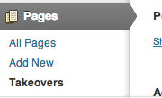
Takeovers
If you want to completely overhaul the look of a page you can create a takeover. The options pages with settings are a dropdown underneath Pages in the wp-admin. The Shovel Knight page is example of what a takeover looks like.


